What's New in GoodData Cloud?
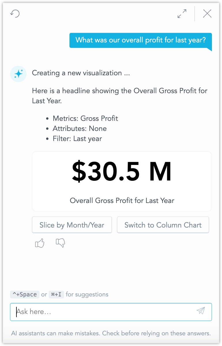
The AI Assistant can now explain analytical objects in natural language when you ask about them.
You can ask questions such as What does Gross Margin mean?, Explain Customer City, or What is this metric measuring? The Assistant responds with a clear explanation based on available semantic metadata, such as the object title, description, definition context, and related dataset information.
This works for analytical objects such as metrics, attributes, facts, date datasets, visualizations, dashboards, and also for ad-hoc visualizations created by the AI Assistant.
This feature turns semantic metadata into an active part of the AI experience and lays the foundation for future dashboard summarization.
AI Knowledge now lets you manage knowledge files not only through the API, but also through the UI, which can then be leveraged via a dedicated AI Assistant skill.
You can now view the list of knowledge documents, upload new TXT and Markdown files, and enable or disable individual knowledge items directly in the UI. The same knowledge can also be managed through the API.
This update also introduces a dedicated skill in AI Assistant that searches your organization’s knowledge base based on user queries and conversation context, which helps users easily reference relevant documents and information.
This release also adds persistent document storage for AI Knowledge, making stored knowledge more durable and allowing the system to recover and rebuild the retrieval index when needed.
For more details, see the AI Knowledge documentation.
You can now manage User Data Filters directly in the GoodData UI. This experimental feature makes it easier to set up, review, and troubleshoot User Data Filters without relying only on API calls. You can view existing assignments, update them, and check filter values more easily during setup or debugging.
Some advanced User Data Filter workflows may still require API usage.
Starting March 19, 2026, APIs for LLM endpoints no longer support creating, updating, or deleting LLM endpoint configurations. These APIs are replaced by the new LLM Provider entity, which supports configuration of multiple providers and models.
Impact
This change does not affect end-user experience. Existing LLM configurations are migrated automatically, and AI features continue to work as before. The change affects only LLM configuration management.
This release adds support for Azure-hosted LLMs through Azure OpenAI / Azure Foundry and for AWS Bedrock, giving each tenant the ability to use its own accounts, keys, deployments, and models.
This helps customers in regulated or security-sensitive environments use AI within their existing cloud security, compliance, and observability frameworks.
Organization administrators can add a provider, test the connection, select up to 20 models per provider, and set a default provider and model for the organization, with workspace-level overrides available when needed.
See the Configure LLM Providers and Models section for details.
You can now restrict access to GoodData’s native UI for embed‑only deployments. Enable the RESTRICT_BASE_UI organization setting to block native apps for end users, and grant BASE_UI_ACCESS only to selected users or groups. Organization administrators always retain access.
See Restrict Access to Native UI and Manage Organization Permissions.
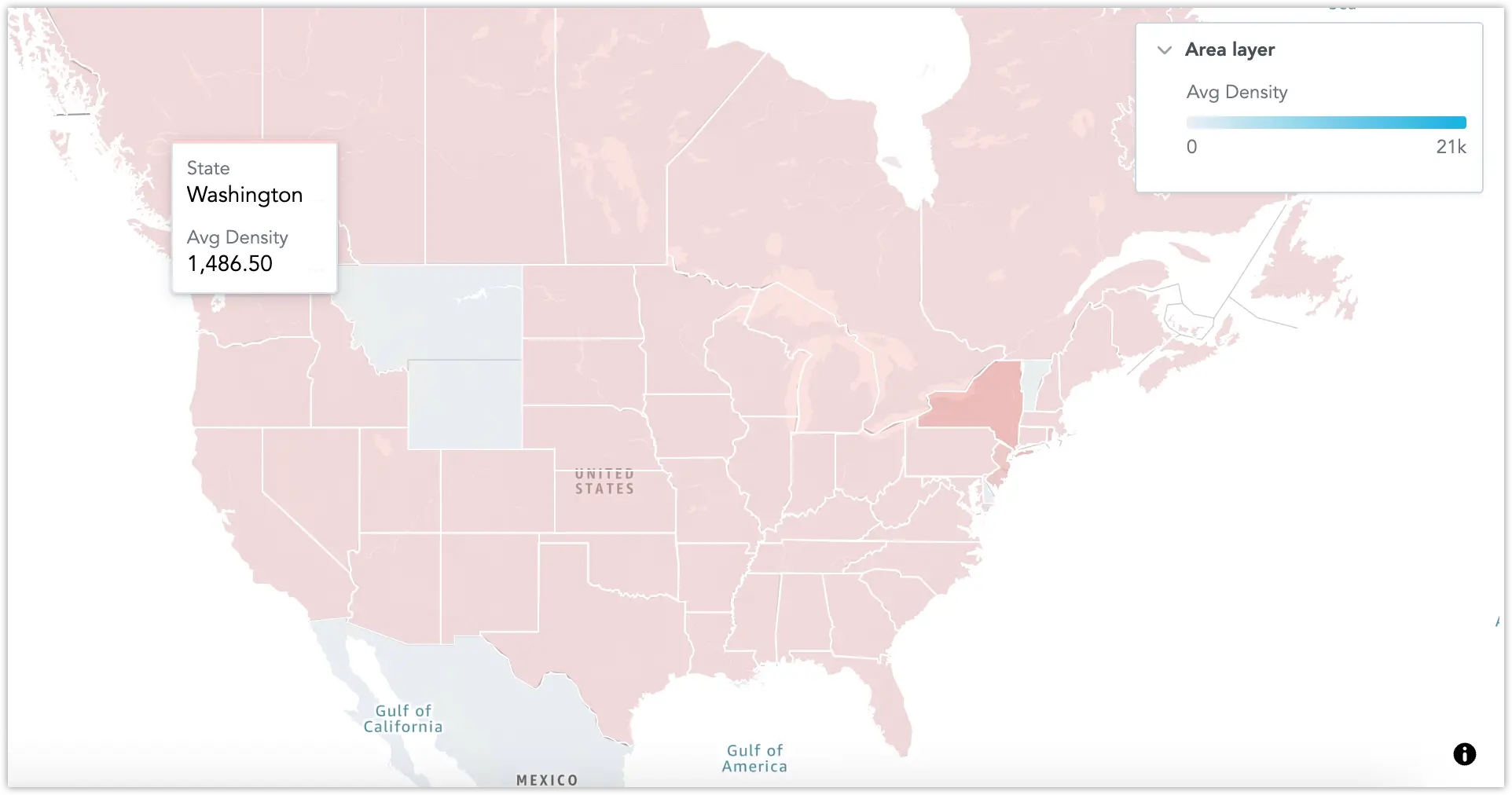
Geo charts and geo area charts now automatically localize basemap labels to the effective locale (organization, workspace, then user). If the selected basemap style does not support the requested language, labels fall back to English. No additional configuration is required in visualizations.
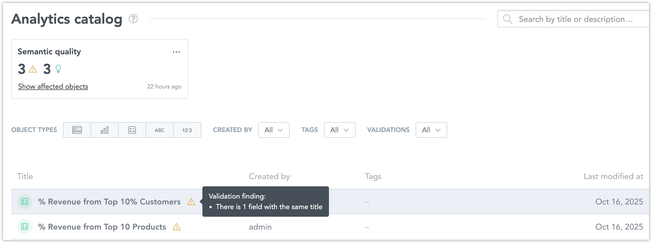
The Semantic Quality Agent helps you detect and fix issues in object titles and descriptions that can reduce clarity and consistency of your semantic layer (for example, duplicate or similar titles/descriptions, or unrecognized abbreviations).
This builds on the earlier experimental release of Semantic Quality Agent. See Semantic Quality Agent and the previous entry.
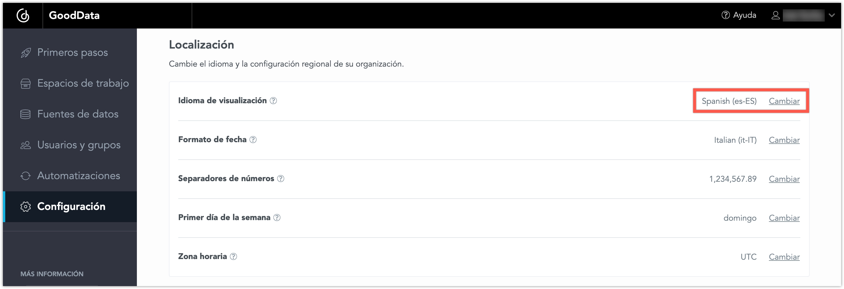
We have expanded the language options for our user interface to include Thai, Vietnamese, and Bahasa Indonesian. These languages are now fully supported in the Analytics Designer, Dashboards, and Metric Editor.
See the Change Display Language section for details.
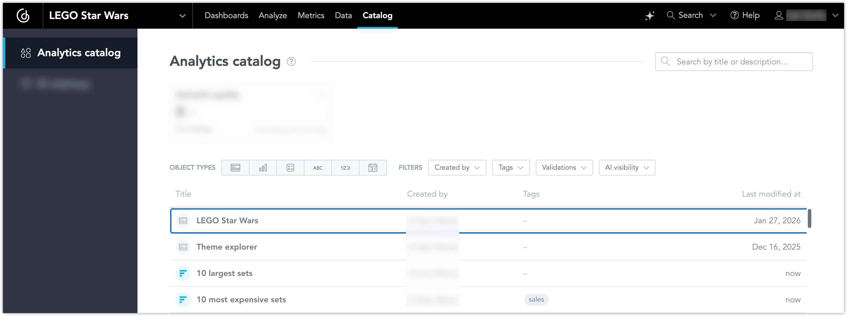
GoodData now brings Smart Search to UI applications, starting with the analytics object catalog in Analytical Designer.
You can now find metrics, attributes, facts, and other analytics objects by meaning, not only by exact names. For example, you can search for revenue and find an object named Sales Amount.
Smart Search combines instant frontend filtering with semantic search in one search box. This helps you find the right objects faster, discover related content, and continue working without changing your search workflow.
See the Smart Search section for more details.
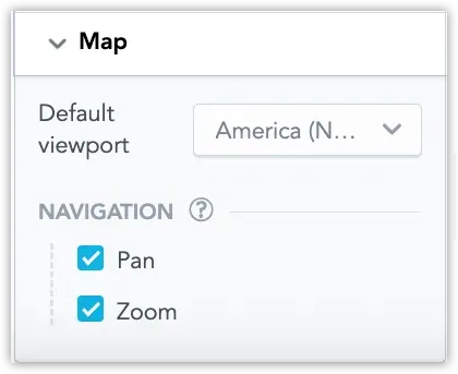
You now have greater control over how users interact with the viewport in geo charts and geo area charts. You can disable panning and zooming and set a default viewport for a specific region. Together, these options help focus users on the region and scale most relevant to your analytics.
In addition, administrators can go to Settings > Appearance & behaviour > Geo collection to upload custom geo collections for use in geo area chart visualizations. Geo collections allow you to define custom geographic regions, for example, company-specific territories or other custom polygon boundaries.
See Use Custom Geo Collections in Geo Charts for details.
In Analytical Designer, you can now use new ways to work with attribute filters. At the moment, this feature is available only in Analytical Designer.
Containsfilters
In addition to exact match filtering, you can now filter text attributes using operators such ascontains,starts with, andends with, including negative variants. This makes it easier to find matching values without having to select them one by one from a list.Manual value entry
You can now type or paste attribute values directly into a filter, even if those values are not currently loaded in the list of available values. This is useful when working with known IDs, codes, names, or copied lists from external systems.
These improvements make attribute filters more flexible, especially for large datasets and text fields with many distinct values.
Starting March 19, 2026, APIs for LLM endpoints will no longer support creating, updating, or deleting LLM endpoint configurations. These APIs are being replaced by the new LLM Provider entity, which supports configuration of multiple providers and models.
Impact
This change does not affect end-user experience. Existing LLM configurations will be migrated automatically, and AI features will continue to work as before. The change affects only LLM configuration management.
Action Required
If you manage LLM configuration through the API, migrate to the LLM Provider APIs before March 19, 2026. The deprecated APIs will stop working after that date and will no longer be available. You should also update to the newest version of Python SDK.
GoodData now adds traceable metadata to SQL queries executed by the platform. This metadata helps database and platform teams understand which user, workspace, dashboard, or visualization triggered a query.
The information is embedded directly in the SQL query (for example, as comments or database query tags where supported). Engineers can view this context in their database logs or monitoring tools, making it easier to investigate slow queries and analyze workload patterns.
This feature can currently be activated for:
Additional data sources may be supported in future releases.
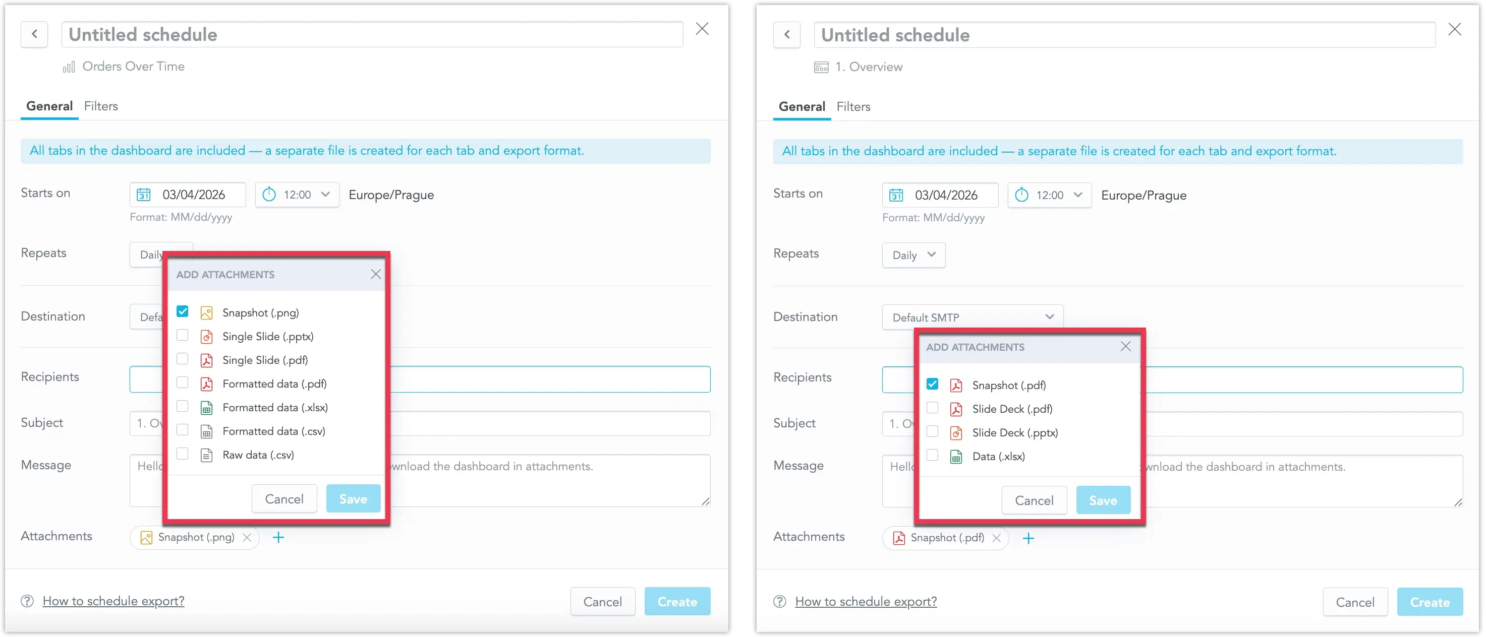
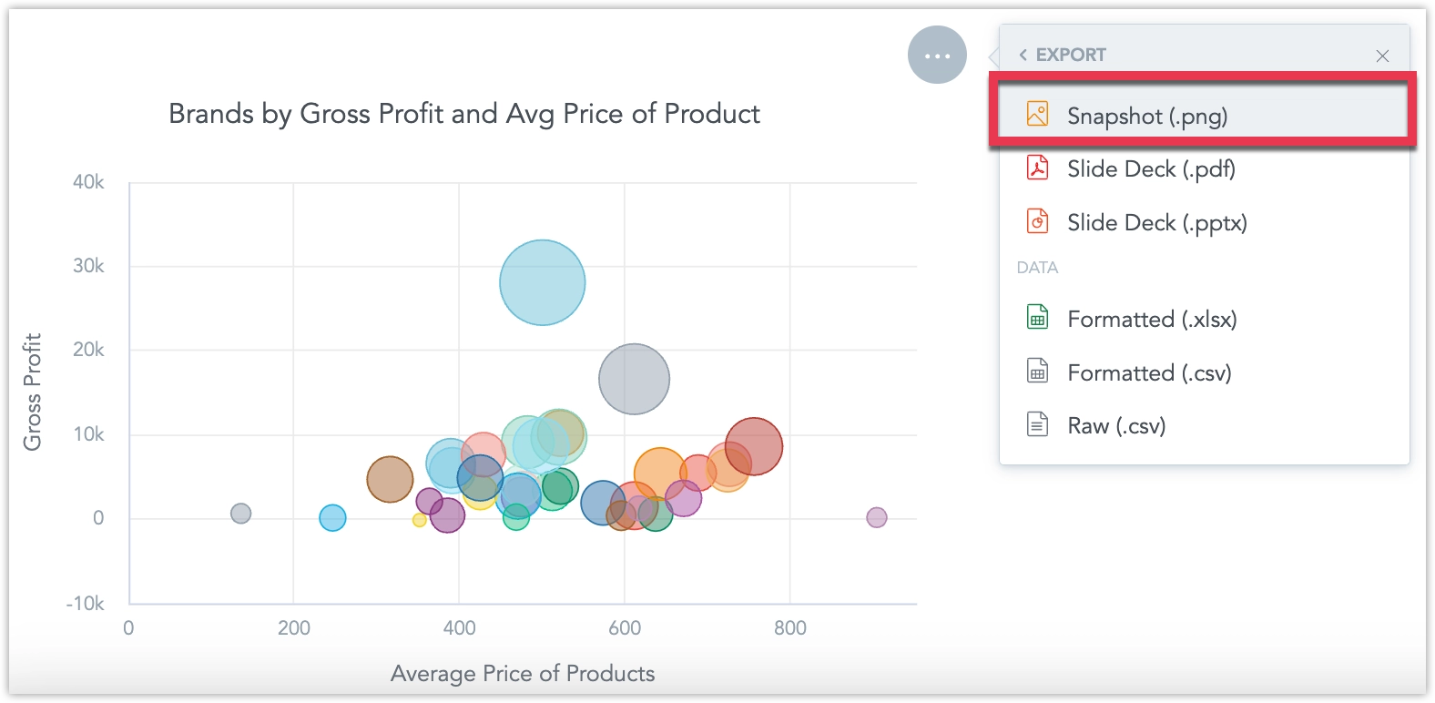
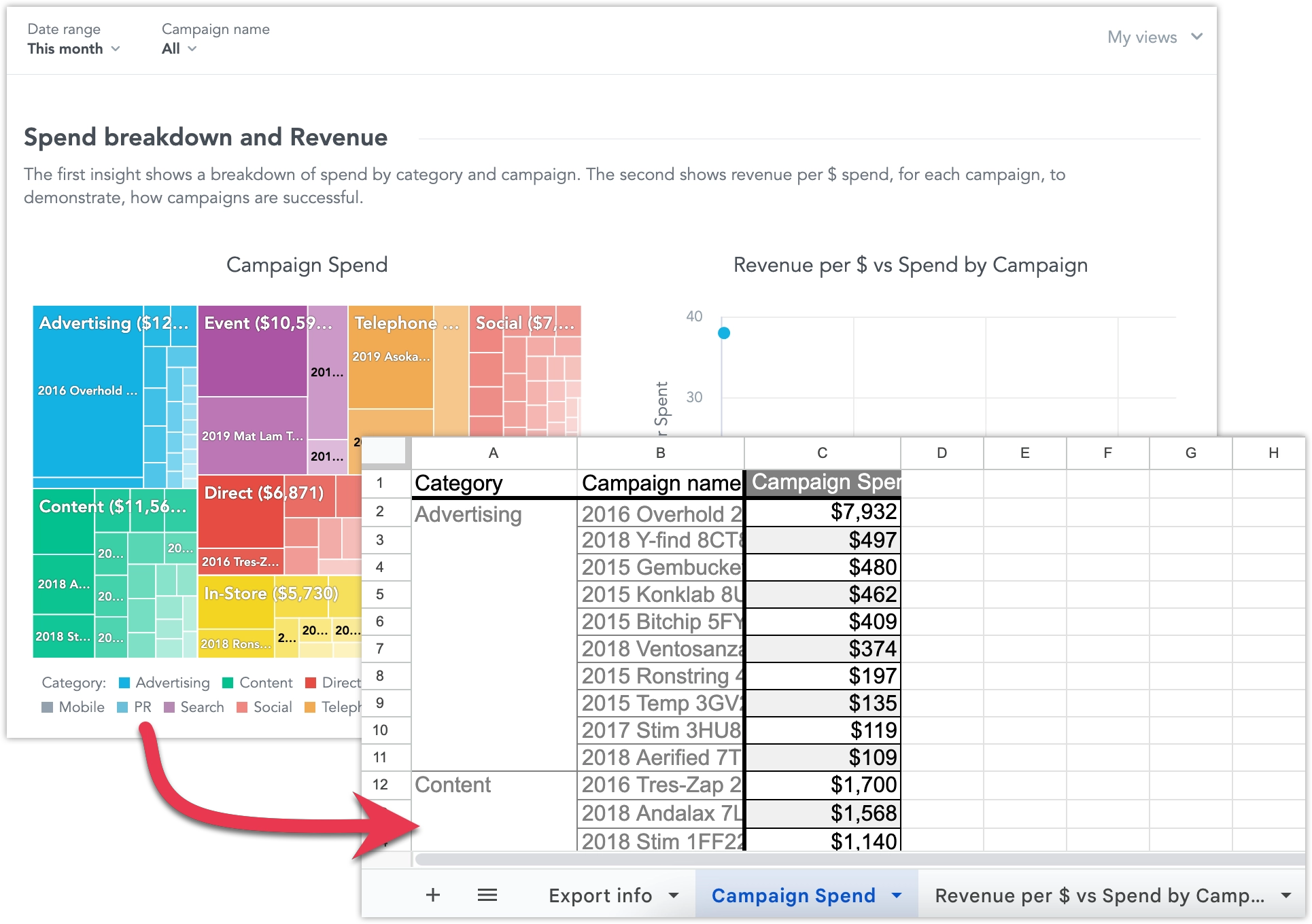
We’ve expanded automation capabilities in scheduled exports with support for new export formats. You can now export dashboards as slideshow presentations in PDF or PPT, download dashboards to XLS, send raw tabular data, and export individual visualizations as PNG images.
See Schedule Exports in Dashboards for details.
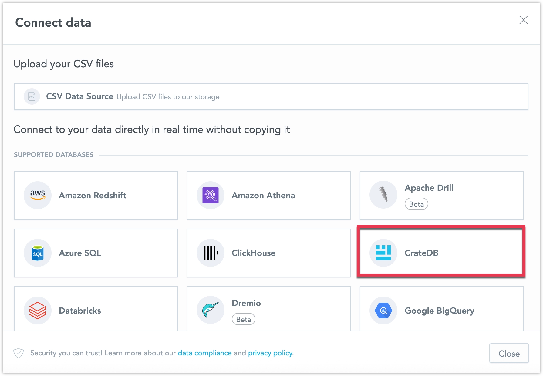
CrateDB Data Source is now out of beta and fully supported by default!
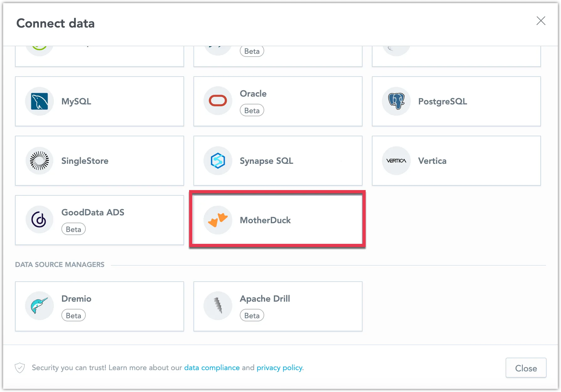
You can now connect directly to CrateDB and create a CrateDB data source within GoodData. This new feature expands your data connectivity options, enabling seamless analytics on real-time operational and IoT data stored in CrateDB.
See Create CrateDB Data Source for details.
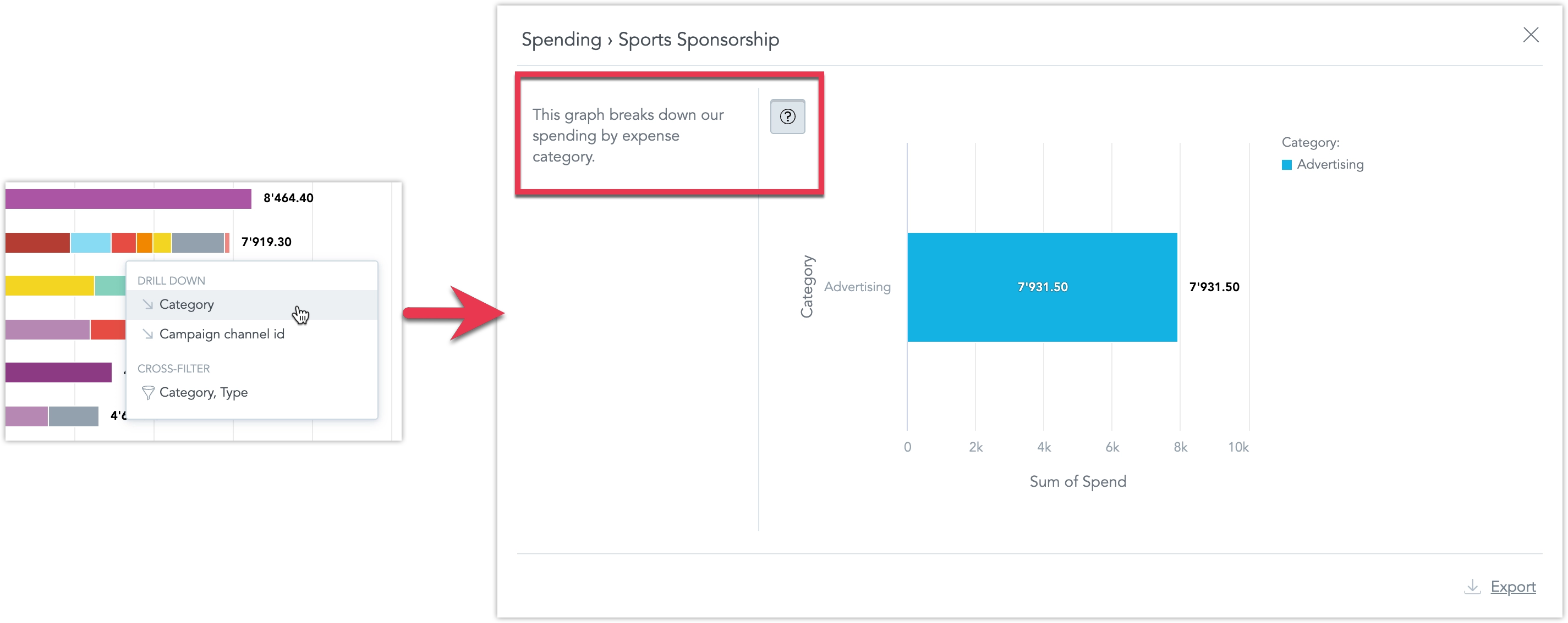
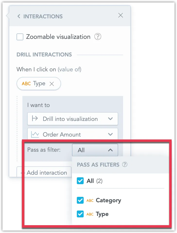
You can now control which filters are passed to drill targets when configuring the Drill into visualization interactions.
The previous Pass as filter option has been replaced with this new configuration. This allows editors to select which filters should be applied to the drill destination.
Filters are grouped by their source, including the drilled data point, dashboard filters, visualization filters, and metric filters. You can enable or disable individual filters, giving you more flexibility when designing drill interactions. This update helps reduce the need to create multiple drill target reports and makes drill behavior easier to customize for different analytical scenarios.
See the Filters in Visualization Drilling section for more information.
Dashboard date filters now support filtering records where the date value is empty or missing. This allows you to include records with no date, making it easier to identify items that are incomplete, pending, or not yet assigned.
Example Use Cases
- Support: Find tickets without a resolution date
- Sales Operations: Identify deals without a close date
- Logistics: Track shipments without an assigned delivery date
- HR: Locate employees missing a last review date
See the Empty Values section for details.
The Analytical Designer now supports multiple numeric conditions within a single metric value filter.
Conditions inside the filter are combined using OR, meaning at least one of the defined conditions must be met. For example, you can define the filter to show values between 200 and 300 OR between 500 and 600.
See the Multiple Conditions in One Metric Value Filter section for details.
You can now use AI in the Analytics Catalog to generate titles and descriptions for analytical objects such as metrics, attributes, and facts.
If an object has no description or needs improvement, you can click Generate with AI to receive a suggested title or description. You can regenerate suggestions or edit them before saving. Manual editing is always available.
See the AI-Assisted Metadata Generation chapter for details.
You can now connect directly to CrateDB and create a CrateDB data source within GoodData. This new feature expands your data connectivity options, enabling seamless analytics on real-time operational and IoT data stored in CrateDB.
See Create CrateDB Data Source for details.
We are introducing Data Localization, a new feature that allows GoodData to display business data in the user’s native language across dashboards, Analytical Designer, and AI Assistant responses.
Using secondary labels in the data model, dashboards can now show localized attribute values while keeping the same underlying analytics logic. The feature is fully backward compatible and configurable per tenant.
Key Benefits:
Simpler Support for Global Teams
Organizations can serve users in multiple languages using a single dashboard model, without maintaining separate copies. Users can consume data in their preferred language without affecting analytics behavior.Consistent Filtering Experience
Users can switch languages without losing filter selections or saved views. Pre-filtered dashboards can also be shared seamlessly across languages.Localized Reporting
Exported reports automatically reflect the user’s language preference.Enterprise Compliance
Supports localization policies in regulated industries such as finance and healthcare.Integration with AI Code Editors
Users can add translations quickly, reducing the cost of manual translation or duplicate analytics maintenance.
See the Localized Data Labels section for further details.
Last Call: Prepare Dashboard Plugins for React SDK 11 Upgrade
As previously announced, we are upgrading GoodData dashboards to React SDK 11 with support for React 19.
This is a last call for customers who maintain custom dashboard plugins. All plugins must support both React 18 and React 19 and must not depend on older React versions.
Plugins that are not updated may stop working after the upgrade.
Please make sure your plugins are updated by the end of next week (February 22, 2026) so we can proceed with the platform upgrade.
You can reference updated examples in our gooddata-dashboard-plugins repository. Also, see Prepare Plugins to Support React 19 for details.
You can now use Drill to URL to turn attribute values into clickable links, even in tables shown inside drill modals.
When an attribute has a hyperlink label in the data model, GoodData can automatically apply URL drilling wherever that attribute is used in table visualizations.
You can control Drill to URL at different levels, including organization, workspace, user, visualization, widget, or through YAML (Analytics as Code).
If other interactions are available for the same attribute, Drill to URL appears as an extra option in the interaction menu. If it is the only action, clicking the value opens the link directly.
See the Drill to URL in Drill Into Visualization section for details.
AI Memory is now available by default. It lets you teach the AI Assistant your company’s language, terminology, and rules so answers are more accurate and consistent in daily use.
With Instructions, you can guide responses for important questions. Abbreviations help the AI understand internal acronyms, and Synonyms align different terms with the same meaning. Together, these settings improve response quality, consistency, and trust across your workspace.
Example use cases:
- Define instructions for high-priority or recurring questions
- Map internal acronyms (for example, GMV → Gross Merchandise Value)
- Set synonyms for equivalent business terms (for example, refunds = returns = returned items)
See the AI Memory article for more information.
Data Source Routing lets you route analytics queries to different compute clusters that share the same storage and Logical Data Model. This enables horizontal scaling of compute without changing dashboards or user workflows. This feature can be used with all supported data sources.
What This Enables:
Better performance
Heavy queries on large, detailed datasets can run on dedicated compute, while standard dashboards stay fast and responsive.Workload isolation
Separate pre-aggregated and transactional workloads so long-running queries do not affect everyday analytics.Cost optimization
Use powerful, more expensive compute only when needed, and route lighter queries to smaller clusters.Improved concurrency By routing queries based on the datasets they use, concurrent workloads are distributed across multiple compute resources. With proper data model setup, this improves responsiveness under load.
See the Data Source Routing section for more information.
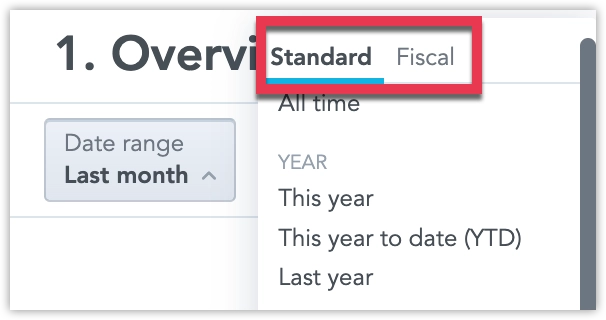
Fiscal calendars are now fully released and available by default. You can now enable and configure a fiscal calendar with a custom start month, allowing you to run date-based comparisons aligned with your organization’s fiscal year instead of the standard January–December calendar.
See Customize Calendars for details.
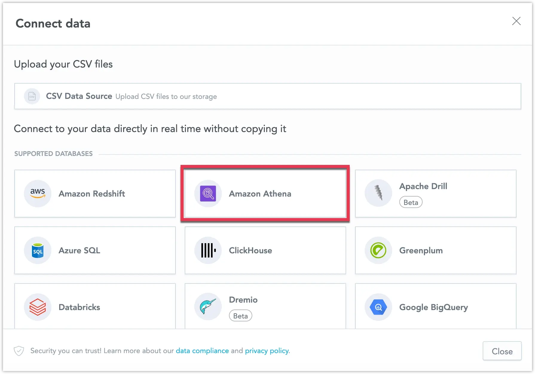
You can now connect directly to Amazon Athena and create an Amazon Athena data source within GoodData. This new feature expands your data connectivity options, enabling seamless analytics on data stored in Amazon S3 using Athena.
See Create Amazon Athena Data Source for details.
GoodData entity APIs now support the standard application/json media type in addition to the existing vendor-specific JSON:API format.
This improves compatibility with strict network environments and firewalls that may block non-standard media types, while keeping the same payload structure and behavior.
What’s New
- Entity APIs (
/api/v1/entities/*) accept and return both:application/vnd.gooddata.api+jsonapplication/json
- Payloads remain identical regardless of the media type used.
- A new organization-level setting, API_ENTITIES_DEFAULT_CONTENT_MEDIA_TYPE, lets administrators define the default response type when no
Acceptheader is provided.
By default, the existing vendor-specific media type remains unchanged, ensuring full backward compatibility.
See the Entity API section for details.
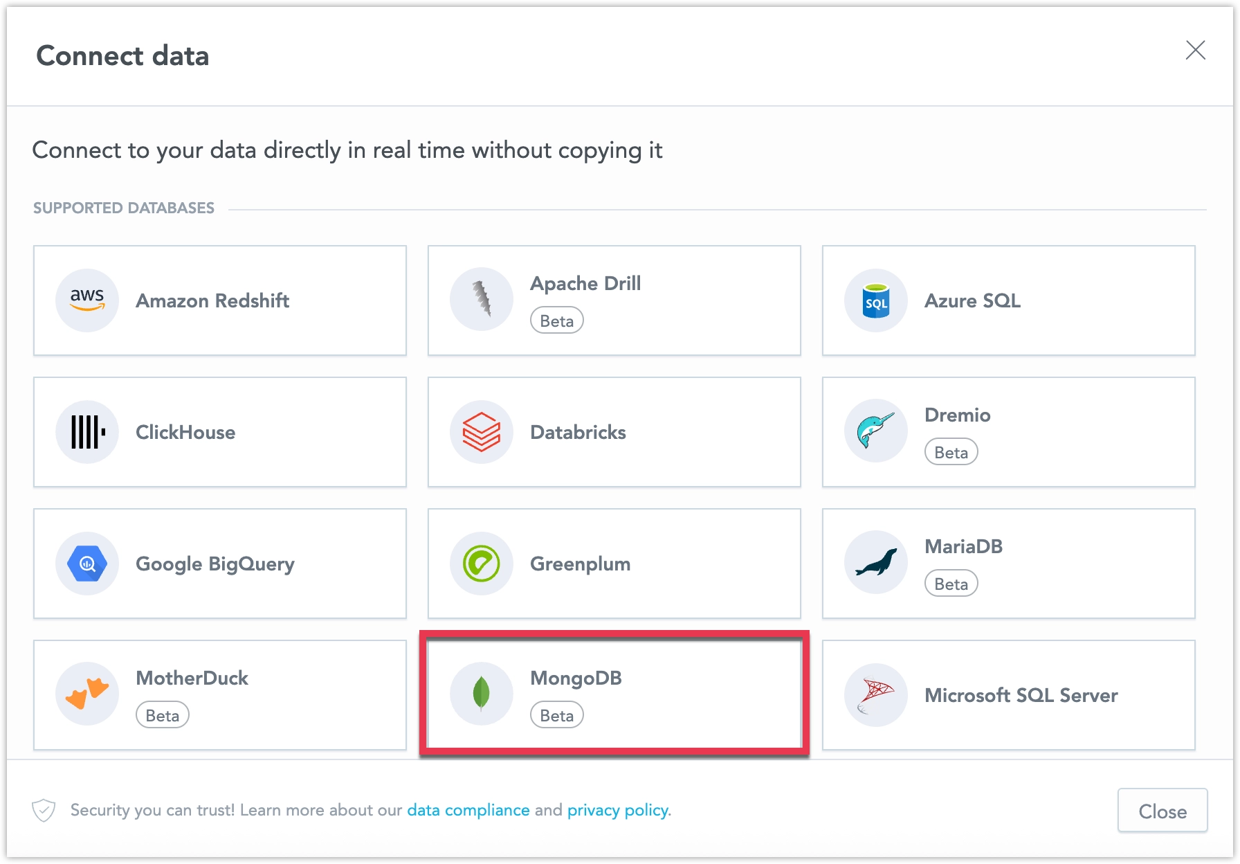
Deprecation of MongoDB, Greenplum, and Apache Drill Data Sources
We are preparing to deprecate the following data sources in GoodData:
MongoDB
We are deprecating MongoDB due to MongoDB’s decision to deprecate the MongoDB BI Connector, which GoodData relies on for connectivity. Because adoption of this connector is low, we do not plan to build an alternative native integration. In line with MongoDB’s timeline, GoodData will deprecate the MongoDB connector by the end of September 2026. For details, see the MongoDB documentation on the BI Connector deprecation.Apache Drill and Greenplum
These data sources are also deprecated and will be removed by the end of March 2026.
If you are affected by these changes, contact your Customer Success representative for guidance and support. We will share timelines before removal.
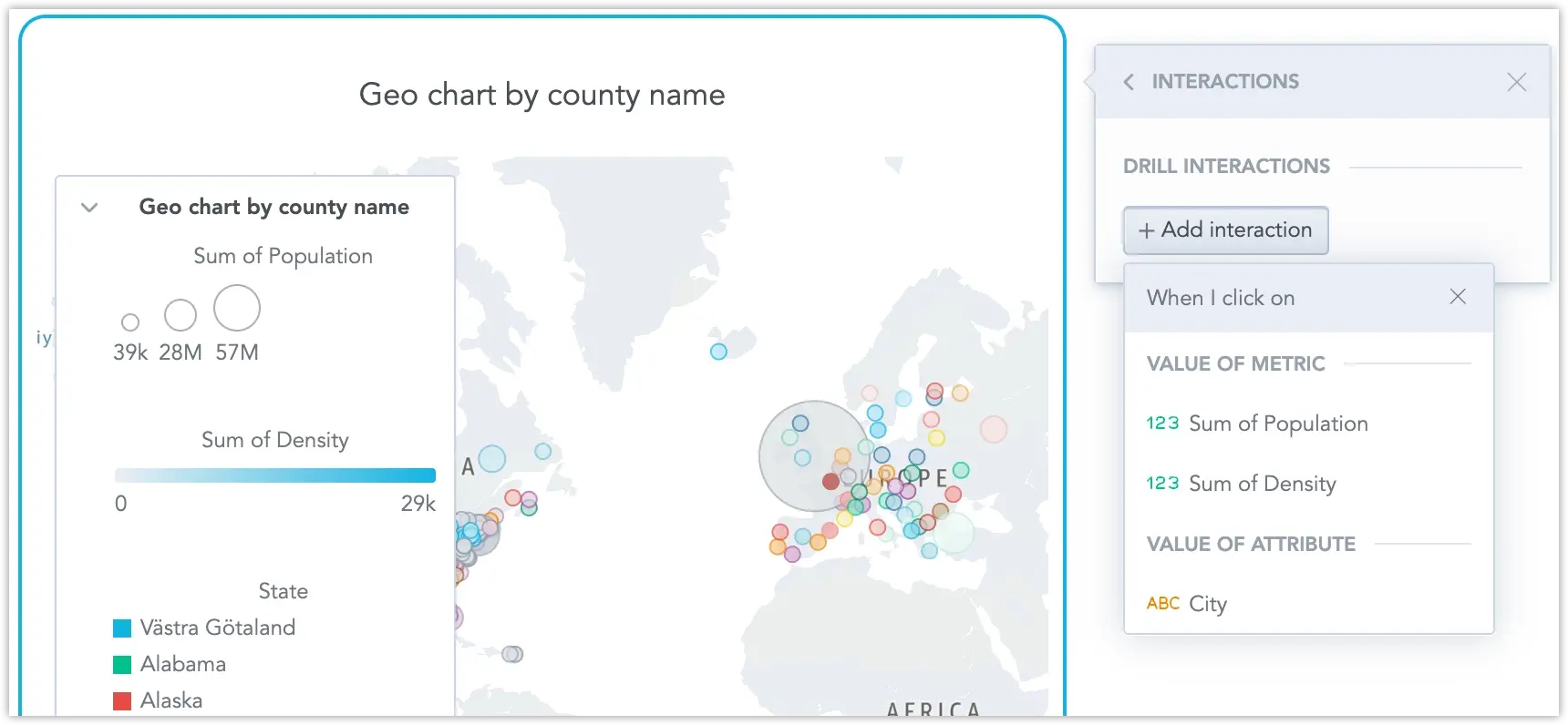
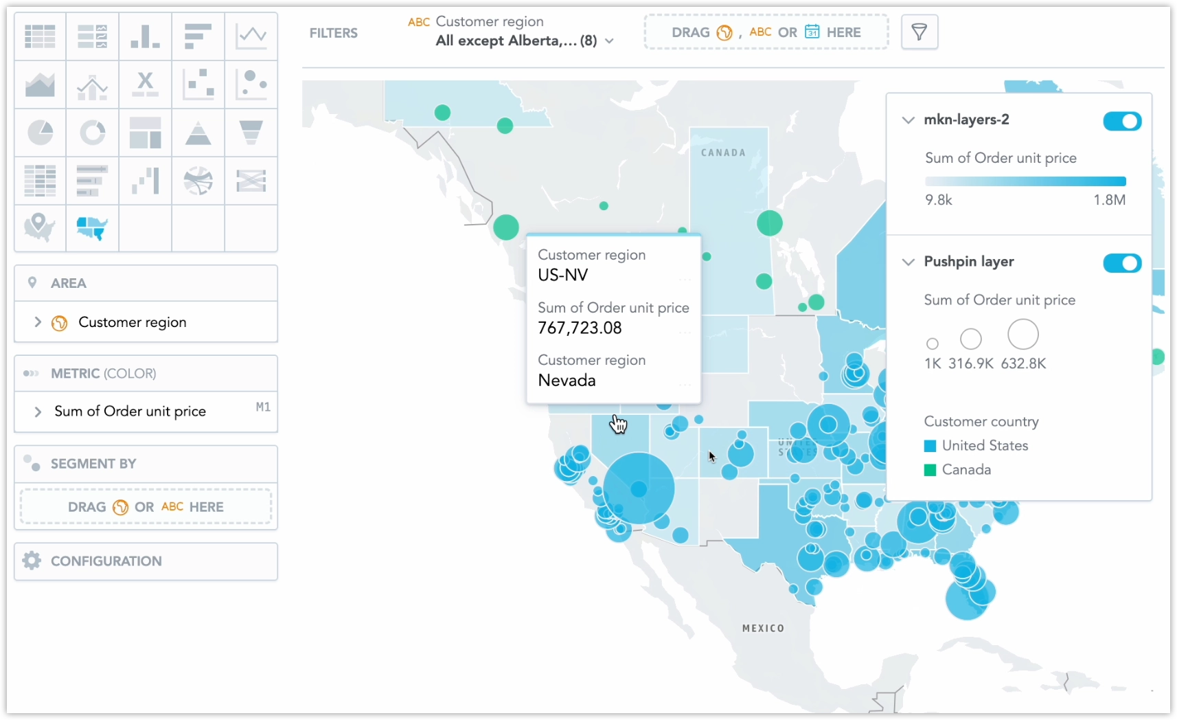
The new generation of geo charts is now released and available by default for all users. This update introduces geo area charts as a standalone visualization for choropleth mapping and modernizes existing geo (pushpin) charts on a new geospatial foundation. Geo charts now support multiple layers and standard interactive features such as drilling and cross-filtering in dashboards.
As part of this transition to a new map engine, you may notice minor visual differences in map rendering. No action is required on your side.
See Geo Charts (Pushpins) and Geo Area Charts for details.
The Analytics Catalog is now generally available, providing a central place to manage semantic objects in a workspace. It includes support for reviewing object details, updating metadata, and working with AI-related governance features (such as AI visibility settings and semantic quality findings).
See the Analytics Catalog article for more information.
The Display Language setting now applies to more areas of the GoodData user interface.
In addition to Dashboards and Analytical Designer, localization also covers the Home page and the main sections, including Getting Started, Workspaces, Data Sources, Users and Groups, Automations, and Settings.
Changing the display language updates both titles and descriptions, providing a more consistent localized experience across the application.
The AI Assistant helps you detect unusual behavior in trendable metrics so teams can react faster without manually monitoring dashboards.
Line charts with a single metric sliced by date can now visually highlight anomalies. Unusual points are clearly marked, with tooltips and legend explanations to help users understand what changed.
See the Anomaly Detection article for more information.
Filter Grouping adds grouped and collapsible sections to the dashboard filter bar, making dashboards with many filters easier to use and easier to read.
- For consumers: Filters are organized into named groups that can be expanded or collapsed. Each group shows which filters are applied.
- For builders: You can create, rename, reorder, and remove filter groups, and control the order of filters within each group using the dashboard definition.
- Accessibility: Filter groups support keyboard navigation and screen readers.
- Alerts and exports: Filter groups are fully supported in alerts and scheduled exports.
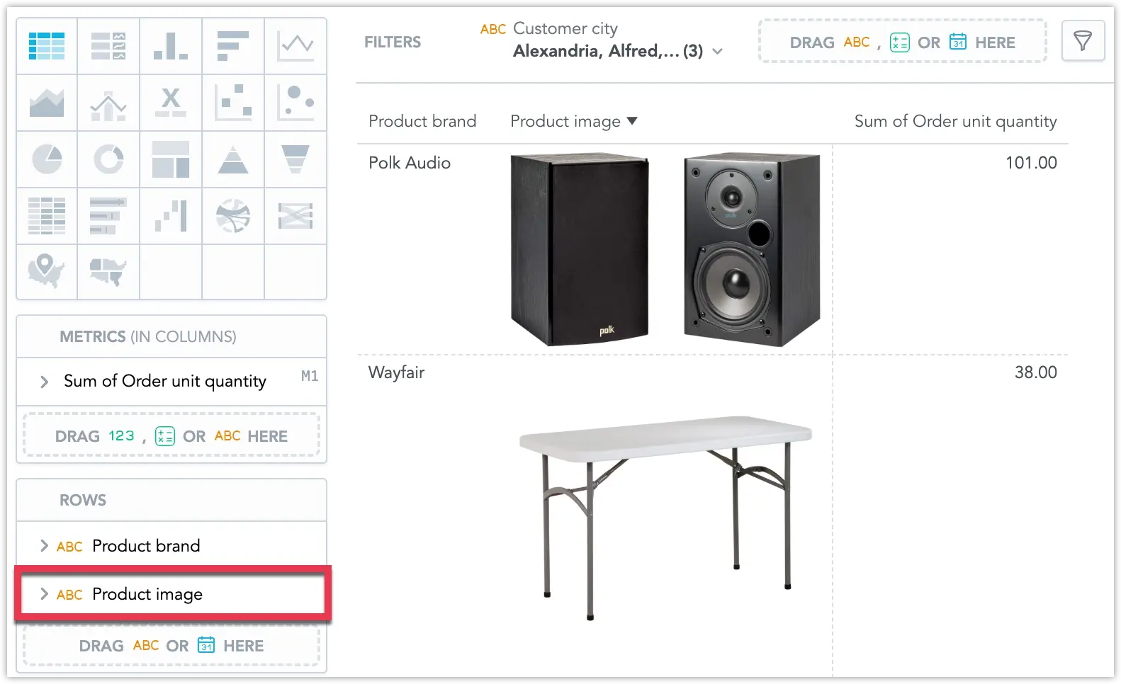
You can now display image links as actual images in your pivot tables. This makes it easier to enrich tabular data with visual context, such as product photos, icons, or status indicators, directly in your dashboards.
For details, see Pivot Tables.
The AI Assistant now reliably applies filters from natural language, even when attribute values are approximate. You no longer need to remember exact attribute names or values, as the Assistant finds the closest match automatically.
This improves accuracy and makes conversational analytics ready for daily production use.
How It Works:
- When you mention a familiar concept in your question, the AI Assistant finds the best matching value in your data. Example: computers is interpreted as Computers and Accessories.
- You can also use values without explicitly naming the attribute. The AI Assistant detects the correct attribute automatically. Example: What is my revenue coming from California? is interpreted as a filter on State = California.
See the Attribute Filtering in AI Assistant section for further details.
The new generation of geo charts is now available as a beta feature, as we prepare for a full release soon. This update introduces geo area charts as a standalone visualization for choropleth mapping and modernizes existing geo (pushpin) charts on a new geospatial foundation. Geo charts now support multiple layers and standard interactive features such as drilling and cross-filtering in dashboards.
As part of this transition to a new map engine, you may notice minor visual differences in map rendering. No action is required on your side.
See New Generation of Geo Charts for details.
You can now hide selected analytical objects (such as attributes, labels, facts, metrics, and visualization objects) from AI Assistant search, suggestions, and ad-hoc visualization usage. This is useful for “technical” objects that should not be exposed to business users.
This feature was previously released in beta. See the Control AI Visibility of Objects section and the previous entry.
Date filters in Analytical Designer now support filtering empty date values. You can choose whether empty values are excluded, included, or whether to return only records without a date. If you select Only, the date range and any additional filters are disabled.
For details, see Visualization Date Filters.
Metric value filters in Analytical Designer are now more flexible:
- You can create a metric value filter using a metric that is not placed in the visualization buckets.
- Metric filters now support configuring the evaluation granularity using For each (including partial granularity and custom attribute/date selection).
- Older metric filters show an informational message explaining why they behave differently until you edit them.
For details, see Filter Insights by Values.
You can now enable and configure a fiscal calendar with a custom start month, allowing you to run date-based comparisons aligned with your organization’s fiscal year instead of the standard January–December calendar.
See Customize Calendars for details.
The new generation of geo charts now supports drilling and cross-filtering. You can drill into a geo chart from other visualizations, as well as drill within a geo chart itself. This enhancement brings geo charts closer to a future production release.
For details, see New Generation of Geo Charts.
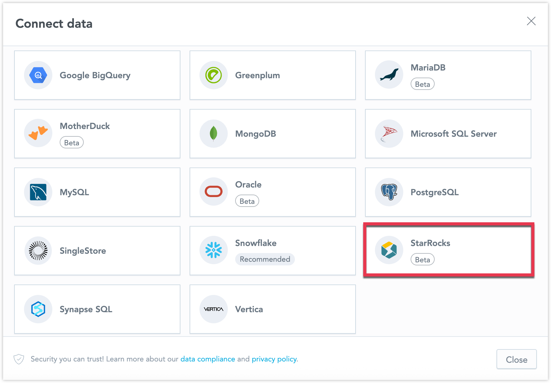
You can now connect directly to a StarRocks database and create a StarRocks data source within GoodData. This new feature broadens your data connectivity options, enabling seamless integration with StarRocks for analytics.
For details, see StarRocks Data Source.
Geocharts now support multiple layers, allowing you to combine different geographic representations, such as area and pushpin layers, within a single visualization.
Layers can currently be defined in GoodData for VS Code using YAML and are rendered on top of the base geochart layer.
See New Generation of Geocharts for details.
As announced in September, we will soon be upgrading GoodData dashboards to React SDK 11; All custom dashboard plugins must support both React 18 and React 19 and must not depend on older React versions. Plugins that are not prepared may stop working after the upgrade.
If you maintain custom dashboard plugins, make sure they are updated by the end of January 2026. You can use plugins from our gooddata-dashboard-plugins repository, that have all been updated already.
See Prepare Plugins to Support React 19 for details.
We updated the GoodData MCP Server tool set to simplify metadata access and add new capabilities. This may require changes for early adopters.
What Changed
- Get tools were removed and consolidated into list tools. Use
list_*withrsql_filterto retrieve a single object (for example,rsql_filter="id==<id>"). - List tools now support
includeto fetch related entities in one call. - Added alert management tools:
pause_alertsandunpause_alerts.
If your MCP client relied on the removed get_* tools, update your integration to use the corresponding list_* tool with an ID filter.
See the GoodData MCP Server article for details.
The AI Assistant now improves answer accuracy by asking clarification questions when multiple relevant data objects match a user’s query. This ensures users receive precise insights aligned with their intent.
When similar metrics, dimensions, or filters are detected, the AI Assistant lists the possible options along with their descriptions. The user then selects the most relevant one, and the Assistant generates the visualization based on that choice.
Examples
- Metrics: “What is the performance of sales for the last quarter?” → AI offers Net Sales and Total Sales for selection.
- Dimensions: “Show me the number of orders by product.” → AI offers Product Category and Product Brand.
- Filters: “Show me the number of orders for last month.” → AI offers Date and Order Date.
This feature enables business users to make informed decisions when data definitions overlap, thereby enhancing the precision and interpretability of AI-generated insights. See the Use AI Assistant article for more information.
See the Use AI Assistant section for details about the AI Assistant.
The AI Assistant now displays the Smart Search UI directly inside the chat. Search results appear in an in-chat widget with a fixed height and scrollable content, so users can browse results without leaving the conversation.
The results respect user permissions:
- Users with MANAGE or ANALYZE can search across all visualizations in the workspace.
- Users with VIEW can search only visualizations that are used on dashboards they can access.
- Dashboard links shown for a visualization include only dashboards the user has permission to open.
From the results, users can open a visualization’s dashboard locations or its definition in Analytics Designer. Opening a dashboard keeps the AI Assistant visible and preserves the current position in the chat.
See the Use AI Assistant section for details about the AI Assistant.
The plugin overlay is now disabled in production.
In some dashboards, especially with flexible layouts, overlays could overlap incorrectly, stack on top of each other, and block parts of the UI. This made editing harder and required extra clicks to dismiss. Since plugin-based visualizations are now supported in edit mode, the overlay is no longer needed for its original purpose.
The Dashboard Tabs feature is now out of early access and ready for use in production environments. This feature enables users to organize dashboards across multiple pages, enhancing navigation, clarity, and overall performance.
See the Dashboard Tabs section for further details.
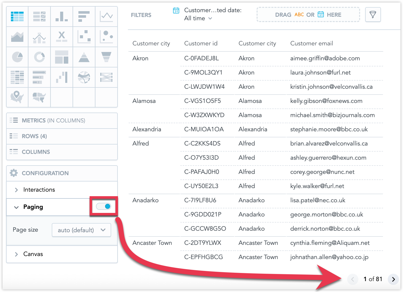
Table visualizations now support paging. You can enable paging in the Analytical Designer to control how many rows are displayed at once, making large tables easier for users to browse and understand.
See Pivot Table section for further details.
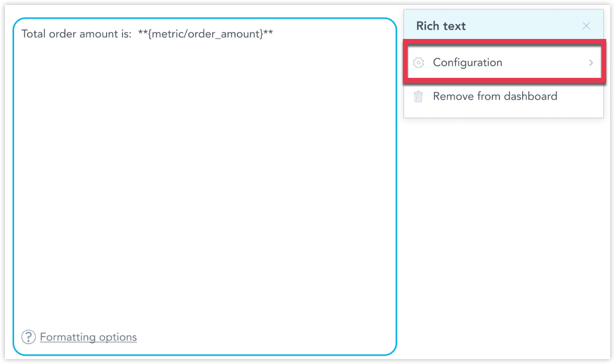
Rich text widgets now include a Configuration dialog where you can choose a date dataset, allowing them to correctly follow the common date filter, just like standard visualization widgets. This ensures metric executions use the intended date dimension and can optionally ignore other filters when needed.
You can now override metric formats in child workspaces, allowing each workspace to apply its own number or currency formatting. This update enables localized reporting, regional currency formatting, and more flexible workspace customization. This is especially useful when different regions require formats such as $#,###.00, ¥#,##0, or other regional currency formats.
This override setting is also shared with the AI Assistant to improve interpretation, while formatting is handled by the platform.
See the Override Metric Format in Child Workspaces article for details.
The AI Assistant can now recognize and apply filters based on semantically similar attribute values, improving natural language interactions without requiring exact string matches. This enhancement enables faster, more flexible, and easier filtering through conversational queries.
See the Attribute Filtering in AI Assistant section for further details.
This update is relevant for React SDK developers, adding experimental support for creating simple choropleth visualizations in the SDK through the IDE. Developers can now define a geochart with a single choropleth layer in YAML, using a Geo area attribute modeled in the LDM and mapped to GoodData’s Geoshape collections (standardized country and region shapes).
Choropleths support default filled-area rendering, optional metric-based or segment-based coloring, and standard map interactions such as zoom, pan, and tooltips.
See New Generation of Geocharts for details.
Note:
If you previously enabled New Generation of Geocharts to test choropleths, you may need to disable and enable it again. The setting has moved from workspace-level to organization-level, so earlier workspace enablement does not automatically carry over.
The updated GoodData MCP Server is now available as an experimental feature. It exposes GoodData platform capabilities over the Model Context Protocol (MCP), allowing MCP-compatible clients to interact with governed analytics using natural language. This enables teams to connect chatbots, IDE assistants, and other AI agents to trusted analytics without custom integrations.
You can connect using any MCP client (for example, Cursor, ChatGPT with MCP support, or MCP Inspector) and use AI-driven commands to browse workspace metadata, create alerts, query label elements, generate visualizations, or scan datasources.
Key Capabilities:
- Full MCP support with authentication, workspace isolation, structured errors, and multi-tool capability.
- 27+ platform tools, including workspace model retrieval, metadata browsing, analytics search and chat, AFM label element execution, datasource scanning, LDM generation, and unified alert management.
- AI-powered search and chat, enabling semantic search and visualization creation directly from natural language.
- Knowledge Base integration through MCP Resources, making GoodData documentation discoverable inside supporting clients.
See the GoodData MCP Server section for further details.
We have expanded the language options for our user interface to include Slovenian. This language is now fully supported in the Analytics Designer, Dashboards, and Metric Editor.
See the Change Display Language section for details.
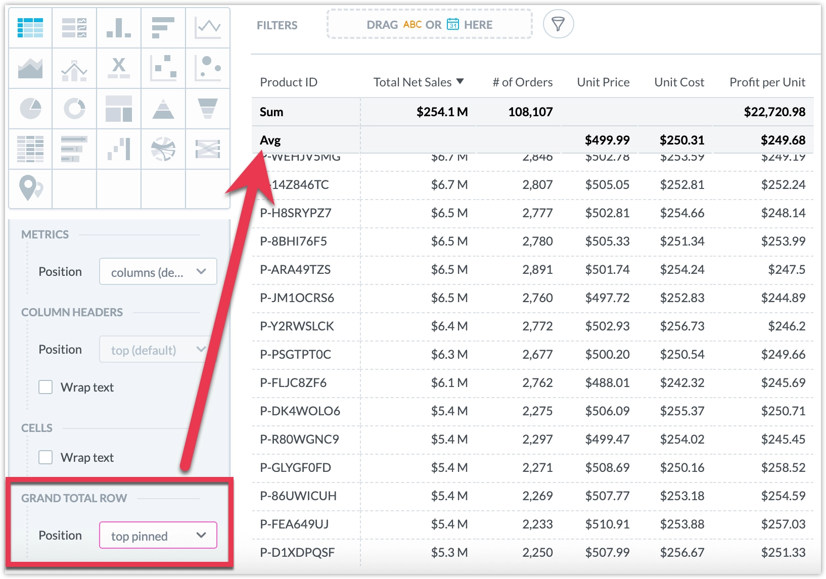
You can now customize where the grand total row appears in your tables and pivot tables. Choose to display it at the top or bottom, and optionally pin it so it remains visible as you scroll through the data.
See Pivot Tables for details.
We increased table and pivot table limits to support up to 1 million rows and 2,000 columns, enabling larger analyses thanks to recent improvements in our cross-tabulation engine.
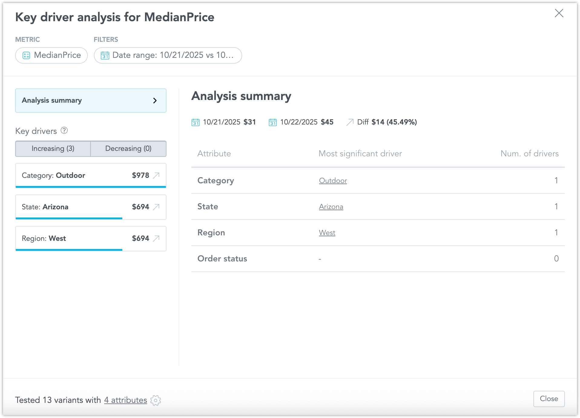
The Key Driver Analysis (KDA) feature has been enhanced to provide users with more control and flexibility when exploring the drivers behind metric changes. These updates improve usability, customization, and integration with the AI Assistant.
New Capabilities
Exclude Attributes from Results Remove irrelevant attributes from KDA results and instantly recalculate the analysis to focus on meaningful drivers.
Customize KDA Inputs Adjust filters, comparison periods (previous period or previous year), and attributes directly in the KDA window, then rerun the analysis for refined results.
Run KDA from AI Assistant Launch KDA directly from ad-hoc visualizations in the AI Assistant. When selecting a data point, choose “Run KDA vs Previous Data Point” or “vs Previous Year” from the context menu.
Conversational “Tell Me Why” Analysis Ask the AI Assistant questions such as “Why did my total sales drop last month?” or “Explain to me the change in July.” The Assistant identifies the relevant metric and periods, fills in any missing details as needed, and presents a summary that includes key drivers, a chart, and a link to view the full results.
See the Key Driver Analysis section for further details.
The MongoDB data source is now generally available and ready for production use. You can connect directly to a MongoDB database and create a MongoDB data source within GoodData to integrate your data seamlessly.
For details, see MongoDB Data Source.
We have improved the Date Filter experience to make it easier for everyone to navigate and use.
The Relative period and Static period options now open in dedicated detail views instead of being part of the main list. This clearer layout helps users quickly select the right date range and provides a smoother experience when using assistive technologies.
We have introduced Dashboard Tabs as an experimental feature. This early access capability allows users to organize dashboards into multiple pages, improving navigation, clarity, and performance.
Currently, tabs can be configured as code and viewed in View mode. Editing and advanced View mode features, such as Saved Views, are not yet supported and will be added in future updates.
Benefits
- Improve information architecture by grouping related content into pages.
- Enhance dashboard performance by loading only the active tab.
- Simplify navigation for business users by organizing content logically.
- Each tab supports its own filters, layout, and sections.
- Only the active tab executes on load. Other tabs load when opened.
See the Dashboard Tabs article for more information.
You can now connect directly to a MongoDB database and create a MongoDB data source within GoodData. This new feature broadens your data connectivity options, enabling seamless integration with MongoDB for analytics.
For details, see MongoDB Data Source. Note that the support is currently in beta, and is not yet recommended for use in production environments.
We’re working on introducing a new generation of geocharts as an experimental feature, a first step forward in expanding GoodData’s geoanalytics capabilities. This first release reimplements the existing pushpin geocharts on a new, modern foundation that enables faster performance, smoother rendering, and greater flexibility for future enhancements.
If your workspace has this experimental feature enabled, you can continue to create and edit geochart visualizations in the Analytical Designer as before, the pushpin visualization will automatically use the new version.
This update lays the groundwork for upcoming features such as choropleth maps, layering, and AI-assisted geoanalysis, which will be added gradually in future releases.
See New Generation of Geocharts for details.
AI Memory lets you teach the AI Assistant your company’s language, terminology, and rules to ensure more accurate and consistent answers.
With Instructions, you can guide responses for key questions. Abbreviations help the AI understand internal acronyms, and Synonyms unify variations in business terms.
This feature enables you to fine-tune the AI Assistant with workspace-specific context, improving response quality, consistency, and trust.
Example Use Cases:
- Define instructions for high-priority or recurring questions.
- Map internal acronyms (e.g., GMV → Gross Merchandise Value).
- Set synonyms for equivalent business terms (e.g., refunds = returns = returned items).
Solution Managers can now hide selected analytical objects from AI search results when those objects have purely technical meaning and should not be used by AI. This helps ensure that AI-generated insights remain clear, relevant, and user-focused.
A new optional metadata property, isHidden, has been introduced to control AI visibility for the following object types:
Attributes, Facts, Labels, Metrics, and Visualization Objects.
The default behavior is unchanged (null), ensuring backward compatibility. Other than that, the property can be set to false = visible (default) or true = hidden.
Even when an object is hidden from AI, it still remains searchable in system-level tools such as the Analytics Catalog.
The Semantic Quality Agent automatically detects issues in a workspace’s logical data model and metrics that may reduce the performance of AI Assistant and Smart Search. Its goal is to improve the accuracy and quality of AI-generated insights.
Key Capabilities
Mark Objects with Issues The Analytics Catalog highlights objects with problematic descriptive properties. Clicking an object shows details with marked fields and explanations.
Filter by Issue Type Filter the Analytics Catalog to display only objects with descriptive property issues for quick review and correction.
Semantic Quality Agent Scorecard Notifications in the Analytics Catalog indicate when issues may affect AI responses and automatically filter relevant objects.
AI Assistant Notifications AI Assistant shows a warning (visible only to Analytics Builders) when issues are detected, linking directly to the prefiltered Analytics Catalog.
Types of Checks
- Identical title
- Identical description
- Semantically similar title
- Semantically similar description
- Unknown abbreviation
See the Semantic Quality Agent section for further details.
Key Driver Analysis (KDA) helps business users understand the main contributors behind changes in a selected metric. It provides fast and explainable insights directly in the GoodData interface through dashboard context menus.
KDA quantifies how strongly each potential driver influences a target KPI. It improves decision-making, reduces manual analysis, and helps users quickly uncover the reasons behind changes in business performance.
See the Key Driver Analysis section for further details.
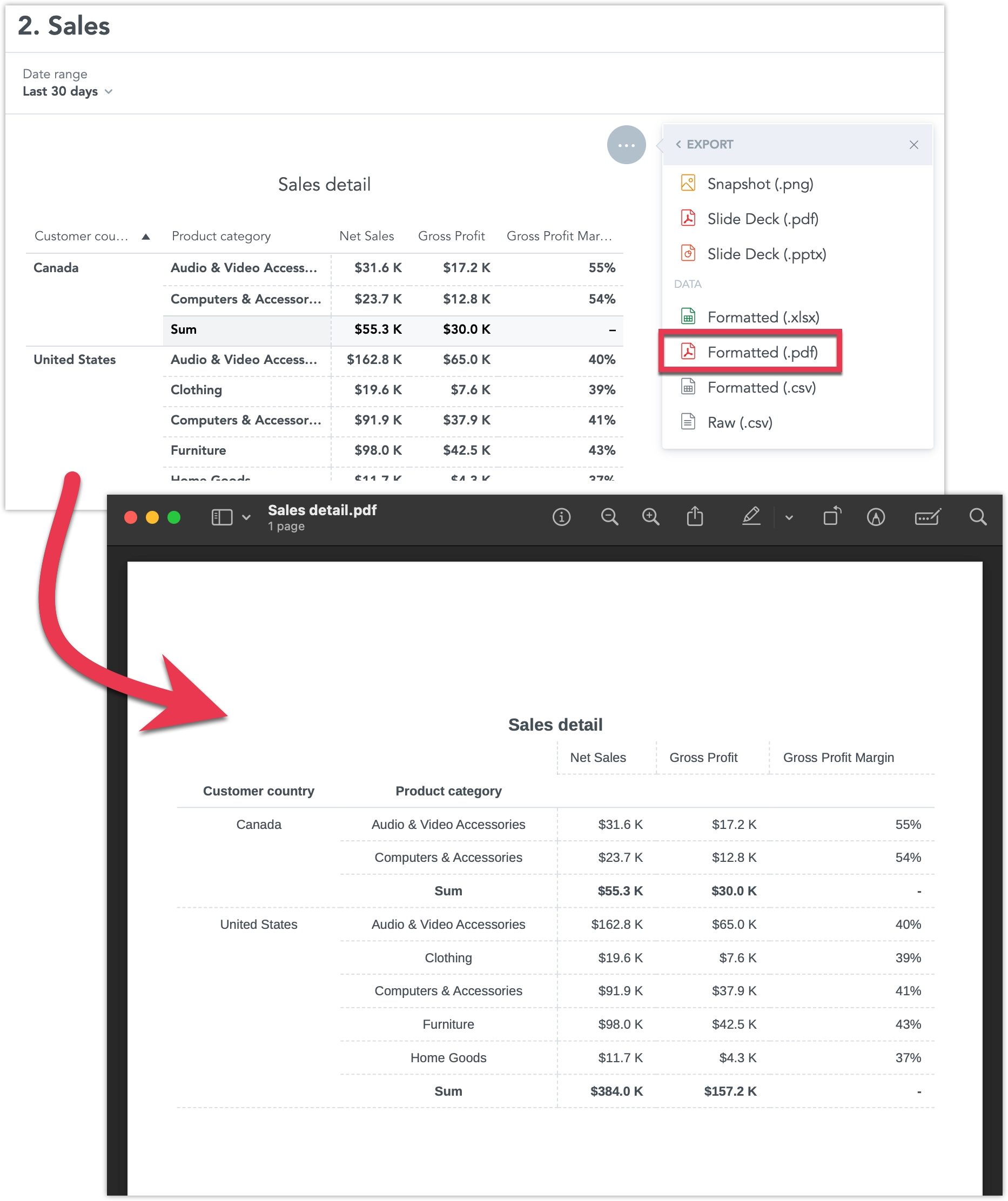
You can now export pivot tables directly into well-formatted, paginated PDF documents from dashboards. This makes it simple for non-technical users to create polished reports to share with stakeholders outside the platform. The export preserves formatting such as headers, row sorting, and metric styles, and works seamlessly in both native and embedded dashboards.
For details, see Export Table.
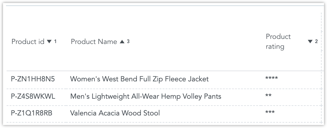
You can now sort pivot tables by multiple columns. Apply sorting to several columns at once, each with its own priority and ascending or descending order. In the Analytical Designer, you can also define a default multi-column sorting configuration for your table.
For details, see Pivot Tables.
Rate limiting has been rolled out today. We’ve published new Rate Limiting documentation explaining how API rate limits work, including response headers, best practices, and guidance for handling 429 Too Many Requests responses. The rate limits have been derived based on long-term traffic analysis of all our current users and should not limit you in any way during normal operations.
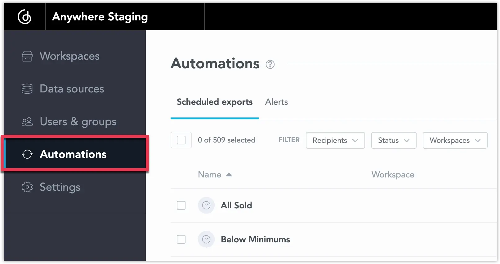
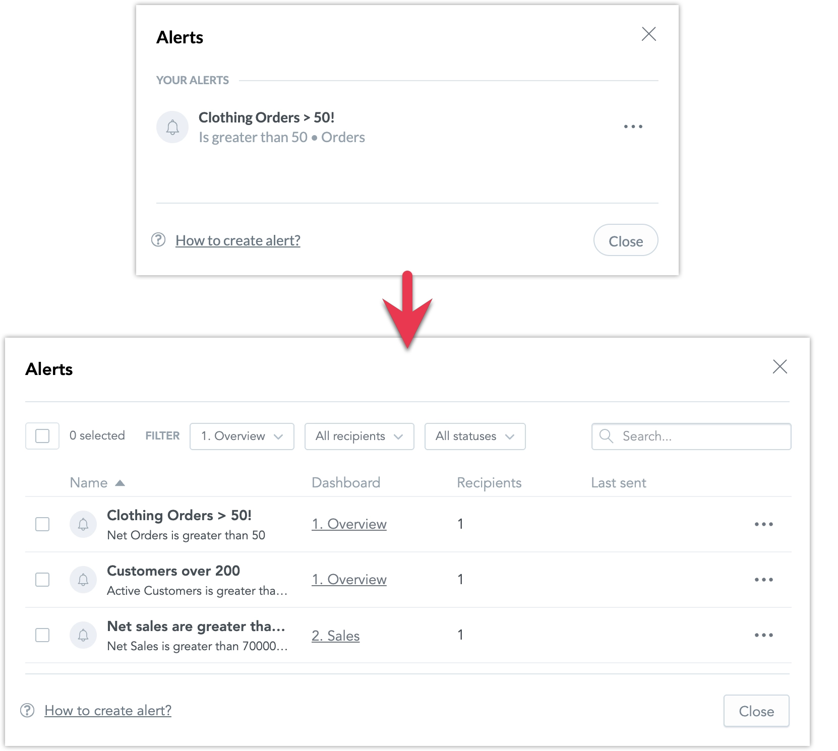
We’re excited to announce the full release of centralizing automations management. You now have a single place to view and manage all automations, scheduled exports and alerts, across your entire workspace or organization.
As an organization admin, you can access the new Automations section on the home page. From here, you can:
- Filter by recipient, workspace, or status
- Search and sort by title
- Perform single or bulk actions like delete, pause, resume, or unsubscribe
And as a dashboard user, you can manage on the workspace level:
For details, see Automation in Dashboards.
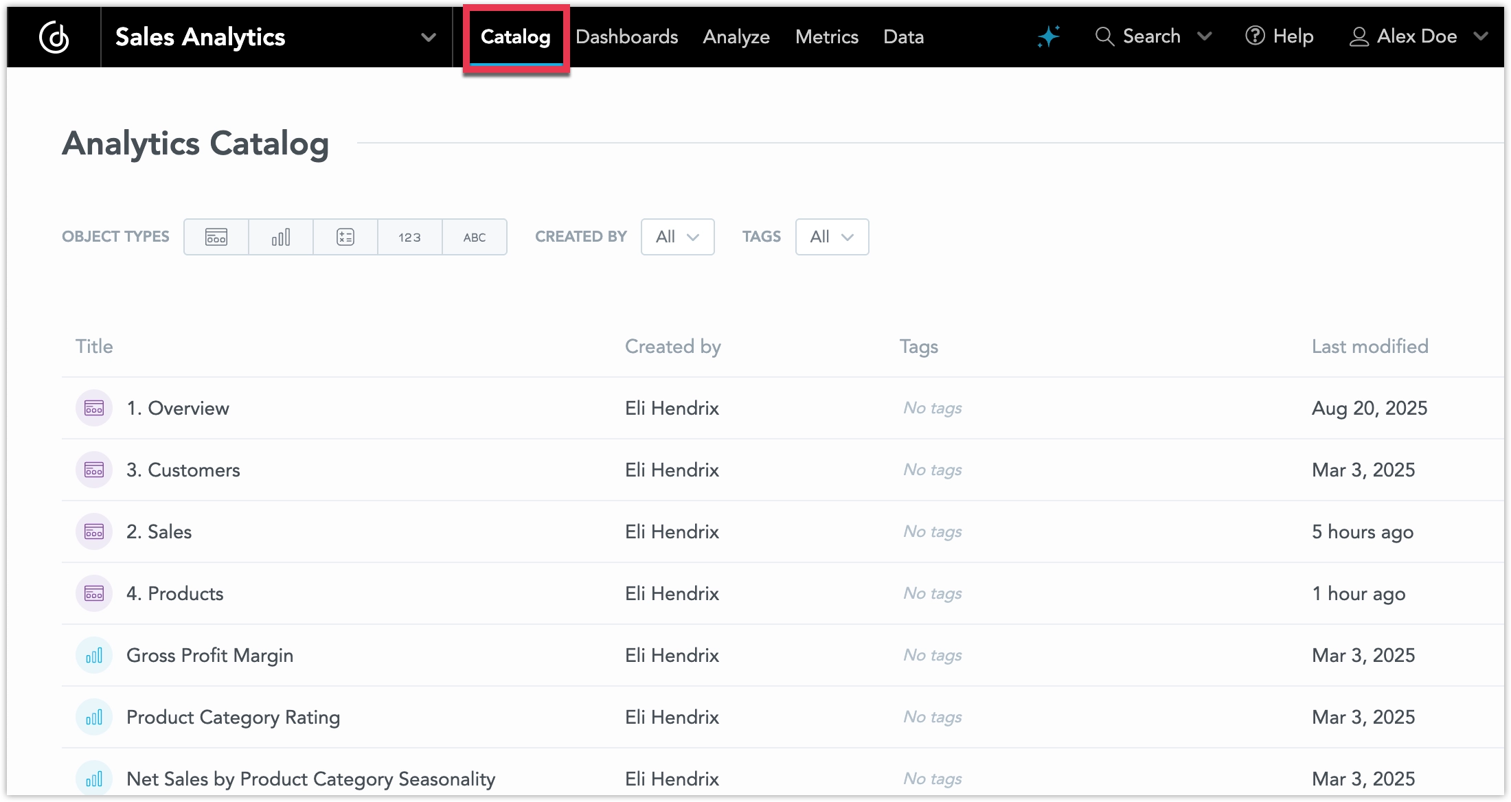
The new Analytics Catalog gives admins and analytics engineers a central place to view and manage all semantic objects in a workspace: dashboards, visualizations, metrics, attributes, facts, and datasets. You can search by title or keyword, filter by type, creator, or tags (multiple filters are supported), and quickly update metadata such as titles, descriptions, and tags. Objects can be opened directly in their respective editors without re-searching.
This feature is now in beta and comes with the following improvements:
- Search and Filter: Narrow results by creator or tags. Multiple filters can be applied (logical AND).
- Object Details: View detailed object metadata in an embeddable modal, identifiable via object ID.
- Workspace Access: Open the Analytics Catalog directly from the Workspace page context menu.
- Classic Search: Search by object titles, including substrings (smart search replaced by classic search).
- Embeddability: The catalog is embeddable via SDK/web components.
The Aggregate Awareness feature is now out of early access and ready for use in production environments. See the Aggregate Awareness section for details.
We previously announced updates to how identity providers are configured in GoodData. These changes enhance flexibility and security when transitioning from the default GoodData Authentication Provider to a custom identity provider (IdP). As part of this update, several OIDC-related fields in the organization entity have been deprecated and will be removed in an upcoming release in the coming weeks.
Deprecated Fields:
"oauthClientId": "string",
"oauthClientSecret": "string",
"oauthCustomAuthAttributes": {
  "property1": "string",
  "property2": "string"
},
"oauthCustomScopes": [
  "string"
],
"oauthIssuerId": "myOidcProvider",
"oauthIssuerLocation": "string",
"oauthSubjectIdClaim": "oid"
For most customers, no action is required because the fields have already been migrated to the new format.
If you have actively reverted or blocked the migration and continued using the deprecated OIDC fields in the organization entity, you should:
- Move all identity provider configuration details into the identity provider object.
- Link the identity provider to the organization using the identityProvider relationship.
For implementation details, see Set Up Authentication.
We’d like to clarify and soften our API rate limits announcement from last week. It may have sounded more alarming than intended.
We will be introducing a limit on the maximum number of API requests per time period to help protect our infrastructure and ensure stable performance for everyone. However, these limits will be set with very generous margins. We’re monitoring current API usage and are confident this change won’t affect the existing user base. No action is needed on your part.
The limits are global, so hitting them could result from unusual traffic (for example, a denial-of-service attack) or from your code unintentionally making excessive calls. In either case, the API will return HTTP status code 429.
Before these limits take effect, we’ll share another update along with a new guide on optimizing your API usage to avoid unnecessary requests.
We apologize if last week’s message caused any concern and appreciate your understanding as we work to make the platform more reliable for everyone.
Today we released React SDK version 11 which introduces support for React 19 and discontinues support for React 16 and 17. Our UI components have been upgraded to React 19. As of today, React SDK 10 enters a six-month support-only phase: service stability and fixes for blocking or security issues will be provided, but no new features.
After the support-only period, React SDK 10 will reach end-of-life. This means we will no longer provide fixes or guarantee continued functionality, though it will remain technically available.
What this means for you:
If you use custom dashboard plugins developed with React 16 or 17, upgrade your plugins immediately to React SDK 10 or higher and React 18 or 19. Otherwise, they may stop working, because support for React 16 and 17 has been removed.
If you embed GoodData with React SDK and your application still uses React 16 or 17, but without plugins, you do not need to upgrade right away. However, plan to migrate your application to at least React 18 and upgrade to React SDK 11 within the next six months.
If you already use React 18 for your plugins or embedding, you are fine for now. No immediate action is required. We still recommend upgrading to React 19 and React SDK 11 though, ideally within the six-month support window.
Starting sometime next week, we will begin rolling out rate limiting for API requests. Rate limiting ensures fair use and improves reliability for all customers. Here’s what to expect:
- Requests will be limited within fixed time windows (typically one minute).
- Standard rate-limit headers will be included in responses so you can monitor your usage and remaining quota.
- If you exceed the limit, the API will return HTTP 429 Too Many Requests until the window resets.
We have raised the maximum number of rows in query results from 100,000 to 500,000.
This new limit applies to all computations, but it is most impactful for table visualizations, which can now display and export much larger datasets.
- Tables can now render up to 500k rows and export them into CSV/XLSX.
- Other visualizations still have their own specific limits, so the biggest benefit is for tables.
This improvement helps you analyze and export larger datasets without splitting queries, making reporting smoother and more scalable in Cloud.
Inviting new users is now available globally for all customers using our Auth0 Identity Provider.
Previously, our Support team had to manually invite users to these organizations. Now, you can invite new users directly through the UI dialog. Invited users receive an email and can accept the invitation using the same flow already available for trial organizations.
If you are using a custom Identity Provider, this change does not affect your setup.
We’re excited to announce the experimental launch of the GoodData MCP Server. This new feature lets AI clients such as Cursor or ChatGPT (with MCP support) connect directly to your governed GoodData metrics using natural language.
For example, you can then use the AI clients in interactions like these:
- “Alert me if Total Revenue drops below 90K.” → Creates an alert with condition
< 90000on the metrictotal_revenue. - “Check it every morning at 7am.” → Updates the cron schedule accordingly.
- “Send it also to example@example.com” → Adds an email recipient (if tied to a valid workspace user).
- “Change the alert value to 100K instead.” → Updates the alert threshold.
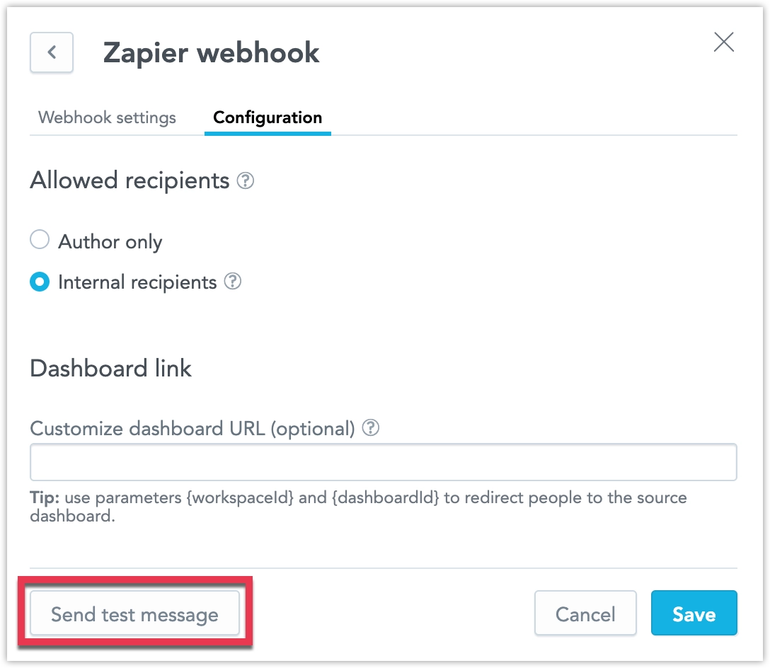
- “Set a webhook instead of email.” → Switches the delivery method to a pre-approved webhook.
See the GoodData MCP Server section for further details.
As part of our ongoing work to improve accessibility, we have made several updates to the readability of visualizations.
High-Contrast Data Labels: A new Backplate option adds a background behind labels. This increases contrast and makes labels easier to read against different chart backgrounds.
Chart Segment Styles You can now choose how chart segments are displayed:
- Pattern Fill: Replaces solid colors with patterns (such as crosshatching or dots). This makes values easier to tell apart because they differ by both color and texture.
- Outline: Tones down solid fills and uses emphasized outlines. This is useful when layering charts (for example, a line chart on top of a column chart) because it improves contrast and separation.
Distinct Data Point Shapes: Line, combo, and stacked area charts now support multiple point shapes. Instead of a single dot for all data, each series can use a different shape (such as a square, diamond, or triangle).
Theming Changes
We have also restructured the theming setup as part of these improvements.
- Chart axis properties (
axisColor,axisLabelColor,axisValueColor) are now grouped under a singleaxisobject. - The same restructuring applies to tooltip-related properties.
Example:
theme: {
    chart: {
        axis: {
            color?: ThemeColor;
            labelColor?: ThemeColor;
            valueColor?: ThemeColor;
        },
    }
}We introduced a new date and time format available to all users: English US 24H.
This is a customized version of the standard en-US locale with the following differences:
- Uses the US date format, but adds leading zeros for month, day, hour, and minute.
- Uses 24-hour time instead of the AM/PM format.
- Adds a timezone to the hour and minute grain (for example:
08/11/25 13:05 CET). - All other date grains remain the same as in the standard
en-USlocale.
The AI Assistant can now recognize and apply ranking filters when users ask for top or bottom values in their queries. This means you can request things like “top 5 products by revenue” or “worst regions by churn” and the assistant will return results sorted accordingly. The assistant supports both single and multi-metric scenarios, synonym detection (“highest”, “best” corresponds to top, “lowest”, “worst” corresponds to bottom), and follow-up refinements on existing visualizations. Limitations apply when multiple attributes are used in the same visualization.
For details see Use AI Assistant.
We are going to release React SDK version 11 next week which introduces support for React 19. As part of this release, support for React 16 and 17 will be removed.
React SDK 11 will launch with full support for React 18 and 19, and our UI components will be upgraded to React 19. On the same day, React SDK 10 will enter a six-month support-only phase: service stability and fixes for blocking or security issues will be provided, but no new features. After this period, React SDK 10 will reach end-of-life. While it will not be formally deprecated, we will no longer provide fixes or guarantee continued functionality.
What this means for you:
If you use custom dashboard plugins developed with React 16 or 17, upgrade your plugins immediately to React SDK 10 and React 18. Otherwise, they may break when we release React SDK 11, because support for React 16 and 17 will be removed.
If you embed GoodData with React SDK and your application still uses React 16 or 17, but without plugins, you do not need to upgrade before the React SDK 11 release. However, plan to migrate your application to at least React 18 and upgrade to React SDK 11 within six months after its release.
If you already use React 18 for your plugins or embedding, you are fine for now. No immediate action is required. We recommend upgrading to React 19 and React SDK 11 once they are available, ideally within the six-month support window.
When scheduling exports, subscribers normally receive files that reflect their own data access. This is intentional and usually the desired behavior, but we’ve heard from some of you that sometimes you want everyone to get exactly the same export.
To address this, we’ve added a new option in the scheduled export dialog that lets you send identical files to all recipients, regardless of their data access level.
Because this feature bypasses standard data access controls, it is disabled by default. Admins can enable it at the organization or workspace level by setting ENABLE_AUTOMATION_EVALUATION_MODE to true. For details see Identical Exports.
We’ve now reached the “centralized” part of our Centralizing Automations Management feature that first launched as experimental three weeks ago.
If enabled, as an organization admin, you’ll see a new Automations section on the home page. It brings together automations across all workspaces, making them much easier to oversee. From here, you can:
- Filter by recipient, workspace, or status
- Search and sort by title
- Perform single or bulk actions like delete, pause, resume, or unsubscribe
Based on the positive feedback we’ve already received, the feature is now moving from experimental into beta in preparation for its full release soon. For details see Centralized Automations Management.
This new experimental feature intelligently routes queries to the most optimal data granularity. By automatically selecting the most efficient dataset (aggregate or detail), it ensures faster response times, lower query costs, and a seamless experience for users working with large datasets.
Key Benefits
- Faster dashboards: Queries for monthly or daily KPIs use pre-aggregated tables, resulting in near-instant load times.
- Consistent drill-downs: Users can drill from month to day using the same metric, with the engine handling the dataset switch.
- Lower costs: Queries avoid scanning unnecessary high-granularity detail tables.
- Scalable embedded analytics: Supports high-traffic applications with real-time responsiveness.
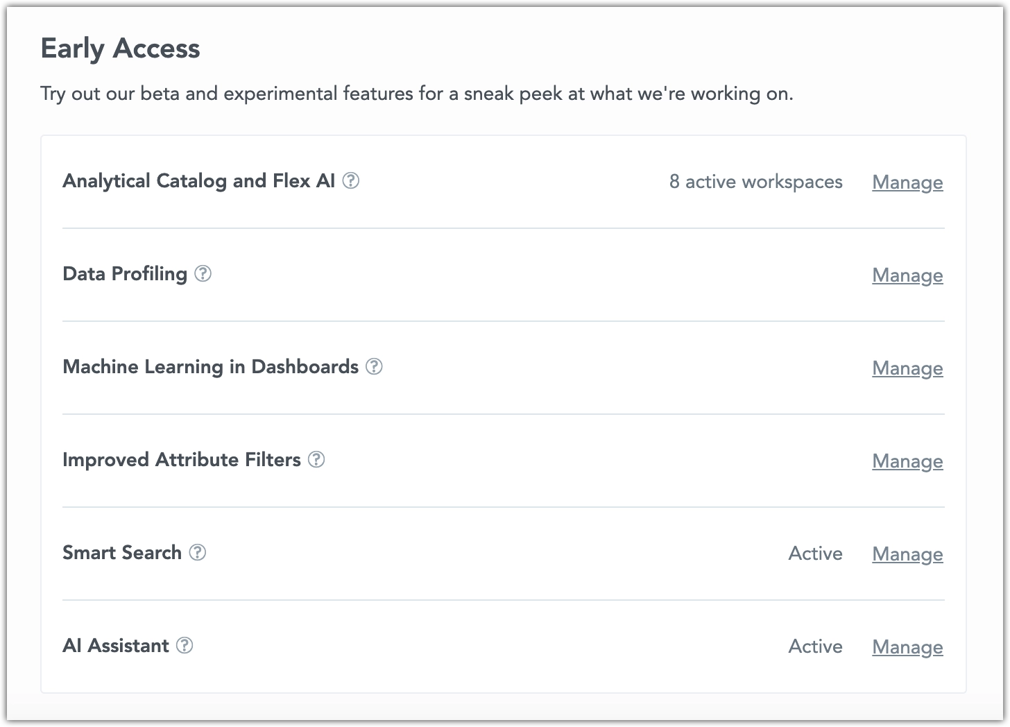
This feature is currently experimental, and you must explicitly opt in via Settings > Early Access to test it out. For details about the feature, see the Aggregate Awareness section.
We have rebuilt our Analytics Catalog experimental feature from the ground up. The new Analytics Catalog makes it easier for admins and analytics engineers to manage large numbers of semantic objects in a workspace. It provides a central UI where you can:
- See all dashboards, visualizations, metrics, attributes, facts, and datasets grouped and sorted.
- Search by syntactic or semantic keywords, and filter by type, creator, or tags, with support for multiple filters.
- Drill into metadata such as name, description, creator, last modified, tags, and dataset links.
- Quickly update titles, descriptions, and tags without leaving the catalog.
- Open objects directly in their respective editors without needing to search again.
This feature is currently experimental, and you must explicitly opt in via Settings > Early Access to test it out. For details about the feature, see Analytics Catalog section.
You can now export pivot tables directly into well-formatted, paginated PDF documents from dashboards. This makes it simple for non-technical users to create polished reports to share with stakeholders outside the platform. The export preserves formatting such as headers, row sorting, and metric styles, and works seamlessly in both native and embedded dashboards.
In PDF exports, text wrapping is always applied automatically. Unlike in dashboards, the table configuration is not respected here. This ensures that no values are cut off, since PDFs do not support hover interactions and are meant to display the full data range.
This feature is currently in beta, and you must explicitly opt in via Settings > Early Access to test it out. For details about the feature, see Export Table.
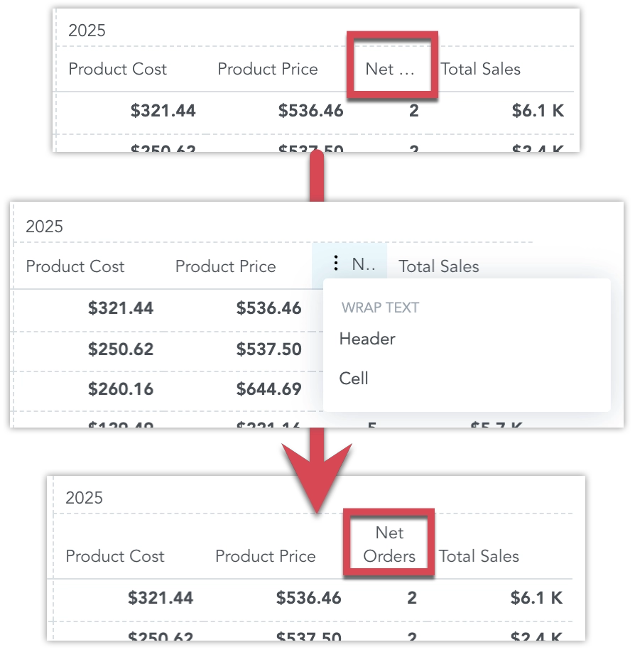
We’ve completed a major rewrite of our pivot table code, which will let us deliver a series of quality-of-life improvements to pivot table visualizations.
The first of these improvements is optional text wrapping in table cells. You can now choose to wrap text in the table headers cells, regular cells or both. This helps prevent important information from being cut off when the text is too long.
This feature is currently in beta, and you must explicitly opt in via Settings > Early Access to test it out. For details about the feature, see Export Table.
We are working centralized automation management, a single interface to view and manage all scheduled exports, and another to manage all alerts, across an entire workspace.
At the moment, automation management is tied to individual dashboards. With centralized management, automations are easier to access, oversee, and control - saving time and improving efficiency.
At this stage, the feature is experimental and needs to be explicitly enabled in organization settings. The feature now works at the workspace level only. In the future, we plan to extend it to the organization level, providing broader visibility and control across all workspaces.
For details see Centralized Automations Management.
We are preparing for release of React SDK version 11, which introduces support for React 19. As part of this release, support for React 16 and 17 will be removed.
The release is planned for late September or October 2025. At that time, React SDK 11 will launch with full support for React 18 and 19, and our UI components will be upgraded to React 19. On the same day, React SDK 10 will enter a six-month support-only phase: service stability and fixes for blocking or security issues will be provided, but no new features. After this period, React SDK 10 will reach end-of-life. While it will not be formally deprecated, we will no longer provide fixes or guarantee continued functionality.
What this means for you:
If you use custom dashboard plugins developed with React 16 or 17, upgrade your plugins immediately to React SDK 10 and React 18. Otherwise, they may break when we release React SDK 11, because support for React 16 and 17 will be removed.
If you embed GoodData with React SDK and your application still uses React 16 or 17, but without plugins, you do not need to upgrade before the React SDK 11 release. However, plan to migrate your application to at least React 18 and upgrade to React SDK 11 within six months after its release.
If you already use React 18 for your plugins or embedding, you are fine for now. No immediate action is required. We recommend upgrading to React 19 and React SDK 11 once they are available, ideally within the six-month support window.
The legacy telemetry section has been fully removed from the /api/v1/profile endpoint. This field had been marked as deprecated for over a year and is no longer returned in the response.
If your integration relies on the deprecated telemetry section, update to use the telemetryConfig section exposed by this endpoint.
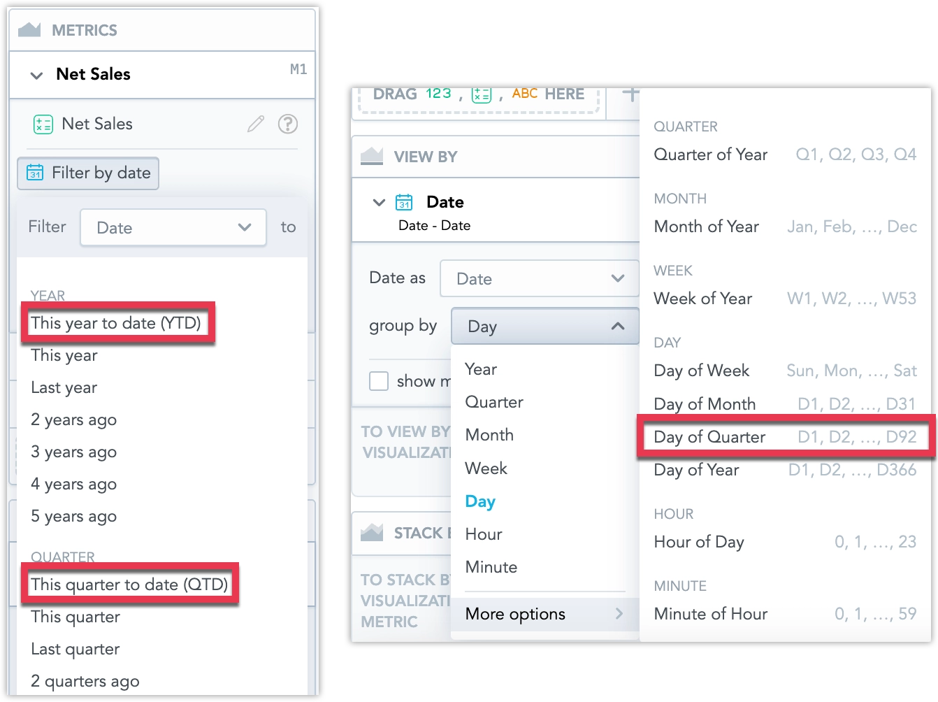
This week, we wrapped up our work on the to-date options in date filters by adding support for to-date filters in metric date filters.
We also slipped in something new: a Day of Quarter date granularity. With it, you can now group your data by individual days within a quarter—handy for spotting trends that sit between monthly and daily views.
To use the new Day of Quarter granularity, you may need to update your Logical Data Model. See Missing Date Granularity for details.
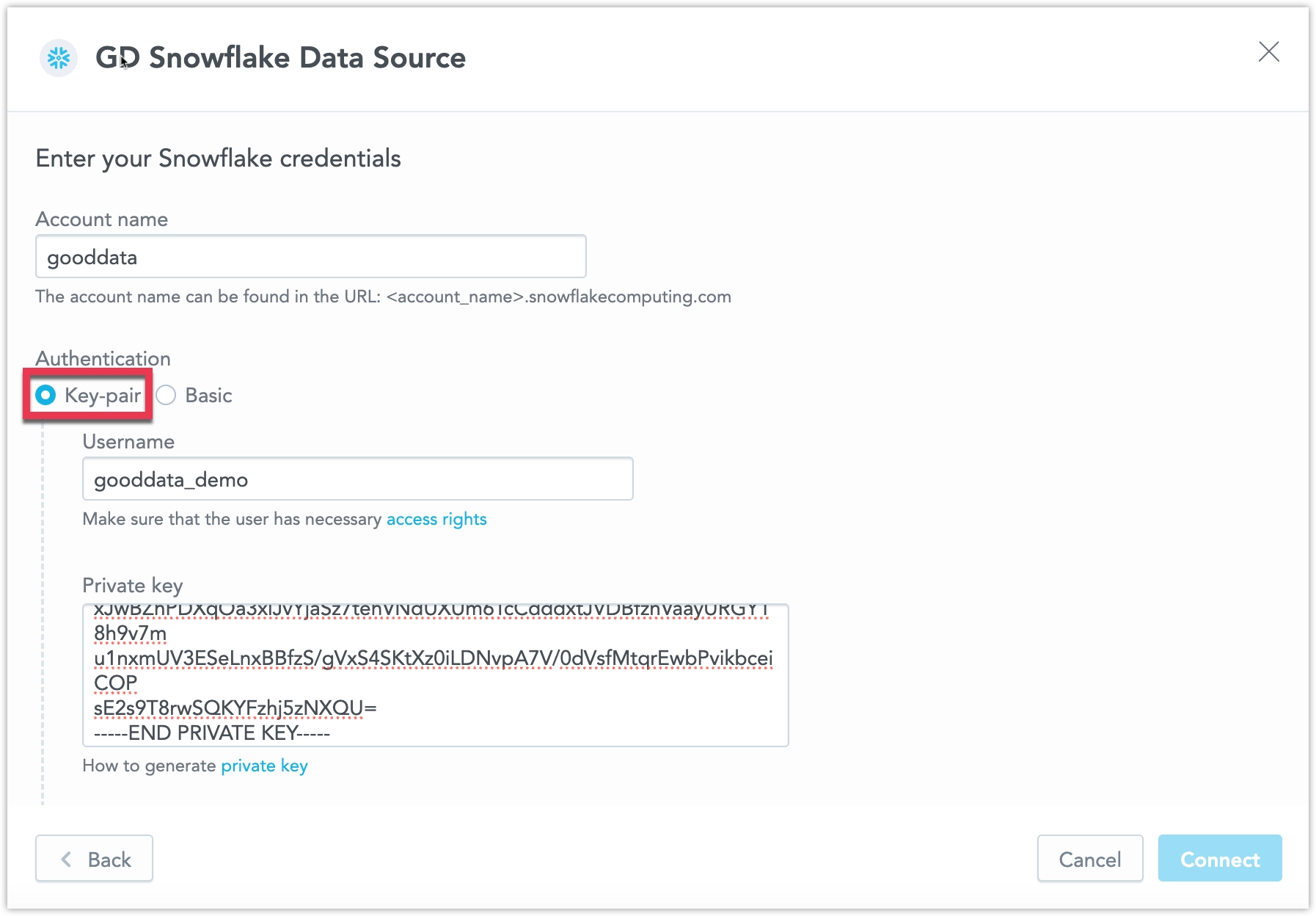
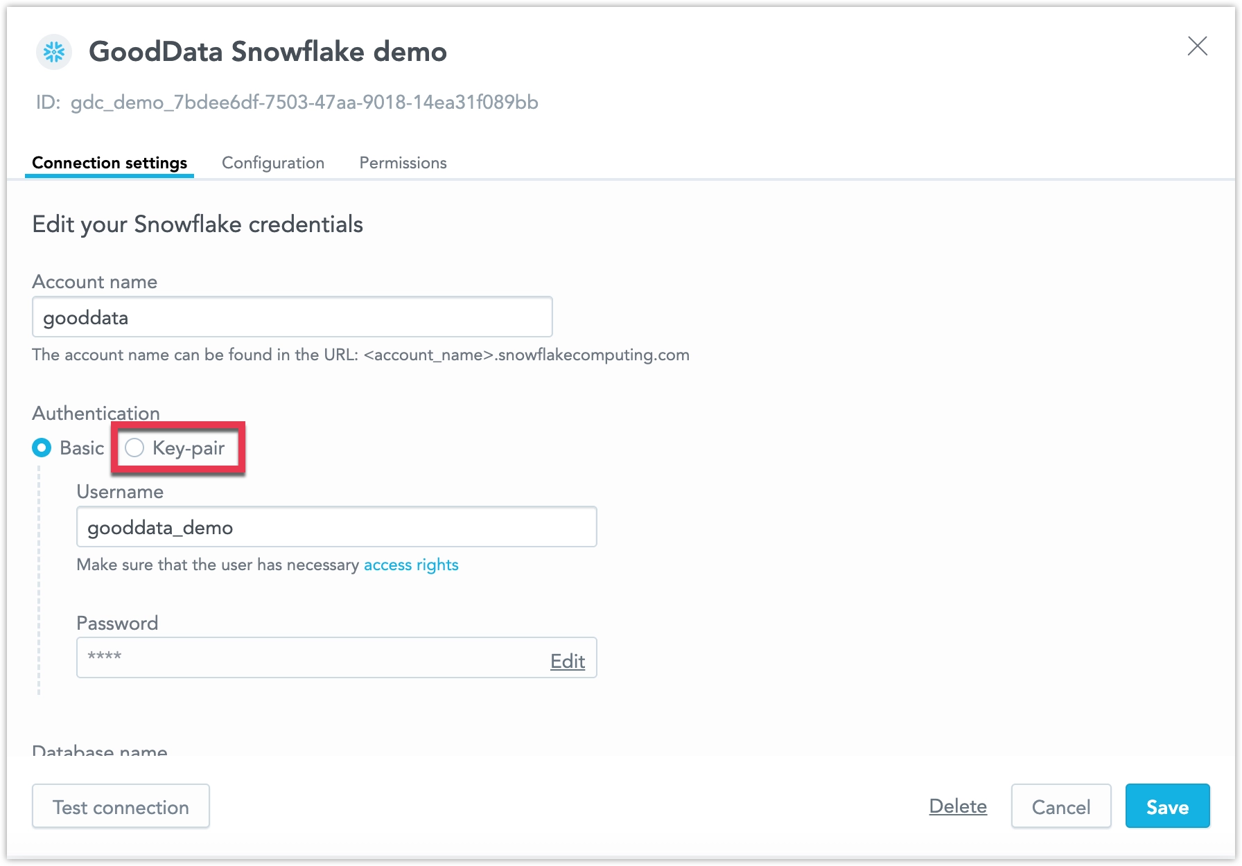
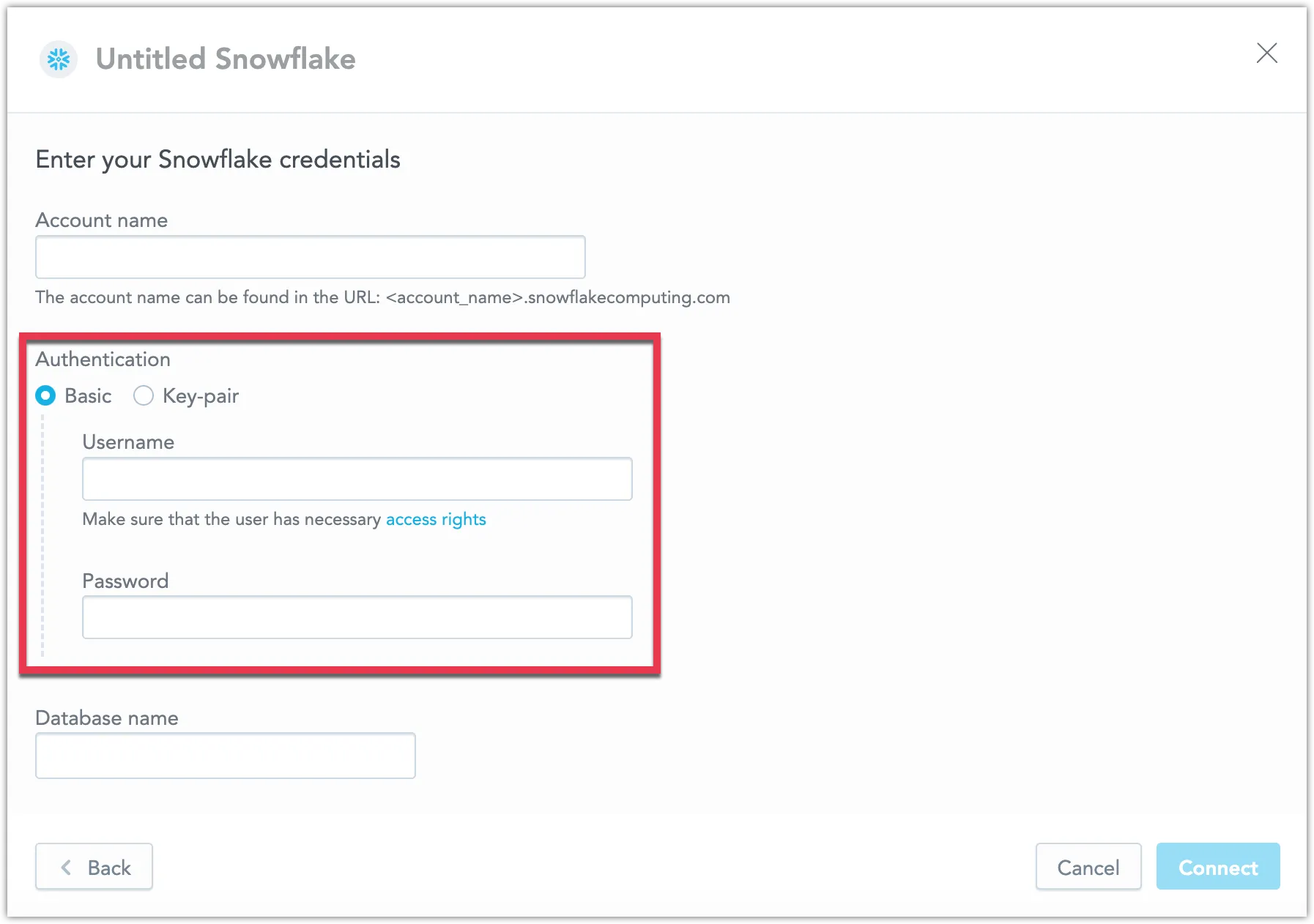
Reminder About the Upcoming Change to Snowflake Data Source Authentication
As announced earlier this year, Snowflake will block single-factor password authentication starting in November 2025. You can read more about this change in this Snowflake blog post.
This means that basic username/password authentication will no longer work for Snowflake data sources in GoodData. To keep your Snowflake data connected, update your data source settings to use key-pair authentication.
Snowflake does provide a temporary workaround by changing your user type to LEGACY_SERVICE (as described in their article), but this will also stop working in November 2025. After that date, only key-pair authentication will be supported. We strongly recommend making the switch as soon as possible to avoid disruptions.
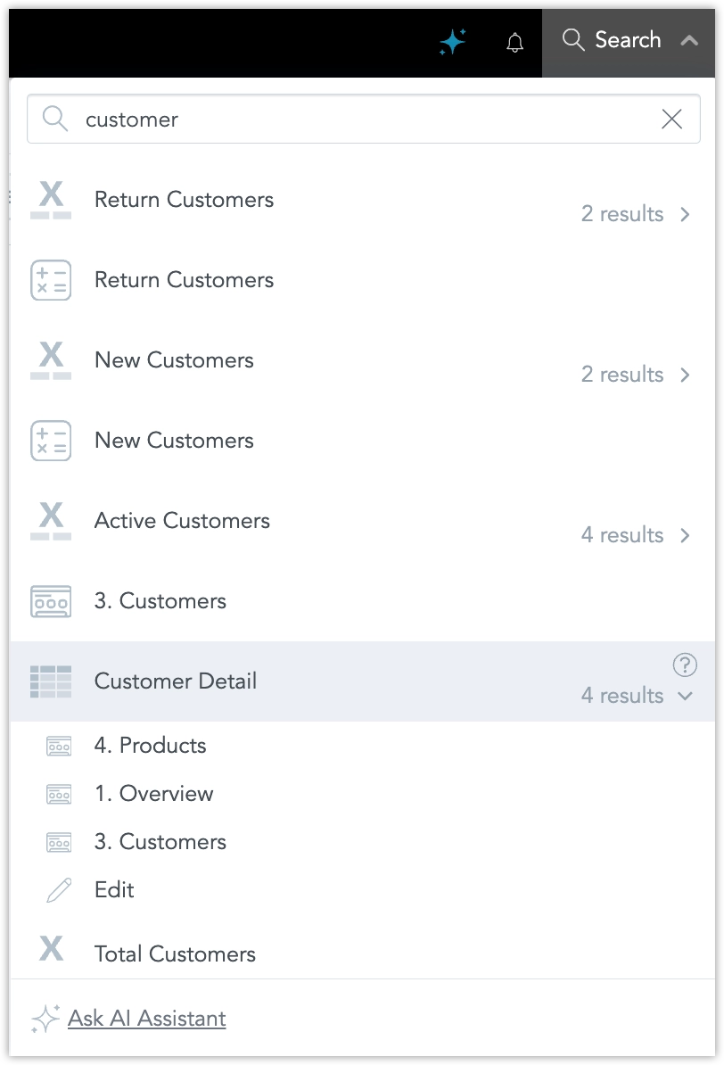
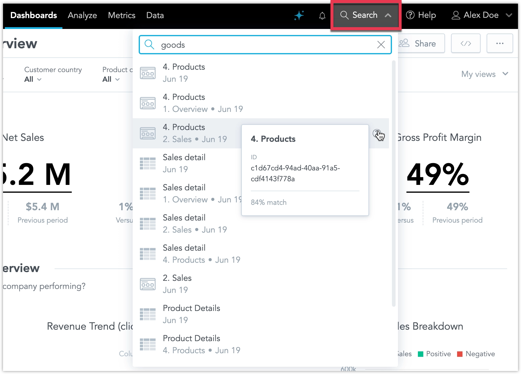
We’ve introduced two enhancements to smart search:
Search results now group identical visualizations used across multiple dashboards into a single expandable result. This reduces clutter and makes it easier to review all occurrences of a visualization. Users can expand the group to see each instance and navigate directly to a dashboard or to Analytical Designer.
Smart Search is also integrated with the AI Assistant. When no relevant results are found, users with access can continue the query in the assistant. The assistant opens with the search term pre-filled and immediately returns an answer or an ad-hoc visualization.
For more information, see Use Smart Search.
We have now fully release the new To-Date values for date range filters which were in beta last week; These include Year-to-Date (YTD), Quarter-to-Date (QTD), Month-to-Date (MTD), and Week-to-Date (WTD).
These filter values enable you to easily select data up to the current day, preventing misleading comparisons with completed historical periods.
For more information, see the To-Date Filters section.
You can now enable a new mode that lets you apply all dashboard filter changes in one step, instead of triggering a reload after each individual change. This is especially helpful for dashboards with many filters and visualizations, reducing the number of queries and improving performance.
For more information, see the Apply All Dashboard Filters at Once section.
To enhance support for whitelabeling, where GoodData branding is removed from the embedded experience, we have updated the behavior of the shareable link feature in Share dashboard dialog.
When whitelabeling is enabled, the shareable link field will now be hidden. Additionally, if a user lacks permission to share dashboards and whitelabeling is active, the Share button will not appear, as no actions would be available in the Share dashboard dialog for that user.
Coming soon: We’re also working on additional improvements to allow customization of the shareable link. These enhancements will enable link sharing for embedded dashboards while still aligning with your whitelabeling setup. Stay tuned!
We are in the process of introducing new To-Date values for date range filters, including Year-to-Date (YTD), Quarter-to-Date (QTD), Month-to-Date (MTD), and Week-to-Date (WTD). These filter values enable you to easily select data up to the current day, preventing misleading comparisons with completed historical periods.
For example, MTD includes data from the first day of the current month up to today. On July 21, 2025, MTD covers the period from July 1, 2025, through July 21, 2025.
When enabled in Settings > Early Access, these new date-filtering options become available in Analytical Designer, Dashboards, and SDKs, providing consistent filtering logic across manual and automated workflows.
We have redesigned the process for configuring authentication providers. The current process offers greater flexibility and safety when switching from the default GoodData Authentication Provider to a custom identity provider (IdP).
This allows administrators to configure both GoodData Auth and a custom IdP in parallel, and switch between them using a dedicated API endpoint, enabling safer testing and easier rollback without requiring assistance from GoodData Support.
Breaking Change
The organization entity now uses the identityProvider relationship to define which IdP is active. All configuration details specific to the identity provider must be defined in the identity provider entity and linked via the organization settings.
This replaces the previous method of including OIDC-related parameters directly in the organization attributes. The following fields are deprecated and will be removed in a future release:
"oauthClientId": "string",
"oauthClientSecret": "string",
"oauthCustomAuthAttributes": {
  "property1": "string",
  "property2": "string"
},
"oauthCustomScopes": [
  "string"
],
"oauthIssuerId": "myOidcProvider",
"oauthIssuerLocation": "string",
"oauthSubjectIdClaim": "oid"
To configure authentication, define these settings within the identity provider object and link it to the organization using the identityProvider relationship.
For full implementation details, see the Set Up Authentication documentation.
We’re planning to release SDK 11 at the end of September, and want to give you advance notice of some important changes.
❗ React 19 Support and Deprecations
Based on popular demand, SDK 11 will support React 19, which introduces some breaking changes:
- Support for React 16 and 17 will be removed.
- React 18 will remain supported.
If your data product is built on React 16 or 17, we recommend starting your upgrade now. Reach out to your customer support representative to discuss the next steps.
SDK Lifecycle
SDK 11 will follow the standard SDK lifecycle process:
- SDK 10 will enter End of Development (EoD) on the release day of SDK 11.
- All new features will only be available in SDK 11 moving forward.
We encourage you to upgrade as soon as possible. We’ll share detailed guidance on the upgrade path in the coming weeks.
The Column container is now available in production, giving you more flexibility and control when building dashboards. It lets you group multiple widgets in a single vertical stack, improving layout, alignment, and responsiveness.
What’s new in the full release:
- You can now use Column containers in the Plugin SDK.
- If you use Analytics as Code, you can add or update Column containers and define their content directly in VS Code.
- In Dashboards, when you add a Column container to the canvas, it behaves like a vertical stack by default. However, you can easily change the layout direction if needed.
- Content inside the container automatically resizes to match the container’s width.
- You can nest one Column container inside another.
- We have improved drop zone indicators to make adding and arranging widgets more intuitive.
Benefits:
- Better control over layout and widget sizing
- Cleaner, more organized dashboards using stacked visualizations
- Improved responsiveness and usability
- Easier migration from legacy dashboards to GoodData Cloud
For more information, see the Column Container section.
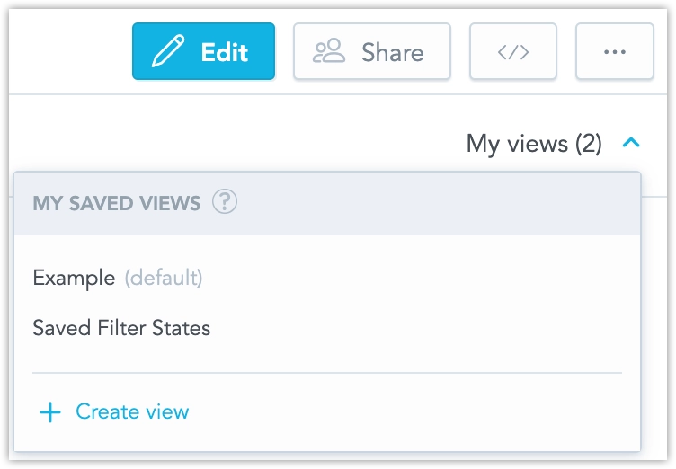
It’s now easier to share a dashboard in the exact state you see it, including all active filters. A new option in the Share dashboard dialog (opened by clicking Share on a dashboard) lets you copy a URL that preserves the current filter settings, so others see the same filtered view.
We have fixed a bug that could cause workspace data filters (WDFs) to stop working correctly after updating the logical data model (LDM) in a parent workspace.
What was the issue:
- When the parent workspace LDM was updated, child workspaces could lose their WDFs.
- Reapplying the same LDM didn’t fix it because the backend thought nothing had changed.
- This happened when parent datasets had no WDFs, but child workspaces added WDFs to those datasets.
- Changes to the LDM using those datasets in the parent prevented WDFs from being properly applied in the child.
Also fixed:
- In some cases, large
PUTrequests with manydatasetExtensionscaused 500 errors due to database load.
These issues are now resolved and no action is needed on your side. However, if your WDFs were affected before this fix, follow these steps:
- Send a
PUTrequest with a small change to the LDM in the child workspace. - Then send the full, correct LDM.
Workspace search is a new functionality that lets you search your workspaces for dashboards, visualizations, and metrics using natural language. The search understands synonyms, tolerates typos, and supports several non-English languages, making it easier to find what you need, even if you’re not sure what it’s called.
This feature is now out of early access and ready for use in production environments. See Search Workspace for details.
You can now export snapshots of dashboard widgets as PNG images, see Export Widget for details.
The previously announced fix to legend positioning in dashboard widgets is now live for all users.
To ensure your dashboards continue to display as expected, we recommend reviewing them and checking the placement of chart legends. If any adjustments are needed, you can update the legend positions directly in the Analytical Designer.
We are making the error responses for object creation and update operations more specific:
- 409 Conflict is now returned when trying to create an object that already exists (previously 400).
- 400 Bad Request remains for other invalid edits.
This has been previously an opt-in beta feature that has now been fully released for all users.
The AI Assistant now supports conversations in Brazilian Portuguese, in addition to English. We’ve optimized its understanding and responses to better serve Portuguese-speaking users.
We have expanded the language options for our user interface to include Korean, Polish, and Turkish. These languages are now fully supported in the Analytics Designer, Dashboards, and Metric Editor.
See the Change Display Language section for details.
We’ve fixed a bug that caused legends in dashboard visualizations to appear in incorrect positions. Previously, legends did not consistently reflect the position settings configured in the Analytical Designer.
With this fix, legends will now reliably follow the position specified, unless the legend position is set to auto, in which case the system will determine the optimal layout.
To give you time to review your dashboards and ensure your visualizations are configured as intended in the Analytical Designer, we will delay the release of this fix until June 26. You can opt-into the fix today by toggling the fix on in the Settings > Early Access.
You can now display charts on your dashboards as tables using the new Show as table button. This lets dashboard users view the widget’s data in a more universally accessible format. The table retains the chart’s drill-down functionality: users can click values to drill into the data, and any drilled-down visualizations automatically open in table view.
This feature isn’t available for Pivot Table, Repeater, or Headline widgets.
You can now export any dashboard directly to an Excel (.xlsx) file. Each visualization is placed on its own worksheet, making it easier to share data, run ad-hoc analysis, and integrate results with other reporting tools.
See Export Dashboards for more details.
The improved filter handling in alerts and scheduled exports feature that went to early access a couple of weeks ago is now out of early access and ready for use in production environments. See Create Alerts and Schedule Exports for details.
With the introduction of the AI Assistant feature, we have added a new permission: USE_AI_ASSISTANT. This new permission may cause compatibility issues in older versions of the GoodData Python SDK. Specifically, calling:
sdk.catalog_permission.get_declarative_permissions(workspace_id)may result in the following error:
Invalid value for name (USE_AI_ASSISTANT), must be one of ['MANAGE', 'ANALYZE', 'EXPORT', 'EXPORT_TABULAR', 'EXPORT_PDF', 'CREATE_AUTOMATION', 'CREATE_FILTER_VIEW', 'VIEW']Resolution:
To resolve this issue, upgrade to GoodData Python SDK version 1.42.0 or later, which includes support for the USE_AI_ASSISTANT permission.
We are introducing AI assistant, a conversational interface that lets you explore data in plain language inside GoodData Cloud. Ask questions in natural language, no SQL or MAQL required. Every query passes through your existing semantic model, so results always respect business terminology, metrics, and security filters. Only metadata is sent to the language model; raw data never leaves GoodData.
The assistant is designed for everyday tasks:
- Ask general business questions for quick insights into your data.
- Generate new visualizations on the fly and iterate on them.
- Save generated visualization and use them in your dashboards right away, or work on them further in Analytical Designer.
- Search for specific dashboards, visualizations, metrics, facts, and attributes without leaving the chat pane.
- Continue a conversation in context; the assistant remembers prior questions inside each workspace.
See Use AI Assistant for details and instructions on how to set it up.
We have introduced an important improvement to how executions are handled to optimize database load and reduce response times.
Now, when you interact with dashboards or build visualizations, such as changing filter values or swapping metrics and attributes in Analytical Designer, any unfinished queries from previous actions are automatically stopped. This ensures that only the query corresponding to the most recent action is executed, avoiding unnecessary use of backend resources.
Previously, every action triggered its own separate execution. Once started, these executions couldn’t be canceled, even if you changed your selection right away. This often led to queries continuing to run in the background even though the UI no longer needed their results, putting unnecessary strain on data sources.
With this update, the system focuses on delivering results for your latest action, which is what you typically want to see. The backend is now smarter about managing resources, especially when accessing raw data sources, which have limited capacity for simultaneous connections and queries.
This enhancement helps ensure faster results, more efficient resource use, and a better overall experience as you explore and analyze your data.
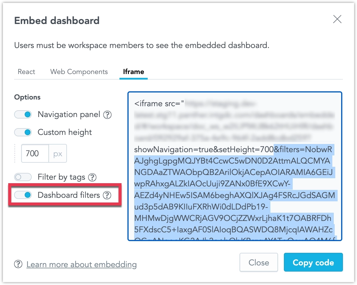
In the Embed dashboard → Iframe dialog, we have added a new option Dashboard filters. Toggling this on adds the active dashboard filters as query parameters in the URL itself, letting you embed or share the dashboard with a specific configuration for cases where using postMessages or saved views might be inconvenient.
This feature is now out of early access and ready for use in production environments.
This feature is now out of beta and ready for use in production environments!
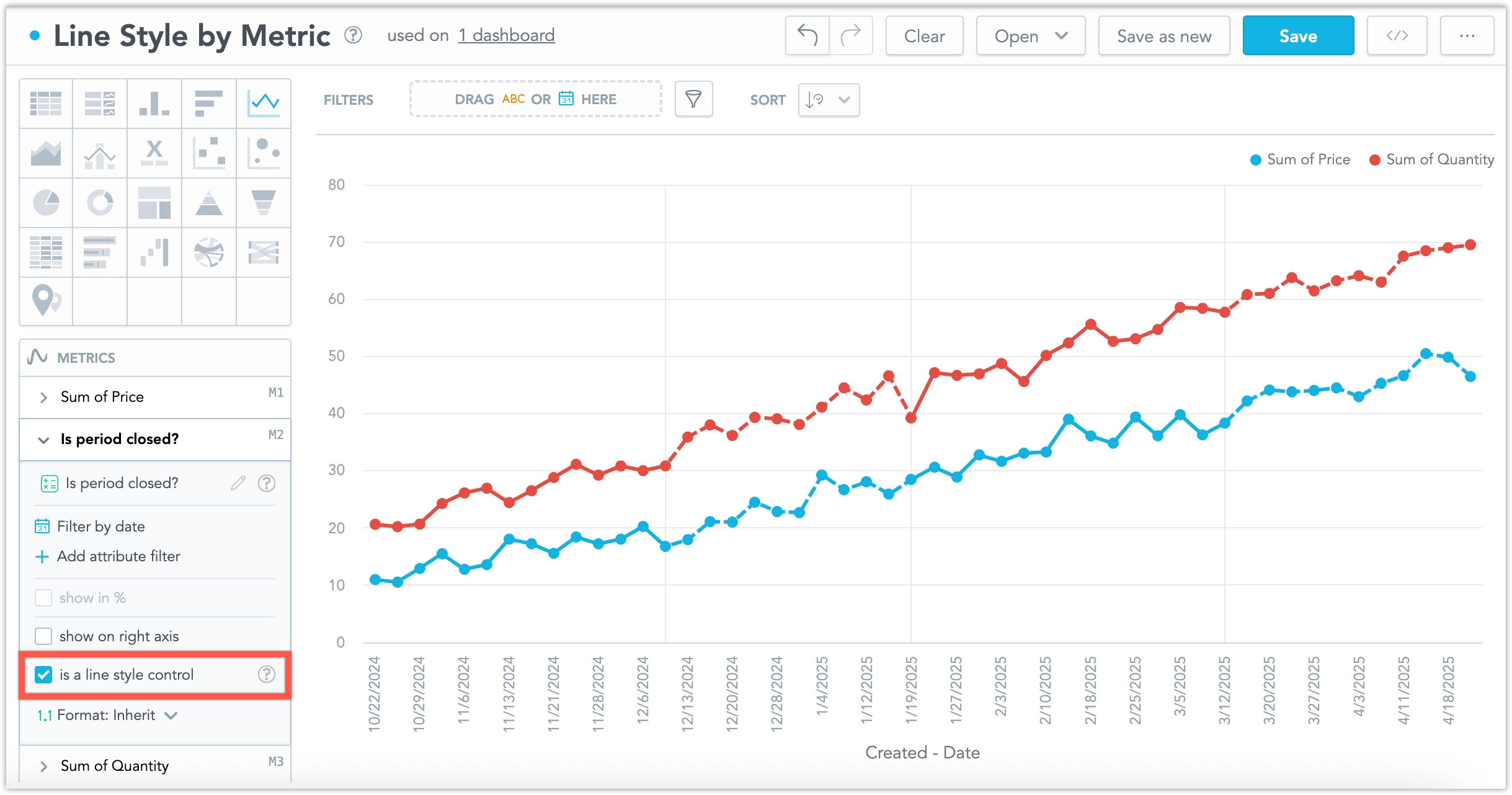
In line charts, you can visually distinguish between complete and incomplete data by applying dashed and solid line styles. The line style is controlled by a dedicated metric not rendered in the visualization.
See the Line Style by Metric section for more details.
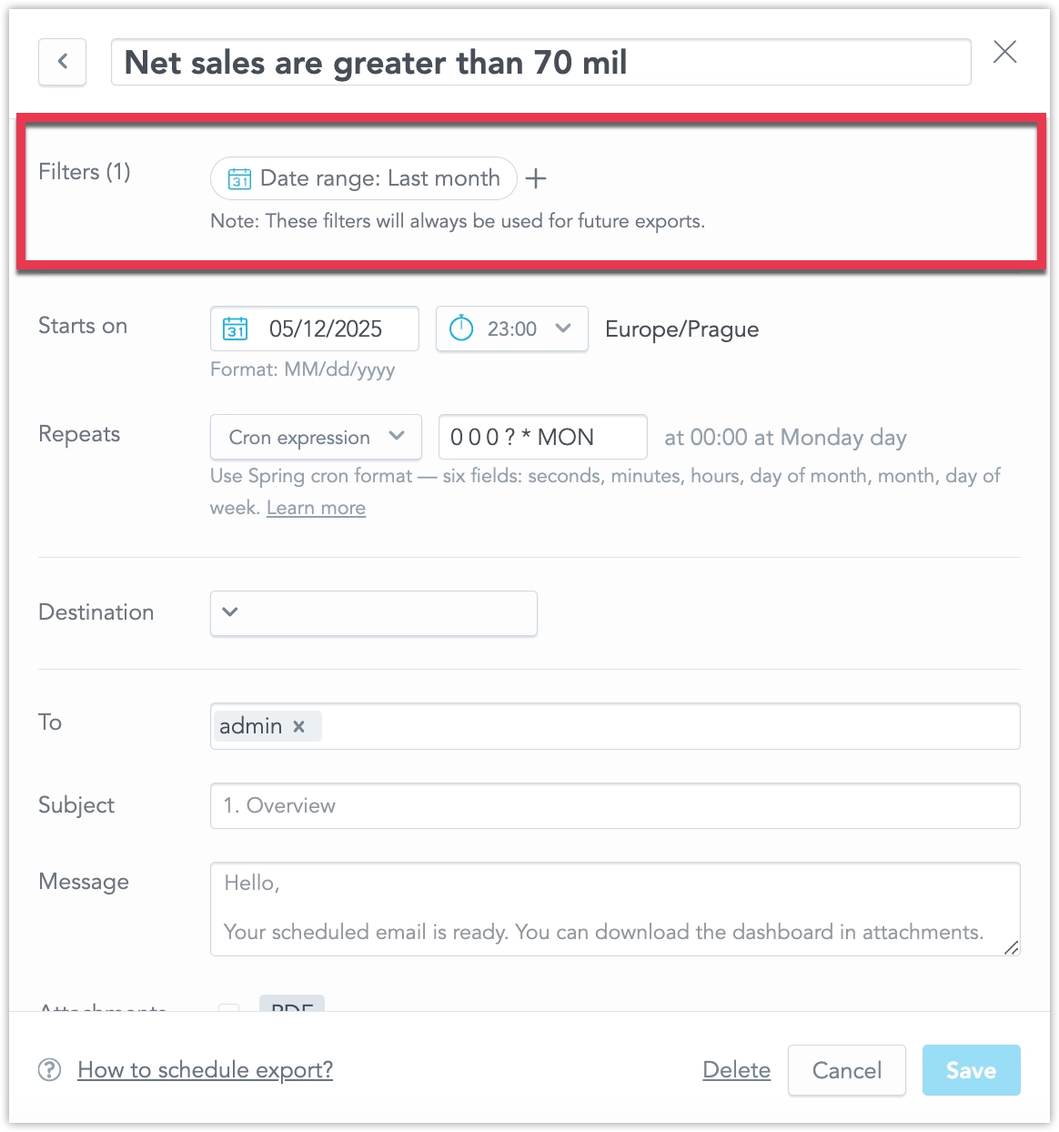
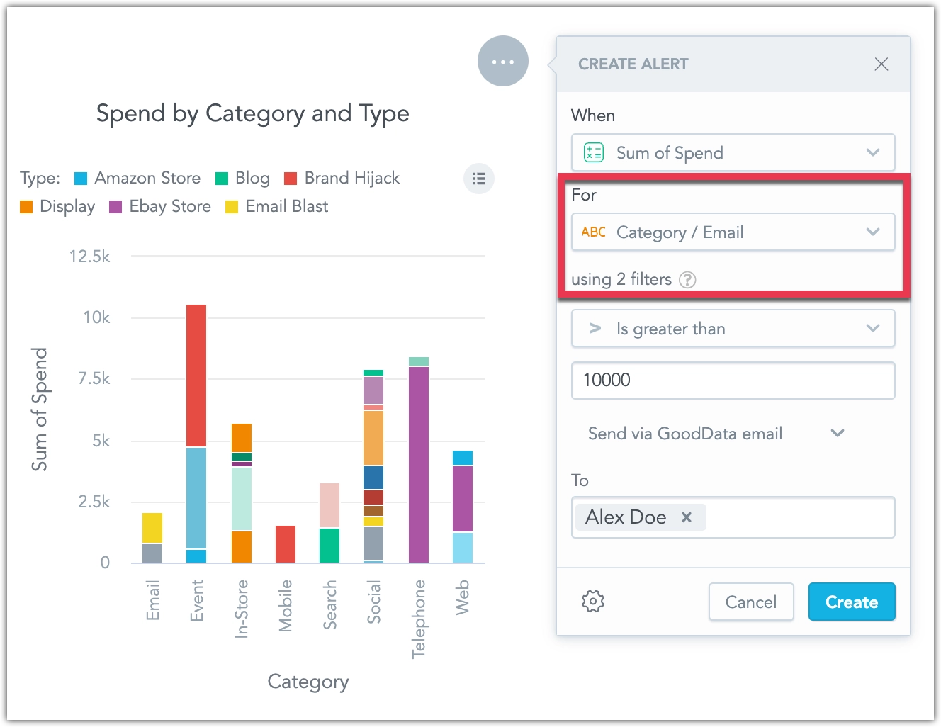
We have completed a comprehensive overhaul of how dashboard date and attribute filters are applied in your alerts and scheduled exports (automations). When you create or edit an automation, a new filters section now lists every filter in use together with its current value, and you can add, modify, or remove them directly in the dialog.
The same filter context now appears in two more places for complete transparency: it is included in the notification e-mail sent with each alert or export, and it can be reviewed via a new filters pop-up available from every item in the in-app notification panel.
This set of features is the reason why we’ve added the localIdentifier property to dateFilter objects a couple of weeks ago. If you are using GoodData declarative API in any of your custom applications or workflows, please review Date Filters Now Require ID Property.
This feature is currently in beta and must be enabled in Settings > Early Access.
We are making the error responses for object creation and update operations more specific:
- 409 Conflict is now returned when trying to create an object that already exists (previously 400).
- 400 Bad Request remains for other invalid edits.
This update is opt-in during the beta phase, giving you one month to enable the feature, test it, and adjust any logic that depends on error codes. The change will become generally available after the transition period.
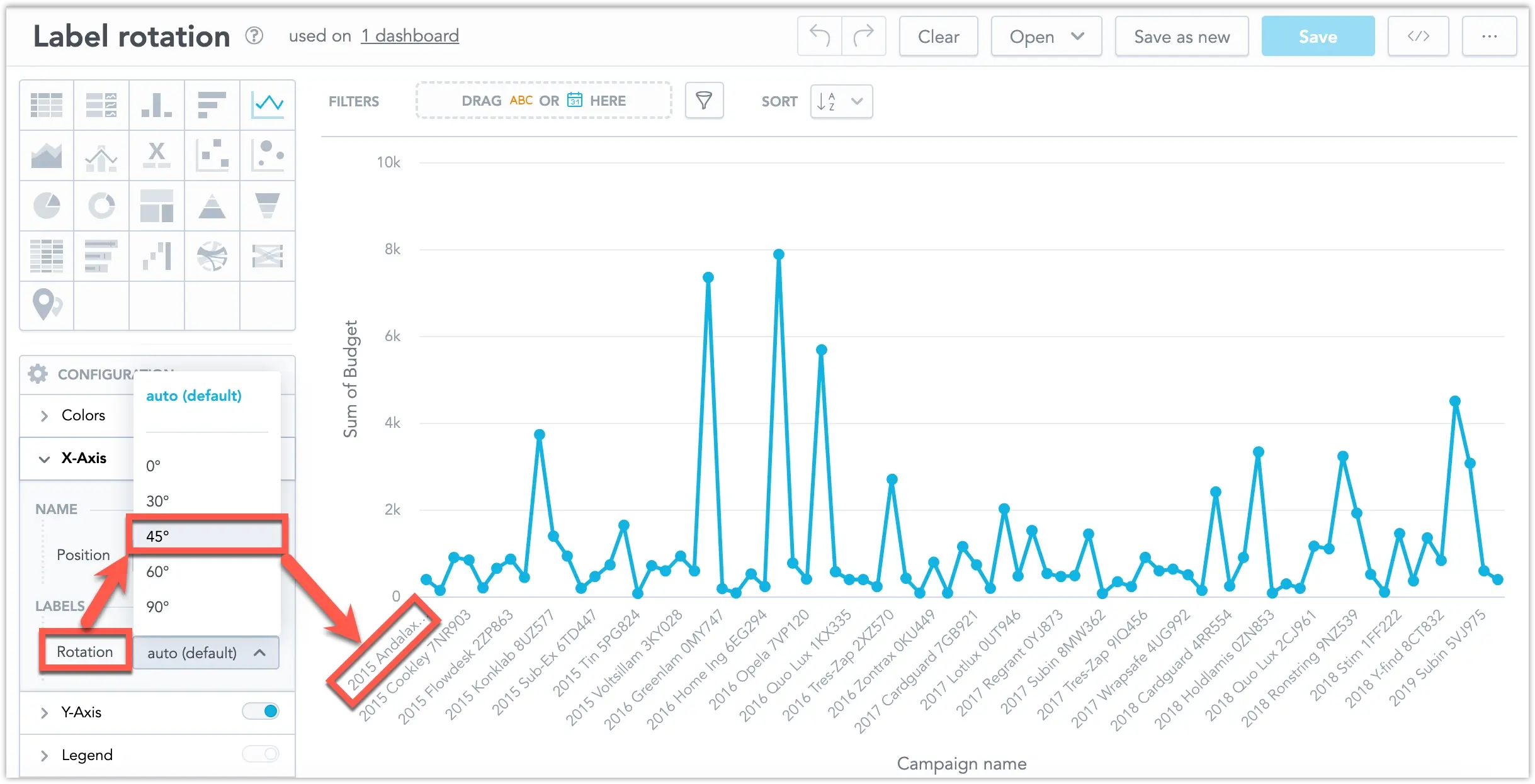
We have expanded the options for rotating chart axis labels. You can now set the rotation angle to 45 degrees in the axis configuration. This is also the new default for the X axis, making the labels easier to read. This feature is supported in all visualizations that include an X and Y axis.
You can now visually distinguish between complete and incomplete data in line charts by applying dashed and solid line styles. The line style is driven by a control metric that is not displayed in the visualization.
This is especially useful when recent data may still be changing. For example, if the last three months of data are considered incomplete, you can use this feature to show those months with a dashed line, while earlier (completed) months appear as a solid line.
For more details, see the Line Style by Metric section.
If you are using the declarative API, note that this update adds a new property to dateFilter objects called localIdentifier. This property is a prerequisite for upcoming improvements to how filters are handled in automations.
"dateFilter": {
    "localIdentifier": "0_dateFilter",
    "type": "relative",
    "granularity": "GDC.time.month",
    "from": 0,
    ...
All existing date filters in your workspaces have been updated automatically with a generated localIdentifier value. However, if you use the declarative API to restore workspaces or individual dashboards from backup, your exported JSON may contain date filters that are missing this property. To avoid issues with future filter functionality, please review and update your declarative API templates as needed.
You can now access a self-service audit log to store and analyze audit events from your GoodData workspace. This new feature empowers your SecOps team to easily investigate who made changes, when, how, and what was changed in your solution, which is especially valuable in case of an incident.
The audit log can support you in several critical areas:
- Security & Fraud Prevention – Monitor unauthorized or suspicious activity.
- Compliance & Legal Requirements – Meet GDPR, HIPAA, or SOC2 standards.
- Troubleshooting & Support – Quickly trace issues and understand changes that impact your setup.
The self-service audit log gives you greater transparency, control, and security when managing your data and analytics environment.
See the Audit Log section for more details.
We are giving users more control over how frequently their alerts are evaluated. Until now, all alerts have been evaluated according to the evaluation frequency setting shared by your entire organization.
Now, dashboard creators can edit the evaluation frequency in the dashboard’s Settings. They can customize the evaluation frequency for all alerts created in that particular dashboard, which overrides the default setting from the organizational settings.
Note that this setting applies only to alerts created after the dashboard setting has been changed; it is not applied retroactively to existing alerts.
Furthermore, users can now edit the evaluation frequency for each individual alert separately using the API. See Create Alerts in Dashboards for details.
We are preparing for new dashboard settings functionality that will be released soon. The old cogwheel icon which opened a dropdown with toggleable options was no longer sufficient. To accommodate the upcoming features, it has now been replaced by a dedicated Settings button. When clicked, this button opens a pop-up dialog that provides ample space for both existing and upcoming configuration options.
We have introduced a new way to export entire dashboards or individual widgets as slide decks. You can generate your presentation in either PDF or PPTX format, making it easier to share insights in meetings or keep stakeholders updated. API users can also apply custom templates to control the look and content of individual slides.
See Export Dashboards for more details.
Rich text now supports referencing attributes and metrics within your rich text widgets, dashboard section descriptions, widget tooltips, and metric or attribute descriptions. This lets you embed live data, filtered according to any applied dashboard filters, directly into your text.
See Add Rich Text to Dashboards for more details.
We have added a new raw data export option, allowing you to download the data used to compute a report. This feature is now out of beta and ready for use in production environments! See the CSV with Raw Data section for more details.
In the Embed dashboard → Iframe dialog, we have added a new option Dashboard filters. Toggling this on adds the active dashboard filters as query parameters in the URL itself, letting you embed or share the dashboard with a specific configuration for cases where using postMessages or saved views might be inconvenient.
Note that this is an early access feature. To enable it, you need to toggle it on in Settings → Early Access, see Enable Early Access Feature.
We have added a new raw data export option, allowing you to download the data used to compute a report. This feature is currently in beta and must be enabled in Settings > Early Access.
If your report is based on large raw data that exceeds GoodData limits, the report may not be computed. With this feature, you can still access the underlying data, even if it cannot be visualized. Even when limits are not exceeded, raw data exports can be useful for further processing in external systems.
- Data is exported in CSV format (raw).
- The exported file is not cross-tabulated, ordered, or formatted.
- Metrics are not formatted in the output.
This feature provides flexibility for handling large datasets and integrating with other data processing tools. See the CSV with Raw Data section for more details.
In April, Snowflake will begin transitioning to an M2M (machine-to-machine) authentication policy. You can read more about it in this article on Snowflake’s website.
As a result, basic username/password authentication will no longer be supported for Snowflake data sources. To continue using your Snowflake data, you must update your data source settings to use Key-pair authentication.
Please make this change by the end of March to avoid losing connectivity. While it’s possible to temporarily work around this by switching your Snowflake user type to LEGACY_SERVICE (as described in the Snowflake article), this workaround will stop working in November. After that point, only key-pair authentication will be supported.
We are updating the engine behind our visualizations to improve performance and accessibility. This update fixes several long-standing bugs and lays the foundation for faster, more accessible visualizations.
As part of this update, you may notice some small but important changes to the appearance of your existing visualizations:
- More space is allocated for each label, which may reduce the total number of labels displayed on axes with high label density. Some labels may be hidden if there isn’t enough space.
- Labels are now less likely to rotate when space is limited.
- Minimum and maximum values for chart axes now round up or down to the nearest whole number, which may slightly adjust the axis range.
- A more advanced approach to zero alignment on dual axes may change how these charts are displayed.
If you have finely tuned visualizations that depend on pixel precision, we recommend reviewing them. If you use automated screenshot tests, you may need to update those tests as well.
We have improved the data blending feature to make it faster and more reliable. These improvements include a new check for mismatched data types, which helps prevent errors during runtime.
If you experience problems:
- Check your database tables to ensure data types are correct.
- Find and fix mismatched data types in dataset references or attribute/label definitions.
Columns referencing primary keys should share the same data type to ensure smooth and effective joins between datasets. For example, you should avoid mixing a numeric type column with a string column. This is essential for successful equi-joins and helps avoid potential failures or performance issues.
Customizable JIT Provisioning is now fully supported and out of beta! It is enabled by default for all users.
Some identity providers do not support custom scopes or have restrictions on character limits. Customizable JIT Provisioning addresses these issues.
We are improving the accessibility of our Dashboards, making it easier for users with disabilities to navigate and interact with dashboard content. This bring us closer to full compliance with accessibility standards and make dashboards more usable for everyone. More improvements will be introduced in future updates.
ClickHouse is now fully supported and out of beta! This data source is enabled by default for all users. See the ClickHouse section for more details.
We have enhanced Federated Identity Management (FIM) to work in embedded setups, including use within an iframe.
Previously, FIM was only available in the standard authentication flow, making it impossible to use in embedded environments. This improvement removes that limitation.
See the Federated Identity Management section for further details.
We now support Azure Identity Management (Microsoft Entra ID) in Federated Identity Management. See the Register an OIDC Provider section for further details.
We are updating the engine behind our visualizations and will release the update soon. This improvement will resolve several long-standing bugs and establish the groundwork for faster, more accessible visualizations in the future.
As a result of this update, you may notice some small but significant changes to the appearance of your existing visualizations:
We are allocating more space for each label, which may reduce the total number of labels displayed on axes with high label density. Some labels might be hidden if there isn’t enough space available.
Labels are less likely to be rotated when space is limited.
The minimum and maximum values for chart axes prefer to round up or down to the next round number, which may slightly stretch the axis range.
We are using a more sophisticated approach for zero alignment on dual axes, which may change the way these charts are displayed.
If you have finely tuned visualizations that rely on pixel precision, we recommend reviewing them. Similarly, if you rely on automated screenshot tests, you may need to update those tests.
We will provide more details in upcoming release notes.
We have made it easier to analyze and combine data from different sources. Now, you can create metrics that calculate summary values at the source level and use FlexQuery to perform final calculations like sum or difference, without loading data into a central data warehouse. This reduces the amount of data transferred, keeping it within platform limits. It’s especially useful for merging data from multiple regional data sources into one workspace.
The feature improvements include the following:
- Ranking Filters and Metric Value Filters now work with visualizations that use metrics from multiple sources.
- Show Missing Values is now supported.
- In the Analytics Designer metrics bucket, you can create cross-source metrics using
Sum,Difference,Product,Ratio, andChange. - In the current version, Show in % works only when breaking down by a single common (non-date) attribute across all federated metric sources.
See the Blending Data section for more details.
Some identity providers do not support custom scopes or have limits on characters and length. To solve this, we introduced Customizable JIT Provisioning. This feature is currently in beta and works alongside the original JIT, so you can continue using the previous version if needed.
Customizable JIT Provisioning is managed in the organization settings, giving you more control over its setup. Both custom scopes and user groups are optional. However, at this time, it only supports organizations with a single identity provider.
Note: When using Federated Identity Management (FIM), JIT provisioning is limited to its original version. With FIM, you can either assign no groups or set default groups that are automatically assigned. However, custom groups, where each user is dynamically assigned a group during creation, are not supported. This functionality is only available for organizations using a single identity provider (IdP).
You can now assign custom names to alerts when creating or editing them, making it easier to recognize which of your alerts has been triggered, when reviewing alerts at a glance. See Create Alerts for details.
We plan to continue enhancing alert automations, including improvements to how filters are handled, in the coming weeks.
On the dashboard, when drilling down from one visualization into another, users can now view the description of the target visualization by clicking a new tooltip icon.
This feature was previously in beta and first became available in early access on January 8, 2025. It is now enabled by default for all users.
We have made improvements to our federated identity management system. Setting up this feature is now easier, as we have eliminated the requirement to create a separate admin group for managing OIDC providers. Instead, once you enable this feature, you will have access to APIs for managing these providers.
Furthermore, this update supports the use of multiple SAML providers, as well as a combination of SAML and OIDC providers.
See the Federated Identity Management section for more information.
You can now manage data separation directly in the GUI. This feature visually represents the functionality of Workspace Data Filters (WDF), which are useful for creating workspace hierarchies and multitenant environments.
WDFs allow you to restrict data available in child workspaces. For example:
- A parent workspace may display data from all company departments.
- A child workspace, with a WDF applied, will only see data for the Sales department in the same visualization.
You can now manage workspace settings directly in the GUI. This update allows you to:
- Create workspace data filters
- Change the workspace’s color theme and palette
- Adjust localization settings
All these changes can now be made without using the API. For further information, see the Workspace Settings section.
We have improved the Widget Containers feature based on user feedback from the experimental version:
- Enhanced visual indicators (e.g., drop zones and resizing indicators) to make dashboard design more intuitive. These clearly show the effect of your actions, streamlining the design process.
- Improved visualization nesting within widget containers by removing unnecessary padding and improving layout consistency.
These updates make dashboard design easier, more predictable, and user-friendly.
See the Widget Container section for more information.
Administrators can now configure destinations that allow users to send alerts and scheduled exports to any email address, including those outside of your organization. For added control, you can disable the inclusion of dashboard links when sending to external recipients. See Create Destinations for details.
When setting up a PostgreSQL data source, the API/backend now requires at least one of the ssl or sslmode parameters.
Changes to Existing Data Sources
If your data source does not include ssl or sslmode in the JDBC URL, we will automatically add sslmode=prefer to keep things working as they are now. This ensures no breaking changes, as it was the previous default for the PostgreSQL driver.
However, we recommend switching to sslmode=verify-full for better security and to ensure encryption in transit protection.
Changes for New Data Sources
When creating a new data source via API, you must now include either ssl or sslmode in your request.
If you’re using a template to create data sources automatically, you need to update the template to include one of these parameters.
If not, the new data source creation will fail, which is different from how it worked before.
In addition to receiving automatically triggered alerts via email and webhook channels, you can now also send alerts to a new notification panel. Located at the top of the web application, the notification panel is accessible from anywhere within the workspace. By clicking a notification, you can navigate directly to the widget that triggered the alert.
Notifications can be sent independently or alongside email and webhook alerts. See Create Destinations for details.
You can now customize the date filters in your dashboard to show specific time granularities, such as only days, months, or years. This is done using the dateFilterConfig metadata object in the GoodData UI. This feature allows you to optimize your dashboards by displaying only the date increments that are most relevant to your use case.
For more details, see the Date Filter Documentation.
Administrators can now edit a destination and test the connection to their webhook or SMTP server using the new Send test message button. This protocol is also initiated whenever you create and attempt to save a new destination, ensuring that all new destinations are automatically validated before they can be used.
On the dashboard, when drilling down from one visualization into another, users can now view the description of the target visualization by clicking a new tooltip icon.
This feature is currently in beta and must be enabled in Settings > Early Access. It will remain in beta until February 6, after which it will be enabled by default. If you are already using tooltips at the visualization level, we recommend enabling this feature now to preview how it will appear when it becomes available to all users.
In response to frequent feedback, we have removed users with organization.MANAGE permissions from the list of recipients in the automation dialog. If your solution requires sharing automations with these users, please ensure they are assigned explicit workspace permissions. This allows you to control which workspaces include admins as recipients and which do not.
This feature is currently in beta and must be enabled in Settings > Early Access. Please note that this feature will be enabled by default for all users on January 23.
We are moving Blending Data feature out of beta, making it usable in production environments. This capability lets you create visualizations using metrics computed from multiple data sources. By blending data into a single result set using common conformed dimension attributes, you can now perform more flexible and powerful cross-source analysis.
We are introducing M2M as a new authentication method to connect Databricks as a data source. We will also remove the option to use basic authentication with this data source by the end of January 2025, as it is no longer supported by Databricks.
See the Databricks section for more information.
We are launching a beta feature that lets you create visualizations using metrics computed from multiple data sources. The data is blended into a single result set using common conformed dimension attributes, enabling more flexible and powerful cross-source analysis.
You need to enable Data Blending in Settings > Early Access to use this feature.
See the Blending Data section for more information.
We are making it easier to organize your dashboards. With widget containers, you can group several widgets together. This gives you more control over how your content is arranged, aligned, and sized. You can also stack visualizations vertically next to each other while keeping the dashboard fully responsive.
See the Widget Container section for more information.
You can now make visualizations smaller, giving you more freedom to design dashboards your way. The minimum width for visualizations is now 2, except for geocharts, which still have a minimum width of 6 due to technical reasons.
We have improved the user creation process based on your feedback. Now, you can create users through a single dialog located in User Management, making the process simpler and consistent across all tiers. This also makes it easier to move from evaluation to production.
For those using our hosted OIDC, the invitation process remains available. However, invitations now instantly create a metadata object defining permissions. This lets you assign detailed permissions to new users before they first log into GoodData.
See the Manage Users and User Groups section for more information.
Companies often have data spread across many sources, and with so many types of data storage, it’s hard to support all combinations with regular data connectors. FlexConnect helps solve this by letting you connect to almost any data source. This includes streaming data, structured and unstructured data, databases, third-party platforms, and machine learning models.
Previously, we used the names “FlexFunctions” and “Flight RPC” during the beta phase. The new name, “FlexConnect,” makes everything consistent in the user interface, repository, and API (which still used “FLIGHTRPC” before).
See the FlexConnect page for more information.
We are introducing an AI assistant for trial users. This chatbot helps you find answers to your business questions easily, so you don’t need to know the details of your data model, dashboards, or visualizations.
In this version, the AI Assistant can:
- Search existing dashboards and visualizations to answer your business questions.
- Create new visualizations if there isn’t an existing one that fits.
- Improve ad-hoc visualizations based on your feedback.
This AI Assistant replaces Flex AI.
You can now create alerts for individual attributes, enabling you to set up multiple alerts for a single metric based on different values of an attribute. For example, you can break down an alert for a budget metric into multiple alerts, one for each category of spending. See Create Alerts for details.
You can now opt into our beta and experimental features by toggling them on in the new Early Access section in Settings. Most features can be enabled for individual workspaces, allowing you to test them out without impacting your production workspaces, which we recommend avoiding. These features are under active development and may change significantly before they are fully productized—or may be removed altogether.
We have expanded the Users & groups web interface to support full workspace permission management, including permissions previously available only through the API. Now, you can manage all user and user group permissions directly from the web interface, streamlining access control for your workspace.
For more information on workspace permissions, see Manage Workspace Permissions.
We have added a Number separators option under Settings > Localization to support various numeric formats across languages. This feature allows you to apply region-specific number formats, such as European standards.
Attribute filters now utilize the primary unique label in the backend while displaying objects using their secondary label in the interface. This update allows for more precise filtering, showing separate entries for objects with identical secondary labels (e.g., two users named “John Doe”). See the Object Labels and Filters section for more details.
GoodData Cloud now supports FlexConnect as a data source. This Flight RPC connector allows integration of custom data computations, which can be used for:
- Real-time data from REST APIs
- Custom benchmarking algorithms
- Data anonymization
- Integrating predictive models into the logical data model
See the FlexConnect section for more details. See the FlexConnect section for more details.
We would like to inform you about a bug fix coming on November 4, 2024, regarding column renaming in repeater visualizations. Previously, column names were incorrectly based on label names instead of the names set in the Analytical Designer. Starting on this date, all columns in Repeaters will reflect the names defined in the Analytical Designer.
To ensure a seamless transition, we recommend you review and update your column names in the Analytical Designer as needed before November 4, 2024.
We have enhanced the layout options in our dashboards by introducing the ability to combine multiple visualizations into a single widget, allowing users to switch between them seamlessly. This feature helps improve dashboard readability, optimizes space, and enhances interactivity and usability for end users.
See the Visualization Switcher section for more details.
You can now automate key actions in dashboards, helping you stay on top of your data without manual effort:
- Alerts: Set up alerts on dashboard widgets to monitor metrics and get notified when specific conditions are met.
- Scheduled Exports: Schedule regular exports of dashboards and dashboard widgets to recieve them as PDF, CSV, or XLSX files.
Both features offer flexible delivery options, including integration with external systems via email or webhooks. Webhook payloads can be customized to support advanced workflows and automation. Initial setup by your organization’s admin is required to start using these features. See Automation in Dashboards for more details.
We have added a new feature that lets you easily load filters you often use on a dashboard. Now, you can save these filter combinations and quickly switch between them with just one click.
Additionally, we have added a new workspace permission that extends the VIEW permission, allowing users to save filters. This permission, called CREATE_FILTER_VIEW (or SAVE VIEWS in the GUI), must be applied alongside the VIEW permission. Users with ANALYZE or MANAGE permissions can save filters without needing any additional permissions.
You can now disable cross-filtering for individual widgets on a dashboard. This allows for more tailored control over the behavior of specific widgets when crossfiltering is applied across a dashboard. See Cross-filtering for details.
We have expanded the language options for our user interface to include Australian English, Cantonese and Traditional Chinese, and Finnish. These languages are now fully supported in the Analytics Designer, Dashboards, and Metric Editor.
See the Change Display Language section for details.
The newest version of GoodData.UI contains the following change:
You can now exclude specific attributes from the drill-down intersection. To configure this, use the addDrillDownForInsightWidget and modifyDrillDownForInsightWidget commands. Be aware that this may introduce breaking changes.
We are going to update attribute filters handle values with non-unique secondary labels, such as users sharing the same User Name.
Current Behavior:
When an attribute (e.g., User) has a unique primary label (e.g., User ID: 1234) and a more readable secondary label (e.g., User Name: John Doe), filtering by the User Name (if multiple users are named John Doe) results in all John Does being combined into a single filter value.
New Behavior:
The improved filter will display each attribute value even if the secondary label is not unique. This means you will see all instances of John Doe separately, with a tooltip showing the primary label (e.g., User ID) to help differentiate them. The filter’s behavior will be consistent across dashboards, visualizations, and drilling or exploring further interactions, regardless of which label is displayed.
This change is straightforward for end users. However, the metadata will have a new ‘Display as label’ parameter to indicate which label should represent the attribute in the GUI. This parameter must be considered when using filters in dashboards, visualizations, drilling, POST messages and events, SDK filter definitions, and cross-filtering. From now on, the filter will always be defined by the attribute’s primary label and values, which you should reflect when defining external filters (e.g., in POST messages).
We do not expect any changes to existing dashboards will be needed. The selection of text from the secondary label will be automatically transformed into a selection of individual attribute values with the value of the secondary label.
More details will be provided in upcoming release notes.
New version of the Python SDK is available today. Please note that in this version we have dropped support for Python version 3.8, please ensure your Python version is up to date if you update to this version of GoodData Python SDK. For details see the changelog.
We are introducing a new type of total that aligns with the metric it aggregates. For example, if the metric is SUM, the rollup will also use SUM, and so on.
Rollup totals are “smart” aggregations. They are particularly useful for tables displaying metrics that represent average values, helping to avoid aggregations like averages of averages.
Example:
Won Metric: The rollup represents the sum of all regions’ won amounts, making the
SumandRollup (Total)equal.Avg. Won Metric: Instead of averaging the row’s values (which are already averages), the rollup averages the original underlying data before it was aggregated by the Won metric and divided into regions like East Coast and West Coast. Consequently, the value of
Avg(an average of averages) differs from theRollup (Total)average (an average based on the original data).
See Rollup Totals for details.
We are introducing a new feature that allows you to set up specific OIDC providers for your organization. Whether your company uses multiple identity providers or your tenants prefer to use their own, this feature provides the flexibility to support them. See Multiple OIDCs.
Please note that this is a beta feature currently in early development, so its functionality is limited at this stage.
You can now choose to exclude certain dates or attributes from being applied as filters when drilling into visualizations, dashboards, or drill-downs. This allows for more flexible data exploration by controlling which filters are passed during drills. See Disable Passing Filters in Drill-Throughs for more details.
We are introducing the ability to use datasets from different data sources in an LDM and connect them using common date dimension datasets. This allows you to apply a common date filter across datasets from different data sources. See Using Multiple Data Sources in an LDM.
Please note that this is a beta feature currently in early development, so its functionality is limited at this stage.
We are going to update attribute filters handle values with non-unique secondary labels, such as users sharing the same User Name.
Current Behaviour:
When an attribute (e.g., User) has a unique primary label (e.g., User ID: 1234) and a more readable secondary label (e.g., User Name: John Doe), filtering by the User Name (if multiple users are named John Doe) results in all John Does being combined into a single filter value.
New Behavior:
The improved filter will display each attribute value even if the secondary label is not unique. This means you will see all instances of John Doe separately, with a tooltip showing the primary label (e.g., User ID) to help differentiate them. The filter’s behavior will be consistent across dashboards, visualizations, and drilling or exploring further interactions, regardless of which label is displayed.
This change is straightforward for end users. However, there will be a new Display as label parameter in the metadata to indicate which label should represent the attribute in the GUI. This parameter must be considered when using filters in dashboards, visualizations, drilling, POST messages and events, SDK filter definitions, and cross-filtering. From now on, the filter will always be defined by the attribute’s primary label and its values, which you should reflect when defining external filters (e.g., in POST messages).
We do not expect any changes to existing dashboards will be needed. The selection of text from the secondary label will be automatically transformed into a selection of individual attribute values with the value of the secondary label.
More details will be provided in upcoming release notes.
We are also releasing a new version of the Python SDK today. This update includes only minor changes, such as version bumps, for details see the changelog.
Today we have released new version of GoodData.UI with the following notable changes:
- You can now specify the
returnToparameter with the backenddeauthenticatefunction for a more seamless user experience. - The export function now supports PDF options, offering greater flexibility in how you share your data.
- The
visualizationObjectwill now be used instead ofexecutionResultfor export operations whenever possible, improving the efficiency of your exports.
We are excited to announce that uploading CSV files as a data source is now fully supported and out of beta! You can now assemble a data source using an unlimited number of CSV files, with each file up to 200MB and a combined limit of 1GB. You can also disable this feature using the API. See Upload CSV Files.
We now support key-pair authentication for Snowflake data sources. This secure method allows you to connect using private and public key pairs, enhancing your data protection. See Create a Snowflake Data Source.
You can now connect directly to a MotherDuck database and create a MotherDuck data source within GoodData. This new feature expands your data connectivity options, allowing you to integrate MotherDuck seamlessly into your workflows. See MotherDuck Data Source.
We’ve added new options to give you more control over dashboard filters. You can now disable the “Reset All Filters” button to ensure users follow a guided data experience. Additionally, you can prevent filter changes from being saved in the user’s browser, so each visit shows the default filter settings. See Disable Resetting Filters.

