Data Visualization Essentials: Tips, Techniques, and Tools
Written by Tom Czaban |

Table of Contents
- What Is Data Visualization?
- Why Is Data Visualization Important?
- Types of Data Visualization
- Out-of-the-Box Visualizations
- Fully-Customized Visualizations
- What Is Real-Time Data Visualization?
- What Is Interactive Data Visualization?
- Advantages and Disadvantages of Data Visualization
- What Tools Do I Need for Data Visualization?
- Examples of Data Visualization
- Data Visualization Best Practices
- Ready To Get Started With Data Visualization?
- Discover More About Data Visualization
What Is Data Visualization?
Data visualization is the use of visual representations to display information. This definition might sound modern, but data visualization has been around for centuries. One of the earliest and most obvious examples is maps, which developed out of the need to graphically display geographic data. Since then data visualization has continued to develop to meet the needs of today’s users.
There are multiple ways to visualize data (including charts, graphs, and infographics), and technology is constantly evolving to present information in more eye-catching and useful ways. Examples of this include making visualizations interactive and allowing the end user to filter and display different metrics. Regardless of these updates, the aim remains the same: to present key insights and make it easier to engage with and understand data.
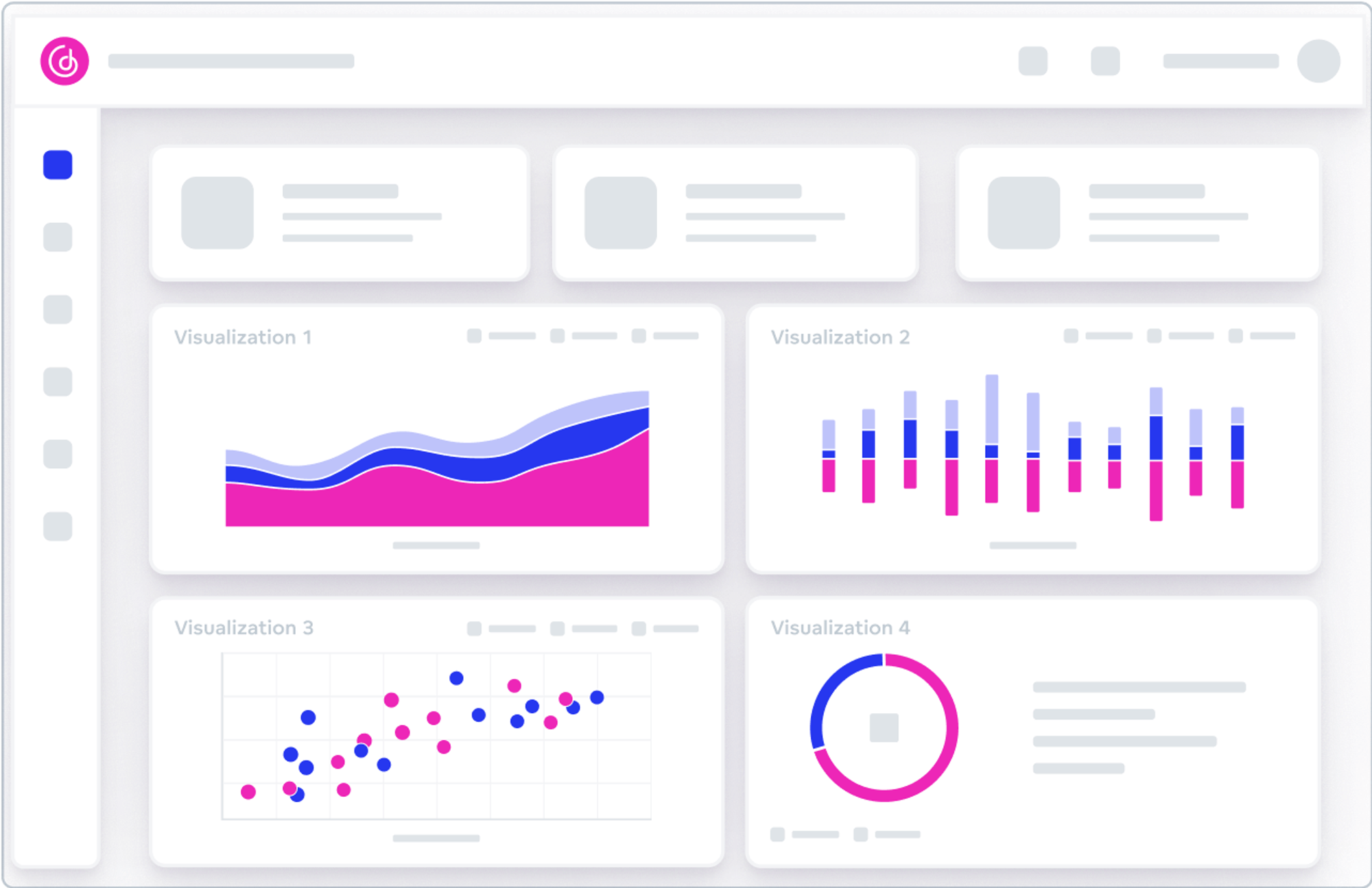
Any discussion of the meaning of data visualization would be incomplete without a mention of creating dashboards. It is important to note that although data visualization and dashboards are closely related they are not in fact the same thing. The aim of a dashboard is to offer an overview of the key performance indicators (KPIs) of the presented area. Typically a dashboard will contain multiple visualizations, which together provide an overview of the key insights — as shown in the image below.

A dashboard containing four visualizations.
Why Is Data Visualization Important?
Data visualization helps to ensure data insights aren’t lost in delivery; most of us can’t process big blocks of statistics, our brains aren’t built like that. Anyone who has looked at a long list of numbers will understand the disconnect this can cause. Graphical representation solves this pain point by making statistics and data easier to absorb.
Data visualization is not only about creating simple and attractive visuals. It can be used to create insights by identifying patterns and trends that would otherwise be difficult to spot. Displaying a set of data on a scatter plot, for example, might reveal connections between outliers that previously went unnoticed when the statistics were in a table.
Data visualization is also an important business intelligence (BI) tool, allowing companies to effectively communicate their data and improve decision-making. High-quality visualizations can help an organization promote a data culture because the insights needn’t be explained to non-technical end users. Decisions can be made with increased accuracy and speed because everyone is on the same page. As well as improving internal processes, visualizations help to increase external engagement by making the data more accessible to partners and customers.
Types of Data Visualization
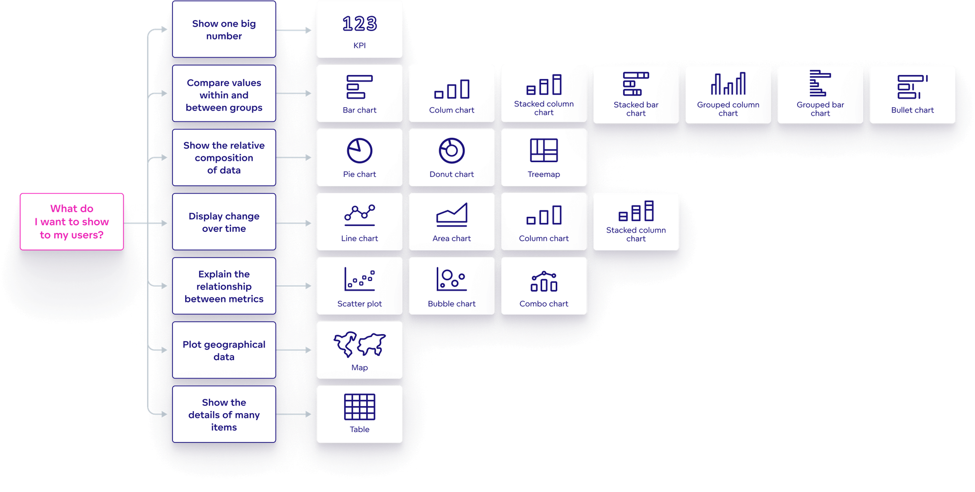
There are different types of visualizations to choose from, and each is better suited to showcasing certain attributes and metrics. It is important to use the visualization that makes the most sense for the insights you aim to convey. Below is a brief overview of the visualizations you might choose for some typical scenarios. For more on this, check out our post on how to choose the best chart type to visualize your data.
There are instances when you may need to display one key figure, for example, the number of customers, or the number of returned items. A KPI visualization is best suited to this purpose because it shows one big number. However, this number will mean nothing on its own; you have to, at the very least, provide a date range and compare it with another metric to give it some context.
To show comparisons between categories, for example, the number of sales each staff member has made in the last month, it is best to use a bar chart or column chart. A stacked bar chart gives you the option to add another category, so as well as showing how many sales each staff member has made, you might also include the product type they sold by adding color and a key.
When comparing parts to the whole it is best to use a pie chart, donut chart, or treemap. An example of part-to-whole comparison is the number of people who answered ‘yes’ or ‘no’ to a specific question. Generally speaking, it is a bad idea to use a pie chart or donut chart for more than three categories because it becomes difficult for users to accurately absorb the data. With more categories, it is better to use a treemap.
To show changes over time the most effective options are line charts, area charts, or column charts. You might, for instance, choose one of these to display month-by-month revenue. If you want to add an additional category (such as product type) you can use a line chart with multiple lines or a stacked area chart. But it's best to tread carefully with these because they can become confusing if not properly executed.
To show the details of many items it is best to use a table. Some people avoid using tables because they seem too basic, but when you have many items (such as a lot of customer details) a table can be the right choice. Amid the myriad of visualization options available, tables can be quite striking when combined with other types of charts and graphs on a dashboard.

Visualization types and how to use them.
Out-of-the-Box Visualizations
Most analytics platforms offer out-of-the-box visualizations that you can use to display your data. Out-of-the-box refers to the standard visualizations available to all customers who have purchased the BI tool. These options typically include tables, column charts, bar charts, line charts, donut charts, etc. Not all out-of-the-box offerings are created equal, so when choosing a BI tool, it is helpful if it has at least some of the following capabilities:
- An interface that makes it easy to change metrics, dimensions, or data visualization types from the out-of-the-box options, such as drag-and-drop.
- The ability to add filters and drill into visualizations.
- The option to adjust certain aspects to match your brand, for example, fonts, colors, and logos.
- The potential to populate visualizations with live data.
Fully-Customized Visualizations
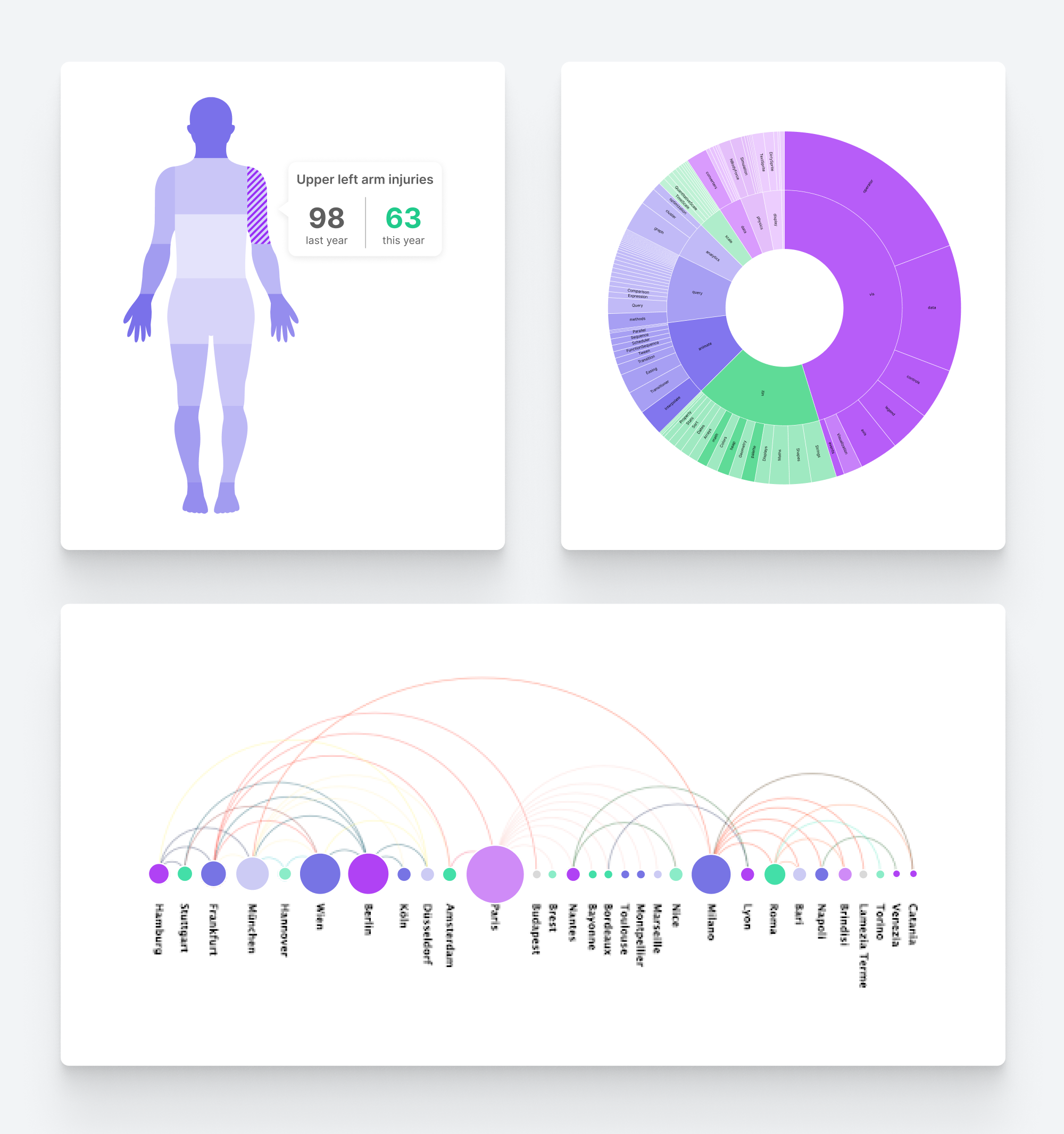
While you can do plenty with out-of-the-box visualizations, your options are limited to the standard charts and graphs that come with the tool. For this reason, you’re often better off with a solution that allows you more creative options. With custom visualization, you can tailor your visualizations to your exact needs. You are no longer limited to standard chart types, and the only barrier to creating highly original visuals is your imagination.

Examples of fully-customized visualizations
A good analytics platform achieves custom visualization by enabling access to third-party charting libraries, such as D3.js, Chart.js, Fusion Charts, Google Charts, and more. These libraries are the best route to creating advanced visuals that are graphically amazing.
Want to see what GoodData can do for you?
Get a guided tour and ask us about GoodData’s features, implementation, and pricing.
Request a demoWhat Is Real-Time Data Visualization?
With real-time data visualization, users can see the data changing as it is being updated or generated. For example, they might see the height of bar charts changing, or colors adjusting themselves on a heatmap.
To create this kind of visualization, a company needs the ability to perform real-time data reporting. In other words, their data architecture must operate in real-time to build up-to-the-minute visuals. This architecture includes components such as data processing, data streaming, and all the logic of the defined analysis that leads to the displayed insights.
Real-time analytics and their visualization can be crucial under certain circumstances. On other occasions, this can be unnecessary and even confusing. Before deciding whether to employ automated real-time visualization, a company might ask themselves the following questions:
- Do we really need to see in-the-moment data to make decisions?
- Do we have enough new data at frequent intervals to necessitate real-time updates?
- Will these instant updates make our decision-making processes more confusing and create delays?
- Will real-time visualization help our users, i.e., what value will they get from the live updates?
Based on the above questions, scenarios where real-time visualizations may be beneficial include:
- Security and fraud prevention, e.g., when monitoring for major security breaches.
- A situation where a company needs to act promptly to a crisis.
- Goal monitoring (but only if these goals are affected by rapidly changing information)
- In financial teams – where it is crucial for team members to receive up-to-the-minute financial information (for example, stock markets).
Below is an example of real-time visualization in action:
What Is Interactive Data Visualization?
On the surface, interactive data visualization tends to look similar to regular (or static) visualization. The difference is there is an option to click a button or move a slider, so the user can interact with the data, rather than just look at it. This ability to manipulate charts, graphs, and maps can positively influence user experience (UX).
Sometimes interactive features are custom-designed for a specific purpose, but generally speaking, the most common interactive features are:
- Filtering: Allows you to filter for the exact information required, highlighting the relevant data and reducing the data that is currently unimportant.
- Drilling: Enables you to move between different visualizations and send an action from the dashboard.
- Zooming and panning: Creates the possibility to hone in on a particular detail; you can zoom in on a specific part of the visualization and pan across it.
Interactive features can be extremely useful, for example, when users quickly need to answer specific queries, which is why they’re often used in BI reports. However, there are also times when a static visualization might be the best choice; for instance, when visualizations need to be printed and shared as reports, or when it is unnecessary for users to manipulate the information and all they need to do is to look at it. For more on this, check out our article that compares interactive and non-interactive visualizations using the example of world happiness levels.
Advantages and Disadvantages of Data Visualization
While there are huge benefits to visualizing data, if not done properly the technique can spread misinformation. Below we look at some of the main advantages of data visualization and how to mitigate its downsides.
Benefits of data visualization
- Easy to spot trends. Visualization allows users to see patterns in the data they might otherwise have missed.
- Simple sharing of information. It is far easier to share data with charts, graphs, and infographics.
- Makes data accessible to non-technical users. With visualization, you no longer need to be a mathematician to understand the data insights.
- Easy to remember. Charts and graphs are not only easier to digest; they also tend to stay in the memory more easily than lists of numbers and statistics.
- Increase revenue. When all the decision-makers have the information at their fingertips, it empowers management to make quick and accurate decisions.
Problems with data visualization
- Information still needs to be accurate. Great visualizations don’t make up for bad data. If best practices are not followed then visualizations can fall into the trap of becoming style over substance.
- Data visualization is an investment. Companies that want to effectively organize and visualize their data, or provide this ability to their customers, will either need a lot of involvement from analytics engineers (if they have the resources)), or an integrated analytics solution. Neither of these options comes without its costs, and pricing can vary depending on requirements. This then raises the question of whether to build the analytics solution in-house or buy off the shelf.
- Correlation does not equal causation. Visualizations often show the correlation between two or more metrics, so users often assume causation. But just because there is a correlation it doesn’t necessarily mean that one is caused by the other. There may be several other factors at play that aren’t included in the visualization.
- Users can still misinterpret the information. While visualization makes it easier for users to absorb data, it is still open to misinterpretation. For example, users might focus on the wrong thing when viewing it. This once again highlights the importance of using the right visualization type for the data displayed and the desired outcome.
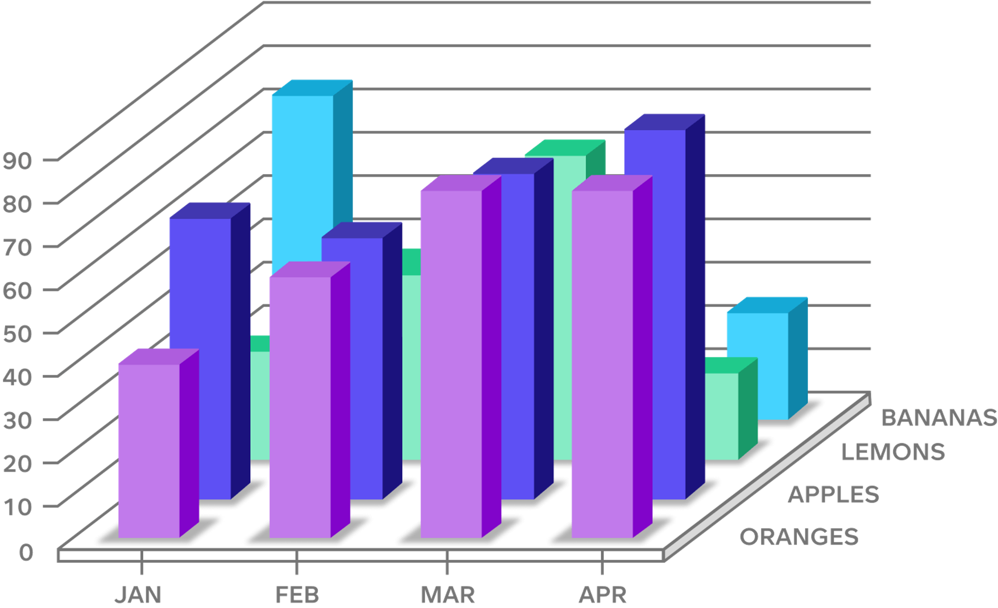
- Confusing visualizations. Visualizations are supposed to simplify data, but if done badly they can make matters even more complicated. Perhaps the wrong chart type has been chosen, or there is too much information — as in the picture below.

An example of a confusing visualization.
What Tools Do I Need for Data Visualization?
The tools required to visualize data will depend on the project and the complexities of what you need to achieve. If you’d like to visualize some basic data for a presentation, you can use Excel to create some simple charts and graphs. If your data is more complex, you’ll need to create the insights first, which may involve data analysis or data mining. To achieve this, you will likely need to learn a programming language like Python. Alternatively, you can invest in a BI solution(s) such as those listed below.
- Chart generators or plugins: These tend to be used by developers and data engineers because the software requires a more advanced level of expertise. The plugins have many visualization types to choose from and there may even be a data-processing API that allows you to create actionable insights from your data. These tools usually have the capability to categorize and analyze basic data, and so can be used as the foundation of a company’s BI platform.
- Visualization reporting software: This is most often used by report developers and BI engineers. The software creates business and data analysis reports, which can then be turned into visualizations using a selection of built-in charts.
- A fully integrated BI and analytics solution: As the name suggests, this is the most complete solution. A good BI platform will allow you to easily explore data on your own, and create interactive dashboards and charts via a user-friendly no-code UI. The top solutions offer plug-and-play integrations, no-code tools, and flexible embedding options (such as React, Iframes, and Web Components) that allow you to seamlessly embed visualizations and dashboards into your product in a way that matches the brand.
To find out more about some of the best BI solutions with visualization tools, check out Gartner’s Magic Quadrant, which provides an objective analysis of the market leaders.
Examples of Data Visualization
Data visualization has become so omnipresent that we use it every day without even noticing. Weather maps, bus schedules, computer audio levels, and fitness trackers – all employ visualizations to provide information in a more palatable way.
The above are just some of the ways companies use customer-facing visualizations to improve UX. But they also call upon data visualization to make internal decisions, for example, when looking at how to improve the supply chain, checking product sales across different countries, or how a specific marketing campaign or project is performing. Data visualization is also useful to get a better sense of external factors that might impact the company, such as the economic climate.
Data visualization use cases across different industries
Data visualization is used across all industries, from banking to healthcare. Below we look at how it can be used to improve processes in four different sectors.
- Software as a service (SAAS): Data is the beating heart of most software companies, and many of these embed analytics into their applications. They can then share the data with their customers through visualizations in a user-friendly way. A good example of this is Zendesk, whose software is all about improving the relationship between a business and its customers. Using advanced analytics and visualization tools, Zendesk gives their customers immediate access to the insights they need, which in turn speeds up response times and increases satisfaction among the clients of their customers.
- E-commerce: Data visualization helps brands and suppliers streamline their logistics and supply chains and optimize their operations. An e-commerce platform might use visualization to both improve the consumer experience and optimize brand performance. They could, for example, use their data to get a better understanding of how shoppers are using their site, helping them to better target customers and grow their business. Visualization is necessary to share these customer insights both internally and externally.
- Financial services: Financial firms leverage data and analytics to meet compliance requirements, manage risk, improve efficiency, and grow their business. Time is money, so the quicker they can make insights available to their employees and partners, the better. Visualization can also be used to help mitigate risk in real-time, and create highly personalized experiences for customers within financial service products.
- Insurance: Insurance firms rely on analysts to create impactful insights. These insights are then shared across the enterprise with people such as adjusters, underwriters, and marketers. Data visualization is crucial for insurance companies as it allows them to present clear insights, increase speed, and reduce inaccuracy.
Data Visualization Best Practices
With the right analytics platform, it is easy to create insights from your data and beautifully visualize them on dashboards. So why do some visualizations fail to achieve what they set out to do? The simple answer is that you need to be intentional about the information you want to convey. Good data visualization requires thoughtful human design. To that end, it can be useful to ask yourself the following questions to ensure best practice.
- What story am I trying to tell?
Visualization is a form of storytelling, only you’re using visuals instead of words. You need to find a clear way to tell the story to ensure it has the greatest impact. Data metrics and attributes must be relevant to the story that you are trying to tell. If you’re allowing users to filter, consider carefully how this will allow them to create their own stories from one source of truth.
- Have I designed the visualization for the viewer’s eye?
Once you’re clear on who the visualization is designed for and what you want them to take from it, you can focus on UX. Big-picture clarity is crucial, but it’s important not to neglect the details either. For example, what do the colors you’re using mean? Red usually implies danger, green is considered more positive. Can you customize the visualization to fit the brand? What about shortening numbers to make them easier to read (e.g., using K, M, B for thousands, millions, billions)?
- Am I trying to display too much data?
When it comes to data visualization, less is more. Although it’s tempting to present as many insights as possible, there is a fine line to be walked between insightful and overwhelming.
- Have I provided context?
Without a goal or a benchmark, users may miss the key insights. It is important to standardize benchmarks so that comparisons are not being made between two different things – which can lead to misleading takeaways.
The above are just some of the questions you might consider when creating visualizations. For a deeper dive, check out our article on visualization best practices.
Ready To Get Started With Data Visualization?
Our analytics platform allows you to fully integrate real-time customized dashboards into your app or product. To see how this works and get your questions instantly answered, book a demo to help you decide whether this is the right tool for your needs. Alternatively, for some first-hand experience with data visualization, sign up for a free GoodData trial.
Discover More About Data Visualization
To learn more about data visualization and how it can help your business, you might like to check out some of our other resources:
Interactive vs. non-interactive data visualizations
7 ways to create great data visualizations
Want to see what GoodData can do for you?
Get a guided tour and ask us about GoodData’s features, implementation, and pricing.
Request a demoWritten by Tom Czaban |

