Supercharge Your GoodData Dashboards: Harnessing Plugins for Custom Visualizations and Beyond
4 min read | Published


GoodData offers an impressive range of built-in visualizations, but we also understand that sometimes you need a unique spin, so we focus on Composability to really push your business potential. GoodData Dashboard Plugins let you go beyond the standard set of features. Want to enhance storytelling of your data with a specific visualization that isn't included by default? No problem! In this post, we'll walk you through how to add a radial bar chart to your dashboard using a plugin from an open-source repository.
If you're interested in developing a plugin from scratch, be sure to check out our other post, How to Develop Your First GoodData Dashboard Plugin. This simple guide will walk you through the process of creating your own custom plugins.
Prerequisites
Before we get started, here's a checklist of the skills you'll need:
- A basic understanding of Git and package managers like npm or yarn
- Basic knowledge of the React JavaScript library
- The ability to deploy files to public hosting (for instance, Amazon's AWS S3, which has a free tier for new users)
You will also need a GoodData Workspace. If you're new to GoodData, you can set up a trial instance in under two minutes. Head over to gooddata.com/trial, click on 'Try it now', enter your email, verify your account, and you're good to go. We'll set you up with your own cloud-based GoodData platform, thanks to our modern microservice cloud architecture.
To get you up and running quickly, you can use our demo instance during the trial period. It connects to our data source and lets you create metrics, dashboards, and insights. For now, you can use the predefined ones and discover the versatility of creating analytics with GoodData later.
Want to see what GoodData can do for you?
Get a guided tour and ask us about GoodData’s features, implementation, and pricing.
Request a demo5 Steps to Apply a Radial Bar Chart to Your Dashboard
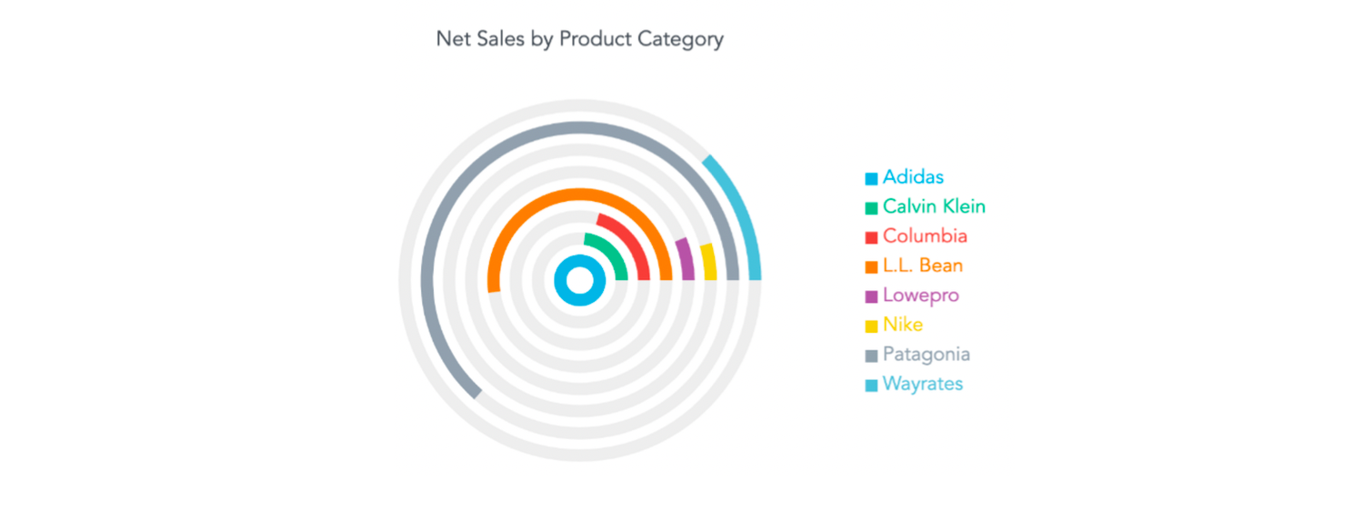
Why a radial bar chart, you might ask? While they might not be as popular as other chart types, they're a great way to present hierarchical data, show cyclical or seasonal trends, or represent large categorical data sets.
Step 1: Set Up a Column Chart in the Dashboard
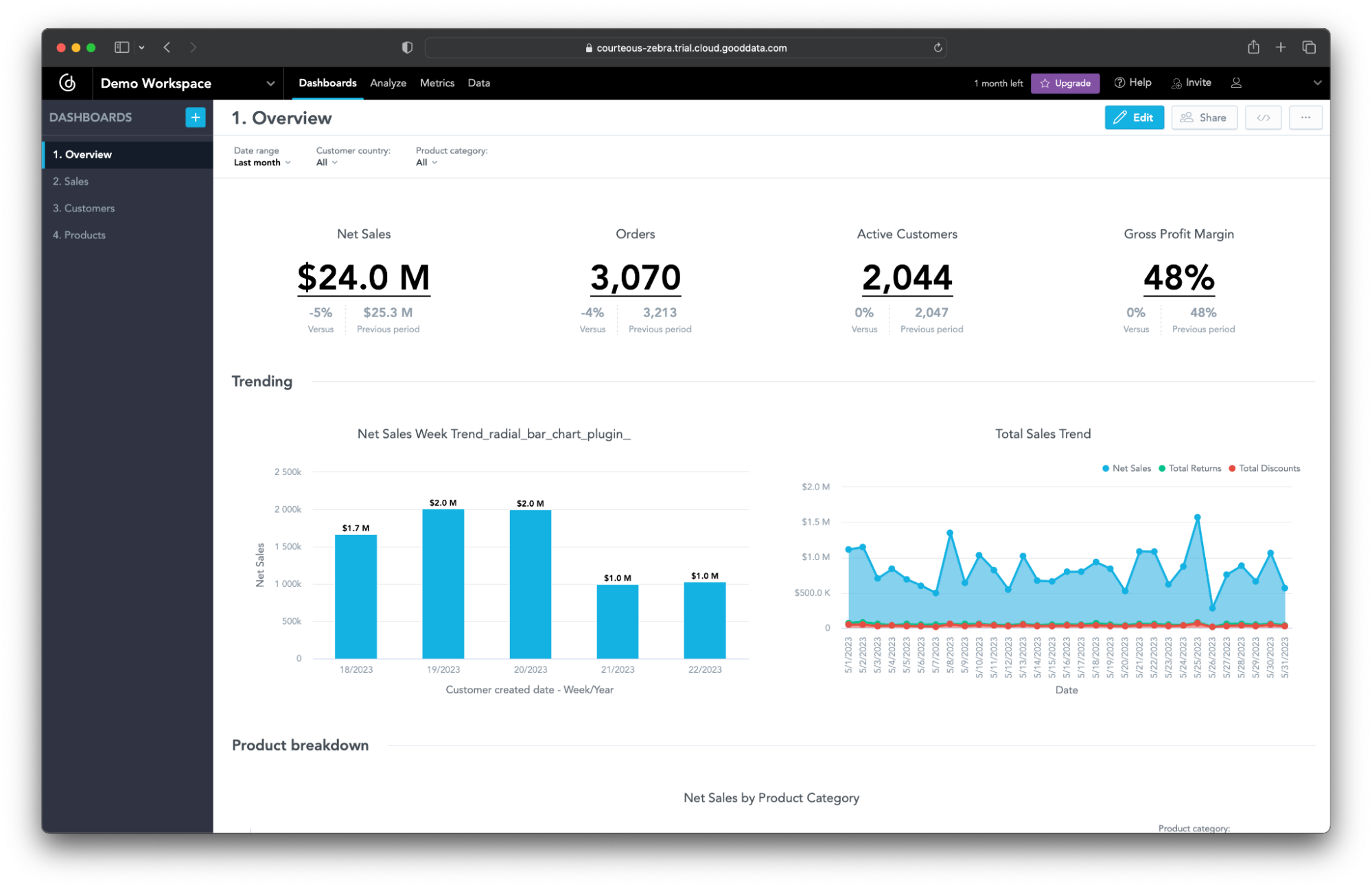
To kick things off, head over to your GoodData trial instance and get ready to create some insights to display in your shiny new radial bar chart. The plugin is designed to enhance column charts, so start there: create a new column chart visualization in our Analytical Designer, save it, and then add it to your dashboard. Make sure to add _radial_bar_chart_plugin_ to the end of the widget title in edit mode — this lets the plugin know that this is the chart it should be enhancing.
Step 2: Run the Plugin Locally
Next up, clone the public repository that contains the radial bar chart plugin (you'll find it in a folder named radial_bar_chart_plugin).
You'll need to add some details to the .env file – the BACKEND_URL, your WORKSPACE_ID, and the DASHBOARD_ID. If you're not sure where to find these, they're all in the URL of your dashboard page:
<BACKEND_URL>/dashboards/#/workspace/<WORKSPACE_ID>/dashboard/<DASHBOARD_ID>
There's one more thing you'll need to do before you can start playing around with your plugin – update the TIGER_API_TOKEN in the env.secrets file. You can find this in the personal access token section of the settings in your GoodData trial.
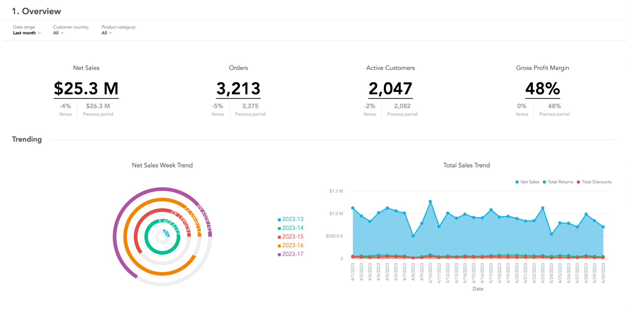
Once you've updated the .env and env.secrets files, run npm install to set up your dependencies then npm start to start the development server. You should now see your dashboard, complete with plugin, at https://localhost:3001/.
Step 3 (Optional): Enhance the Radial Bar Chart
To enhance the plugin, navigate to RadialBarChart.jsx and uncomment the label in the RadialBar component. Each bar should now render a value. As the plugin uses the Recharts library under the hood, you can refer to the Recharts API documentation for more chart tweaks.
Step 4: Build and Link the Plugin
When you're happy with how your radial bar chart looks in the development environment, it's time to set it up in your GoodData trial instance. First, stop your development server, then do npm run build-plugin. After that, upload everything in the /dist/dashboardPlugin folder to your public blob storage (in our example, that's AWS S3).
Take the URL that ends with dp_radial_bar_chart_plugin.js using npm run add-plugin, then copy the object ID that appears in the terminal message similar to this one “Created new plugin object with ID a8682044–3c57–4daf-9b00–05b082a3450”. You'll need this to link the plugin object ID with the dashboard using npm run link-plugin.
If you need a bit more detail on these steps, check out the README.md file in the plugin folder or our previous post where we focused more on these steps.
Step 5: Enable the Plugin in GoodData
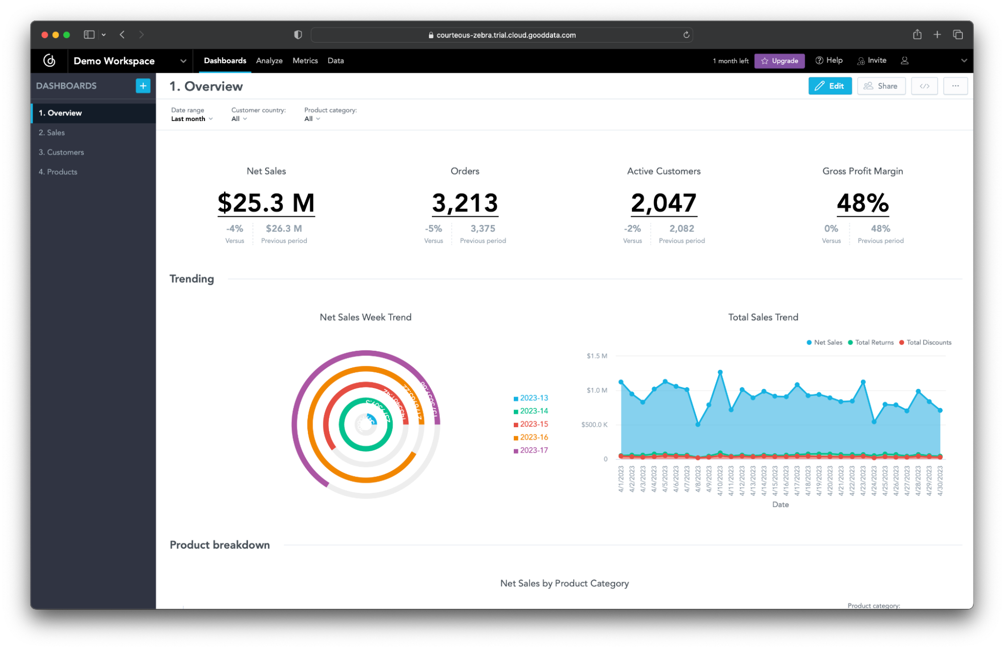
To finish up, head back to your GoodData trial instance, navigate to the CSP settings, and add the domain URL to the script-src directive. We prioritize the security of our products, which is the reason why we have included this step to whitelist your plugin in the content security policy. Refresh your dashboard, and there it is: your custom radial bar chart, integrated beautifully into your GoodData dashboard.
Conclusion
We hope you've found this exploration of GoodData Dashboard Plugins enlightening. The beauty of GoodData Dashboard Plugins lies in their versatility. They're not just for visualizations: they let you create custom filters, integrate rich content, even bring in third-party or custom code. With this kind of power and flexibility at your fingertips, the possibilities for optimizing your data analysis and decision-making are virtually endless.
If you're curious and eager to experience this first-hand, don't hesitate to start your free trial at gooddata.com/trial. With a few clicks, you'll be ready to explore the world of custom plugins on your own GoodData platform. Remember, the possibilities are limitless.
What are some specific use cases you find for custom visualizations like the radial bar chart in your data storytelling? We'd love to hear about your experiences in the comments section below.
Happy experimenting! 🧪
Want to see what GoodData can do for you?
Get a guided tour and ask us about GoodData’s features, implementation, and pricing.
Request a demo
