Six Principles of Dashboard Information Architecture
6 min read | Published

Summary
This article outlines six concrete principles (structure, navigation, hierarchy, grouping, labeling, and filtering) to help designers craft dashboards that feel intuitive and effortless. Rather than focusing solely on individual visual components, the article shows how these elements should be orchestrated so users can navigate dashboards naturally, understand the prioritization of information visually and logically, and quickly hone in on meaningful insights.
Information Architecture
Information architecture is a crucial element in designing an outstanding dashboard. A well-designed dashboard has a clear and intuitive way of organizing and presenting data, making it easy for your users to find what they're looking for.
In the previous article, I talked about choosing the correct chart types for your data — about the individual pieces you use for building a dashboard. In this article, I’ll tell you how to put those pieces together.
Do you remember playing with LEGO bricks? You can put them together in endless ways to build a beautiful dinosaur or a sleek spaceship. But if you don't know your bricks well and don't know how they fit together, an ugly abomination is born. And the same principle applies when building dashboards out of charts.
Information architecture should be intuitive and logical, making it easy for users to find the information they need. It is driven by several key principles:
- Structure: How the information is distributed among separate dashboards. The structure typically follows logical or business areas but can also be defined by specific user needs or company processes.
- Navigation: Users should be able to move between different dashboards or different dashboard sections with ease. This includes global navigation components like menus and local or contextual navigation elements like tooltips, links, and drills.
- Hierarchy: Visual and logical hierarchies must work together to create an effective and user-friendly design.
- Grouping: Similar information should be shown together, allowing users to compare and contrast different metrics and trends quickly. Group the information onto separate dashboards or concentrate them into sections on a single dashboard.
- Labeling: Labels should be clear, concise, and maintain consistency between individual charts and dashboards, making it easy for users to understand what each metric or trend represents.
- Filtering: Dashboards should allow users to filter out the displayed information so that they can focus on the most relevant information.
Want to see what GoodData can do for you?
Get a guided tour and ask us about GoodData’s features, implementation, and pricing.
Request a demoStructure
Dividing information between different dashboards allows users to focus on a specific set of data or metrics and helps avoid overwhelming the users by dumping all of the information on them at once. A good structure allows users to grasp the available breadth of the information first, and then it allows users to focus on the area of interest and get into the depth of the information.
Remember that following a logical information structure might not be enough in some cases. The structure has to meet the needs and goals of the actual user. By carefully considering how information is divided and presented, you can create dashboards that are focused, relevant, and easy to use.
Let’s look at modern support center analytics as an example. These days, support centers accept calls, emails, and messages through various channels. Putting all those metrics together could be quite overwhelming, and some of them are hard to compare on the same scale; A phone call could be resolved in seconds or minutes, but an email conversation can last for hours or days. Or the waiting time, which is an important metric for phone calls, and the sentiment of the message for emails.
This problem could be solved with an overview dashboard for common metrics like the number of created or resolved tickets or customer satisfaction, with the ability to drill into separate dashboards for specific support channels like phone calls or emails.
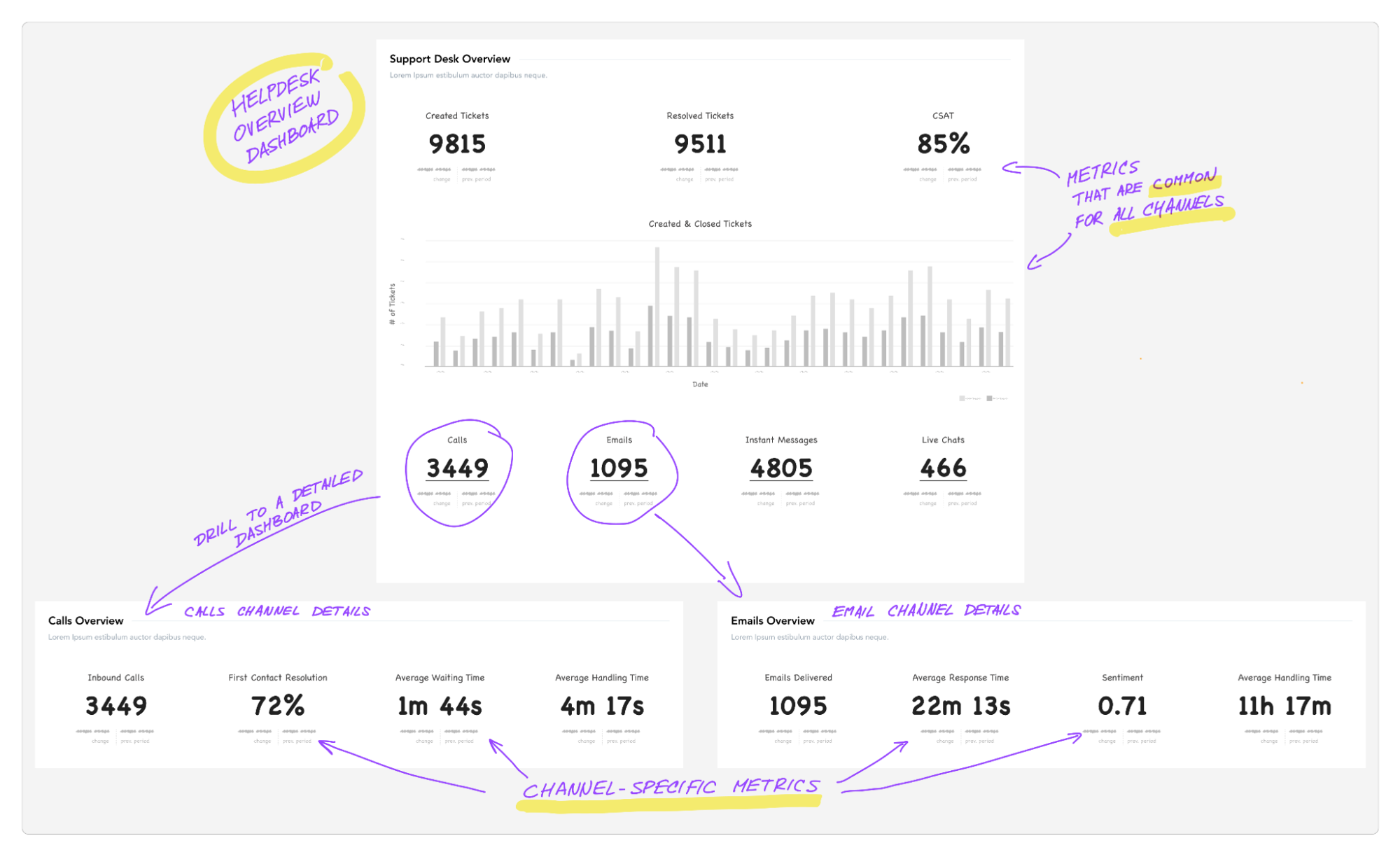
The proper structure of dashboards allows users to understand both the width and the depth of information.
Navigation
Navigation is an important aspect of information architecture, as it allows users to efficiently move around the dashboard and access the information they need. There are several different types of navigation that you can work with on a dashboard:
- Global navigation consists of navigation elements that allow users to move between different dashboards or their tabs, for example, a list of dashboards.
- Local or contextual navigation refers to the smaller interactive elements all around the dashboard. Examples of these include tooltips, links, or switches allowing the change of the metric in the chart.
- Drills are a dashboard-specific type of interaction that allows users to explore selected data points in more detail, in a different view, or in a different context. For example, a user might start by looking at sales data for a particular region and then drill down to see sales data for individual cities within that region.
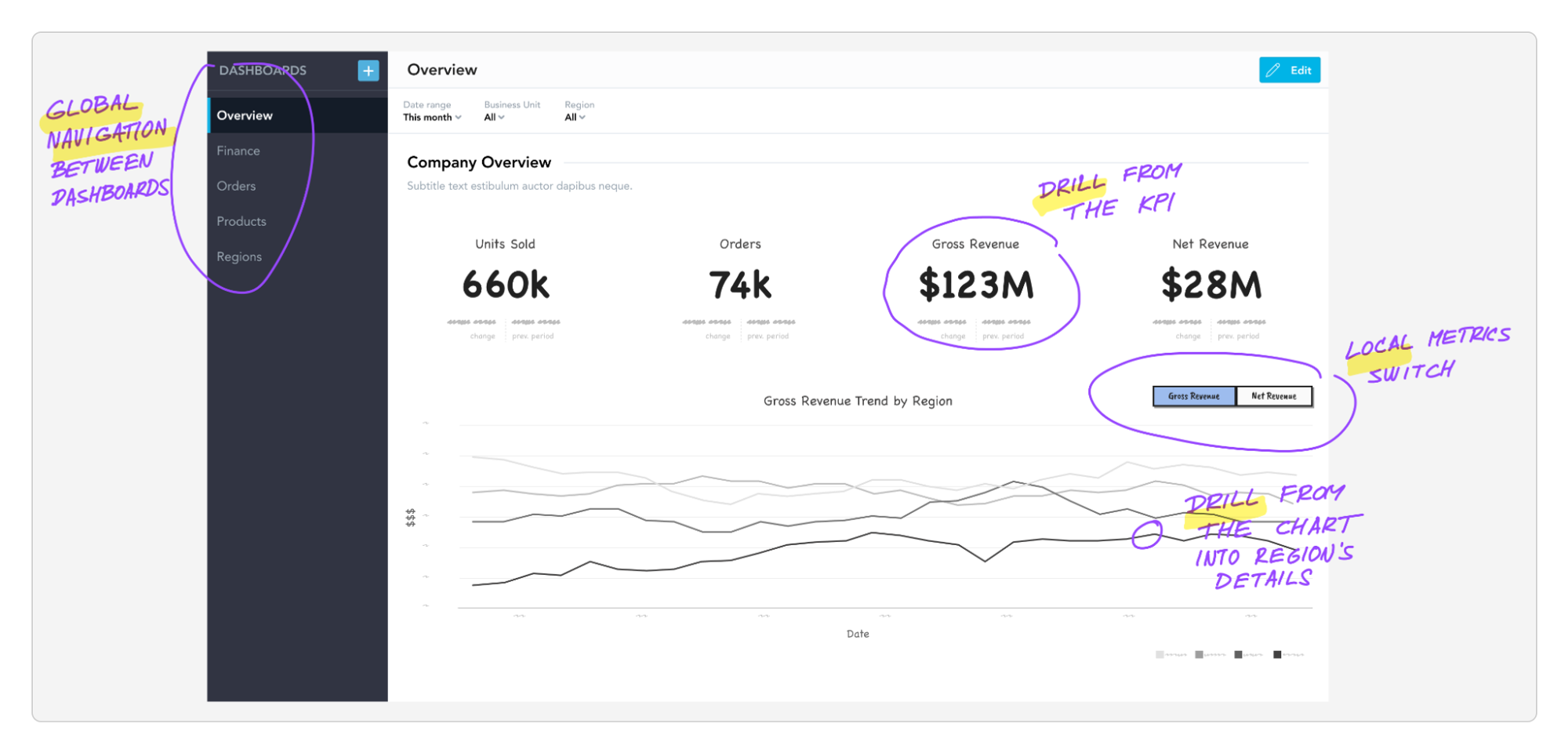
Navigation on dashboards is not just about global navigation but also local menus, switches, and primarily different types of drills.
Hierarchy
Hierarchy refers to how the information is organized in a logical and visual manner in relation to each other. A good hierarchy allows users to quickly and easily identify the most important information and explore more details as needed.
A logical hierarchy refers to the organization and arrangement of information based on its significance or importance. It is determined by the relationships and connections between different pieces of information — you can imagine it as a tree-like structure. For example, a dashboard might have a top-level overview that shows key metrics and trends, with the ability to explore more detailed information for each metric.
A visual hierarchy is the arrangement of elements on a dashboard that guides the user's attention through the most important elements on the page. It is determined by the size, color, position, and other visual characteristics of the elements.
Visual and logical hierarchies must work together to create an effective and user-friendly design. If they work against each other, the dashboard becomes cluttered and hard to understand because the organization of the information (the logical hierarchy) is not aligned with how the user's attention is drawn to different elements on the page (the visual hierarchy).
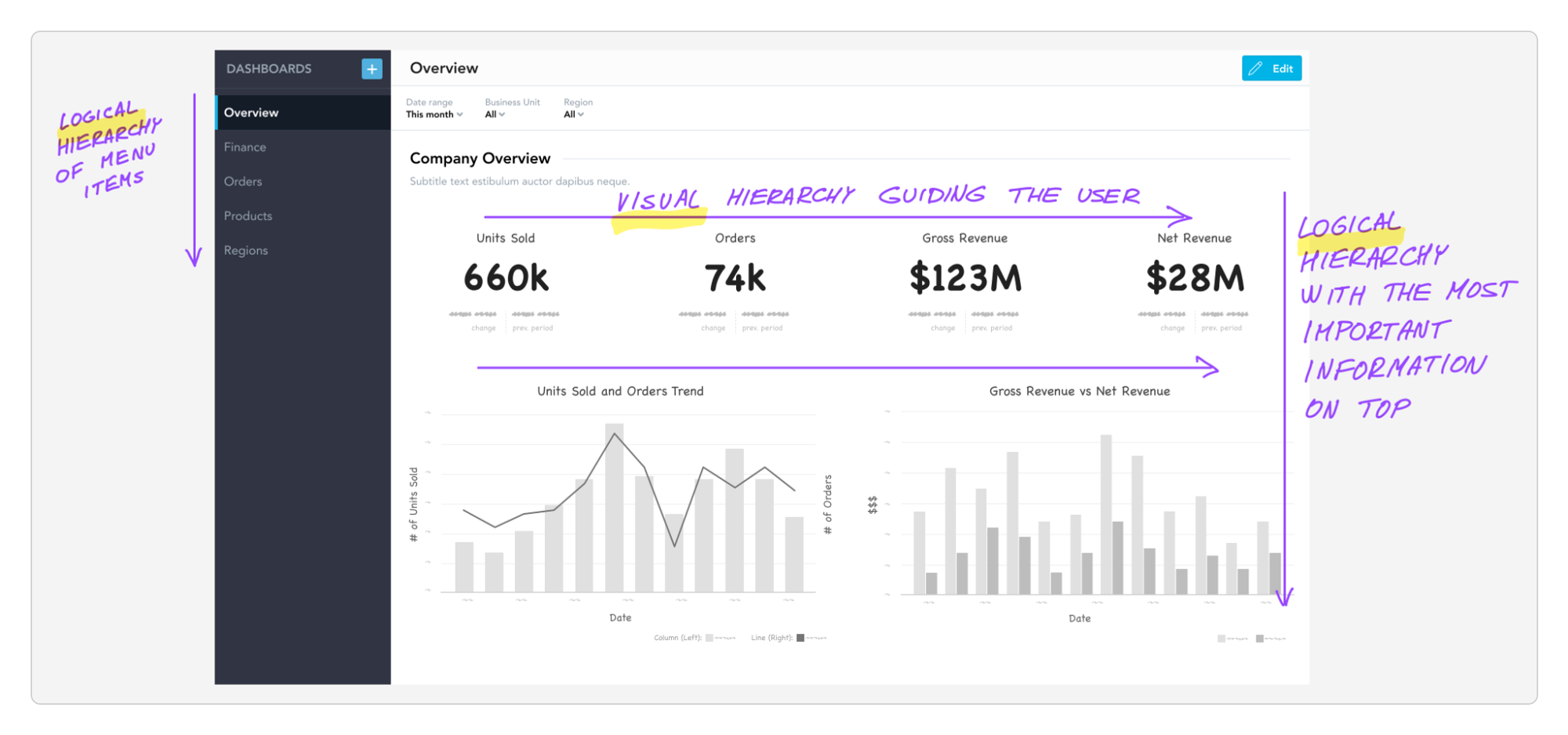
The visual hierarchy guides the user's attention, while the logical hierarchy helps them understand the presented information.
Grouping
Grouping refers to the way similar information is organized together on a dashboard. It is used to help users quickly and easily compare and gain insights from different metrics and trends shown together.
For example, a financial dashboard with several distinct sections for showing all revenue metrics together, all expense metrics together, and all profit metrics together. This allows users to get various insights about the whole area.
Another common way to use grouping on a dashboard is to group different metrics or trends by category. For example, a customer's dashboard with a group of metrics that is repeated for every customer segment, such as first-time customers, active customers, or high-value customers. This allows users to easily compare metrics between the customer segments, and identify trends and patterns.
Let’s look at the grouping by category as an example of a customer's dashboard below. All segments share the same metrics and visualizations, which are repeated for easy comparison between the groups.
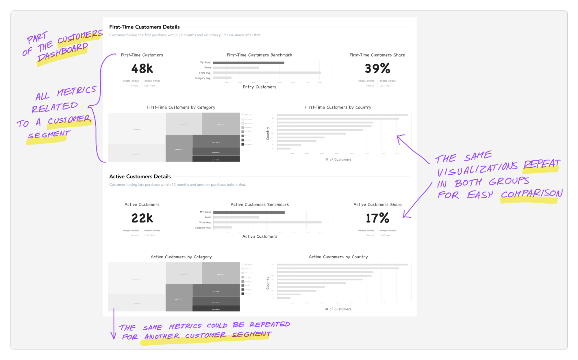
Grouping of metrics allows users to compare, for example, different customer segments.
Labeling
You can have the greatest dashboard in the world, but without clear labels, it's just a pile of charts without any meaning. Labeling is a crucial aspect of dashboard design, as it helps users to understand and interpret the data displayed and provide the context. With clear labels, users can easily find the information they are looking for, and they are able to quickly parse through the different sections of the dashboard.
Another important benefit of correct labeling on dashboards is that it helps to make the data more visually appealing. By using clear, concise, and consistent labels, users can easily scan the dashboard and quickly understand the information being presented. When thinking about labels, avoid abbreviations and technical terms, as they can be confusing for users.

The different types of labels a simple column chart may have.
Filtering
It's great to have a bird's-eye view of your data, but often it's crucial to be able to dig into the details and figure out what's wrong. That's where filtering comes in handy. In the world of dashboard design, filtering is like a treasure map, narrowing down the area in which to dig for insights.
Filters allow users to refine the data displayed on the dashboard so that they can focus just on the specific piece of information that is most relevant to them.
A common approach to filtering is to use drop-down menus that allow users to choose specific criteria for the data they want to see. Another approach is to use interactive elements, such as buttons or sliders, that enable users to dynamically change the data displayed. The following example shows a company-wide overview dashboard which can be filtered down to any level of detail currently necessary.
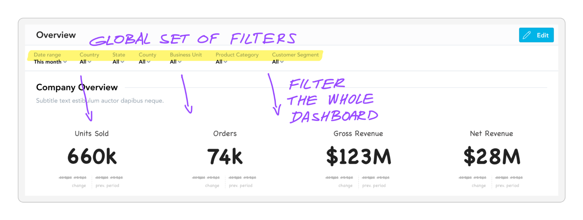
Filtering can change a company-wide dashboard into a hyper-focused view of a single country, business unit, product category, and customer segment.
Wrapping Things Up
The information architecture of a dashboard is a critical element of its design. Well-designed information architecture should be intuitive and logical, allowing users to roam around freely and making it easy for them to find and understand the information they need. If done correctly, the usage of the dashboards becomes so natural that the information architecture is almost invisible. By keeping the aforementioned principles in mind, you can create effective and engaging dashboards that help users make well-informed decisions.
Interested in trying it for yourself?
If you want to put any of these principles to work, why not register for the free GoodData trial and try applying them yourself?
Want to see what GoodData can do for you?
Get a guided tour and ask us about GoodData’s features, implementation, and pricing.
Request a demoFAQs About the Principles of Dashboard Architecture
A clear structure organizes content so users can predict where to find information. It reduces confusion and allows data to be scanned quickly, making dashboards easier to use in everyday decision-making.
Good navigation ensures users can move smoothly between sections and understand how information connects. It keeps them from feeling lost and helps them follow a logical flow through the data.
Hierarchy highlights the most important insights first and pushes supporting details further down. This prevents information overload and directs attention to metrics that matter most.
Grouping related information together makes comparisons easier and patterns more visible. It also reduces the effort needed to connect ideas that belong to the same context.
Labels that are simple and precise help users immediately understand what each metric or chart represents. Clear labeling eliminates guesswork and ensures consistency across the dashboard.
Filtering is most effective when different users need to look at the same data from different perspectives. It allows each person to focus on their own priorities without losing the overall structure of the dashboard.

