Machine Learning in Dashboards


The Next Big Step for Better Informed Decisions
Have you ever seen a dashboard and thought to yourself that it would be nice to be able to use machine learning to get more out of your data? Well, I have. I always had the idea that when working with data, no matter the environment, you should have the power to manipulate it, to always see more, and to be one step ahead — dashboards included.
However, there is one small caveat when it comes to dashboards. They are visited by people with various skills — data scientists, business analysts, business executives, and managers. This means that there is no one-size-fits-all solution.
Right now, I’m working on the private beta for machine learning in dashboards, within GoodData. Currently, there are two possible use cases on the table:
- A one-click solution tailored for business users
- Hands-on experience in Jupyter Notebook for the tech-savvy
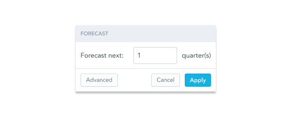
The one-click solution is pretty straightforward. Picture this: you're a business person who just taps a button, tweaks a couple of parameters for the algorithm, and voilà! You've got yourself a forecast for next quarter.

Is the One-Click Approach Perfect for Everyone?
No, of course not. The one-click experience should be viewed as a quick peek into the data rather than a robust tool. ML is often very sophisticated and requires many steps before you can really benefit from it. When you input garbage, you get garbage back. But hey, you can always roll up your sleeves, clean up that data, give it a little polish, and set yourself up for some smarter outputs.
To do this, you need to have the data on hand and know your way around it. Ideally, this will be part of the transformation process. But sometimes, you can’t change the data flows to the BI tool. In that case, you can still fetch the data and use something like pandas in Python to get it into shape.
For the second use case, if the one-click experience is insufficient, you can open up a Jupyter notebook directly in your dashboard to work with the data firsthand. This means you can retrieve a dataframe from any visualization and, for instance, change the ML algorithm or normalize the data beforehand.
While working with the data, you can of course utilize various libraries to visualize it and work with it more easily. Afterwards, you can send the modified data back through the API to see it in your dashboard. That way, Jupyter notebooks break the barriers between data visualization and data science, making machine learning not just another tool, but an integral part of informed decision making.
For us, the guiding principle is accessibility for all, from beginners to seasoned data professionals. That's why our Jupyter notebooks are designed to follow a 'happy path,' providing clear explanations at each step. This ensures that, right out of the box, the results you get from the notebooks align seamlessly with those from the one-click solution.
This integrated approach eliminates the need for context-switching, allowing you to concentrate solely on the task at hand. You'll also have the flexibility to preview your work at any stage and easily compare it with the existing dashboard:
The notebooks also contain a slight abstraction for the retrieval of dataframes and the follow-up push to the server. Data enthusiasts simply want to work with the data, and we want to help them achieve this faster. Retrieving and previewing the data frame is as easy as running these Jupyter cells:
Pet Shop Story
Let’s use a story to demonstrate how all this might come together.
You work for a large pet store and your boss asks you to create a dashboard to show him how well the store is doing. As it is a pet store, there might be some special things he’d like to see, like indoor temperature or humidity. Unfortunately, your deadline is tonight.
Easy enough. You connect your data source (where you aggregate all your data) to some BI tool and try to drag-and-drop yourself out of trouble. Let’s say you have Snowflake and use GoodData. This would make it easy to quickly create a dashboard that looks like this:
That might work, but your boss wants to see if there are any spikes in temperature, because the parrots are susceptible to sudden temperature changes. He would like to see how the new type of dog food might be priced, due to economic changes. And he would also like to see types of buyers, as he would like to better tailor the next discount flyer.
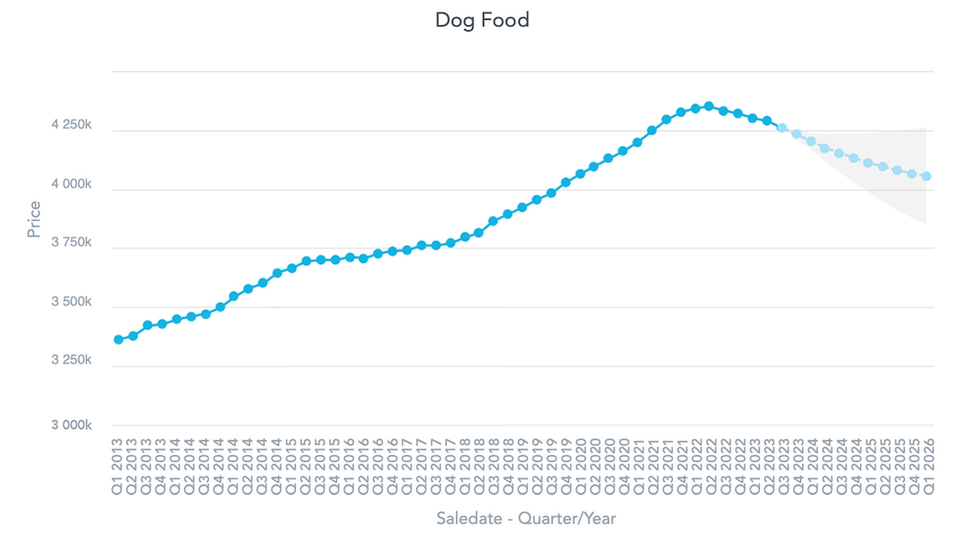
You decide to try the one-click ML and hope for the best. You start with dog food, and with two clicks you have this visualization:

That seems quite reasonable, so you move onto the temperature. But when looking at it, you notice there are some data points missing:

Well, what can you do? Some of the algorithms fail on data with missing values. Not all data is perfect, you can talk to your boss about it later. Since you want to see the temperature anomalies as fast as possible, you open up the integrated Jupyter notebook and use something like PersistanceAD from the adtk library:
df = get_df()  # Simply fetch the dataframe

# ML parameters:
sensitivity = 1
window = 3

seasonal_ad = PersistAD(window = window, c=sensitivity, side="both")
anomalies = seasonal_ad.fit_detect(df)
This gets you a list of bools, denoting whether each point is an anomaly or not. Now you might want to visualize it using matplotlib:
fig, ax = plt.subplots(figsize=(7, 2.5))
df.plot(ax=ax, label="data")
anomalies = anomalies.fillna(False)

# Filter the data using the anomalies binary mask to get the anomaly values.
anomaly_values = df[anomalies]

# Use scatter to plot the anomalies as points.
ax.scatter(anomaly_values.index, anomaly_values, color="red", label="anomalies")

ax.legend()
This is not really telling, so you play with the parameters for a while. And after a few minutes you are done! Now you can finally see the points you wanted to see:

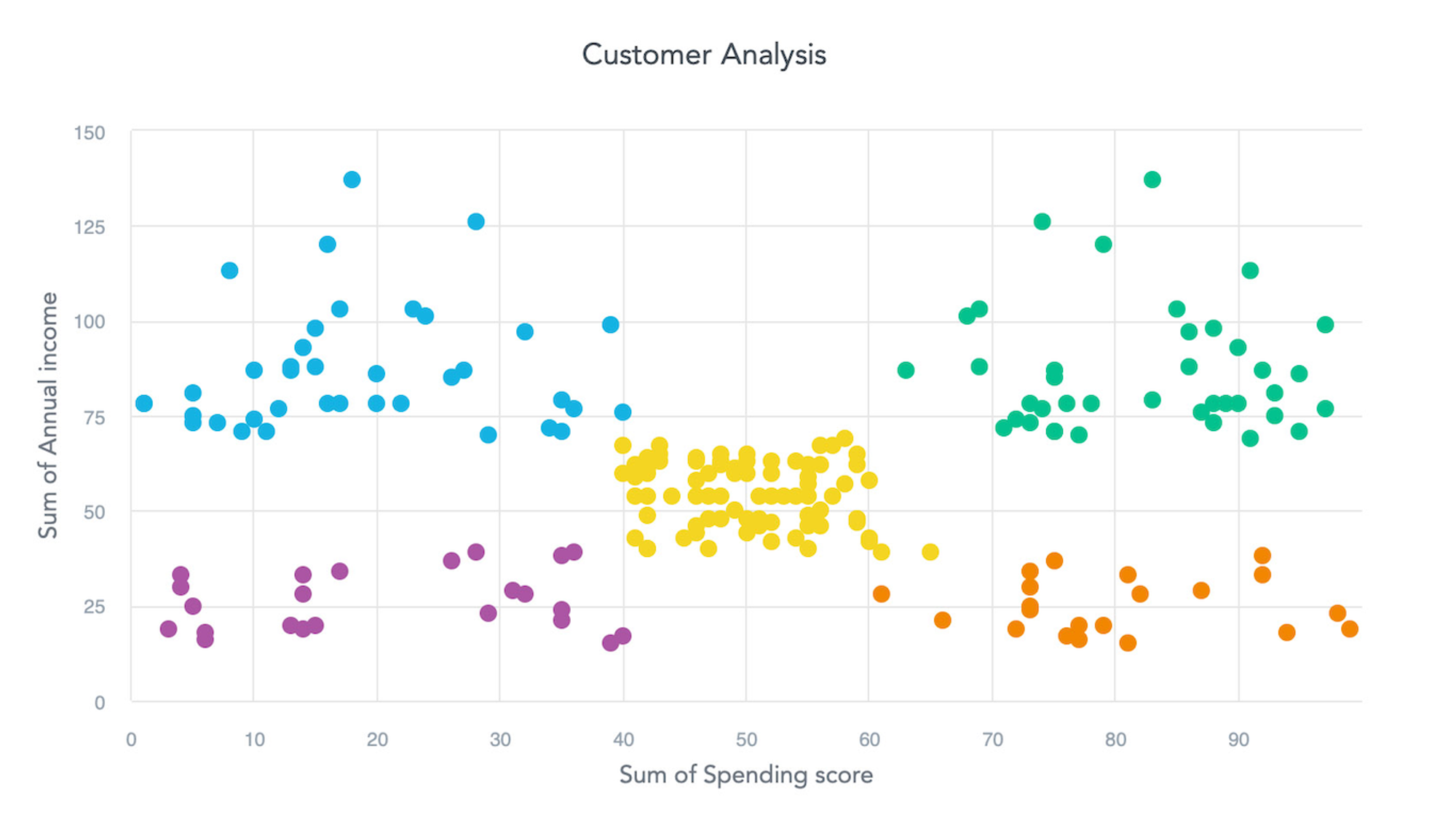
Lastly, you want to cluster the users by buying power, so your boss can finally update the old discount flyer. For this you have the following dataset:
This seems to be easily distinguishable with K-means or a Birch algorithm. You have already used the Jupyter, so you want to be in control of this visualization. You start the notebook again and run some variation of:
# Threshold for cluster proximity, lower promotes splitting
threshold = 0.03

cluster_count = 5

# Update DataFrame to be compatible with Birch
x = np.column_stack((df[df.columns[0]], df[df.columns[1]]))

model = Birch(threshold=threshold, n_clusters=cluster_count)
yhat = model.fit_predict(x)
Now you send the yhat (the predicted values) to the server. You are rewarded with this visualization:

That really looks like a job well done. To put it into context, let’s see how your whole dashboard looks:
That’s it! You’ve managed to create the dashboard in time! And with this same level of ease, you can enhance any part of your dashboard to make it even more capable than before.
Conclusion
Machine learning is the next logical step in maximizing the potential of your data, making it an essential feature in modern dashboards. Seamless implementation of machine learning is vital to prevent loss of context, ensuring that all data exploration can be conducted in one place.
As of now, we are aiming to create guided walkthroughs in Jupyter notebooks for the most popular visualizations. This means that most line plots and bar charts will soon feature a notebook for anomaly detection and forecasting. Scatter plots and bubble charts, on the other hand, will focus on clustering.
Of course, the possibilities don’t end there. Machine learning can enhance nearly any type of data, and when paired with AI, it can be directed through natural language queries. This is definitely a promising avenue that we want to explore!
If you're interested in AI, check out this article by Patrik Braborec that discusses How to Build Data Analytics Using LLMs.
Would you like to try the machine learning-enhanced dashboards? The features described in this article are currently being tested in a private beta, but if you want to try them, please contact us. You can also check out our free trial, or ask us a question in our community Slack!
Experience GoodData in Action
Discover how our platform brings data, analytics, and AI together — through interactive product walkthroughs.
Explore product tours

