How to Clean Your BI Project
Written by Tomas Gabik |

Table of Contents
Keeping a clean, organized data catalog is essential to improving the usability and maintaining the accuracy of a business intelligence (BI) project. Disorganized reporting will often prove to be the downfall of any long-lasting data project, but the straightforward practices we will review in this article can help prevent issues caused by disorganized data.
The Importance of a Clean BI Project
Long-lasting and well-liked dashboards tend to scale over time, which can lead to several crucial maintenance issues. These issues stem from the common need to continuously add new insights, metrics, reports, or visualizations to dashboards. When building robust dashboards, it’s important to consider the following questions.
- How many metrics or reports are no longer in use and could be deleted?
- Which metrics and datasets are connected and could therefore be included in a report?
- How can you ensure that only relevant changes are published and that a backup version of the BI project is available?
Properly navigating these challenges is crucial to maintaining accurate, reliable analytics. In the following sections, we will demonstrate how integrating GoodData into your software stack can mitigate issues caused by disorganized BI projects.
Identify Irrelevant Metrics and Reports
Experience with BI tools of any kind teaches us one thing: It is much easier and more common to add new metrics and reports to a solution than it is to remove them. While it is not typically a capability you’d consider to be a must-have at the start of a BI tool implementation, the ability to identify whether a specific metric could be deleted is essential as the BI project reaches its peak usage.
With GoodData, identifying objects to remove has never been easier. With just a few clicks, users can easily see if a selected metric is being used in another metric or if it is a part of any existing insights or reports. This feature allows users to easily identify metrics and reports that are either inconsistent or simply not used enough to justify retaining them.
In the following example, we are able to see that the metric Revenue is used in 17 metrics and nine insights.

Ensuring that everyone in your organization can clearly identify metrics that are essential versus ones that could be deleted will allow the project to remain relevant and usable for much longer.
Why not try our 30-day free trial?
Fully managed, API-first analytics platform. Get instant access — no installation or credit card required.
Get startedOrganize Your Metrics in Comprehensible Folders
Analytics is continuously becoming more accessible with self-service functionalities, allowing business users to construct reports and dashboards by themselves. For the average business user, understanding the structure of the Logical Data Model (LDM) and how the relationships between different metrics and attributes are defined is usually unnecessary.
However, if end users do not feel confident that your data is accurate and reliable, the interpretation of your data and actions taken based on it could be largely affected. Problems can also arise if end users are uncertain whether the metrics used in the report are actually working in the desired way. Ensuring that the end user understands which metrics and datasets are connected is essential. Consider the example report below:

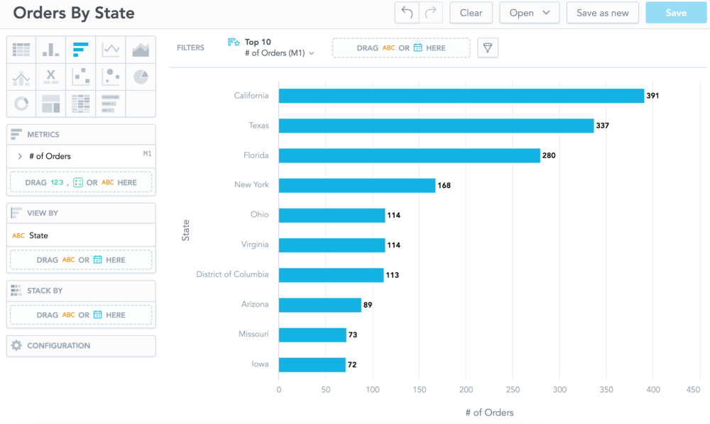
The end user constructs a simple report showing the number of orders by state. Prior to making any decision on whether to close the Iowa branch, the end user will wonder if the information is correct and can be trusted. To make an informed decision, we might ask the following questions that you, as a data analyst, or your BI project itself should be able to answer.
Question #1: Is the number of orders actually based on customer sales or on the store’s inventory?
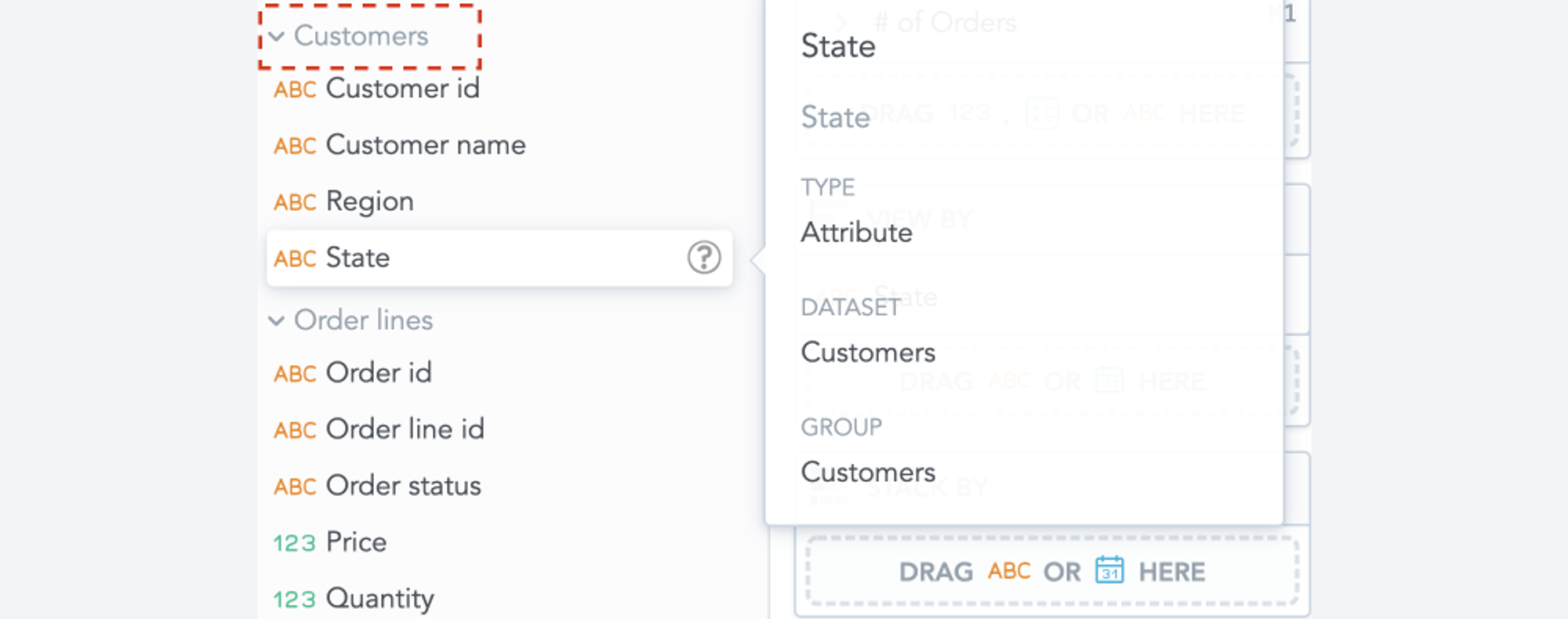
Here GoodData has got you covered. The LDM in GoodData automatically creates subgroups of attributes which are visible and accessible in the Analyze section.

With the ability to see that State belongs to the Customers dataset, we may be able to say that the orders are, in fact, coming from the customers. A follow-up question may arise.
Question #2: What about the # of Orders metric? I don’t see it stored in the same subgroup. How can I include it in the Customers subgroup?
In this example, the # of Orders metric is actually located in a separate group called Ungrouped:

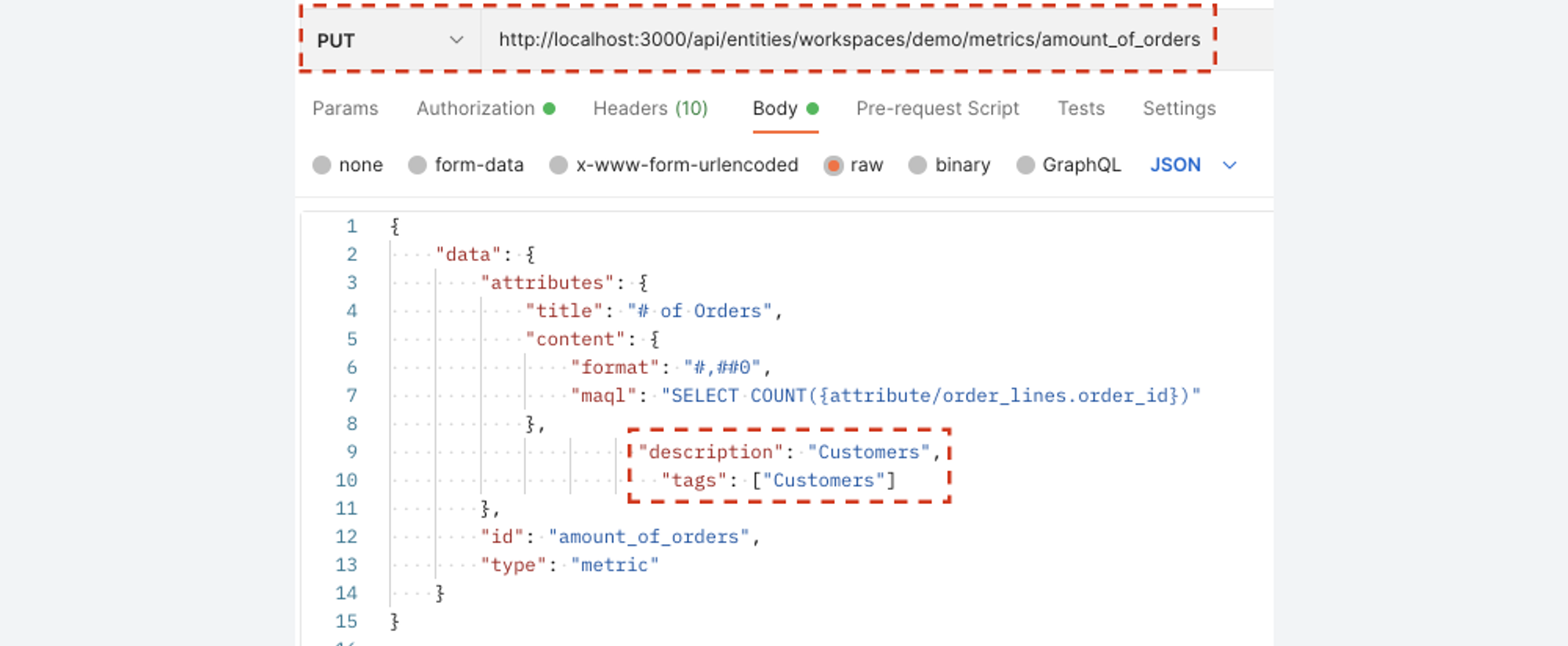
To help users identify which metrics and attributes are connected, GoodData offers a functionality called tags. Adding tags to a specific metric will allow the end user to place it in the same subgroup as the connected relevant attributes. We can do this with a simple API PUT call:

And just like that, the # of Orders metric, which was previously untagged, is now a part of the Customers subgroup.

Question #3: I also wanted to add the Campaign Spend metric to the report, but for some reason this metric is no longer visible. What happened to it?
The simple answer is that GoodData sees the Campaign Spend metric as unrelated to what is already selected in the report. This is a rather helpful feature which prohibits the use of unrelated attributes and metrics in a single report. GoodData hides the unrelated items for us and lets us know that they are still there, just not to be used in this report.

This feature will prevent end users from constructing a report that is nonsensical, therefore increasing the reliability of our BI project.
Add Versioning to Your Analytics
The goal here is simple. We want our end users to enjoy a seamless analytics experience where no extensive technical knowledge is required. At the same time, we want our data engineers and architects to be able to work with the analytics in a way that is familiar to them. GoodData’s goal is to seamlessly integrate into your existing tech ecosystems, including the most common collaboration and versioning tools such as Git.
With GoodData.CN, all created and adjusted objects (e.g., dashboards, reports, and metrics) in your analytics projects have an existing, digestible API layer. This API layer can be easily accessed, versioned, and adjusted both on the UI and code level — all based on your preference and level of technical expertise.

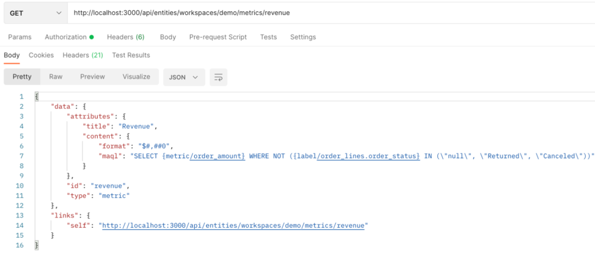
The definition of the Revenue metric featured above is a prime example of how versioning analytics in GoodData could work wonders for your business. The MAQL part of the code is where the definition of the metric lies. This is something that could be either written in the UI level or kept within the declarative API environment.
As mentioned previously, all reports, metrics, and dashboards are defined in the same fashion. This means that you can easily keep track of changes, restore previous versions of your analytics, or collaborate with your BI team. Code versioning tools like GitHub can easily store all changes and versions of your analytics.
Ready to Try GoodData?
Are any of the organizational challenges that we discussed familiar to you? Are you eager to see how GoodData can make your analytics more consistent and easier to understand? Start a free trial of our solution or request a demo today.
Why not try our 30-day free trial?
Fully managed, API-first analytics platform. Get instant access — no installation or credit card required.
Get startedIf you are interested in GoodData.CN, please contact us. Alternatively, sign up for a trial version of GoodData Cloud: https://www.gooddata.com/trial/
Written by Tomas Gabik |

