From Sketch to Interactive Data: What Is Napkin Analytics All About?
4 min read | Published

Imagine you’re in a high-stakes moment. Maybe you’re pitching your startup idea to investors, brainstorming a new product feature with your team, or solving a critical analytics problem during a hackathon. The concept in your head is crystal clear, but you need a way to illustrate it. With no laptop in sight, you grab the closest tool available — a napkin — and sketch your vision.
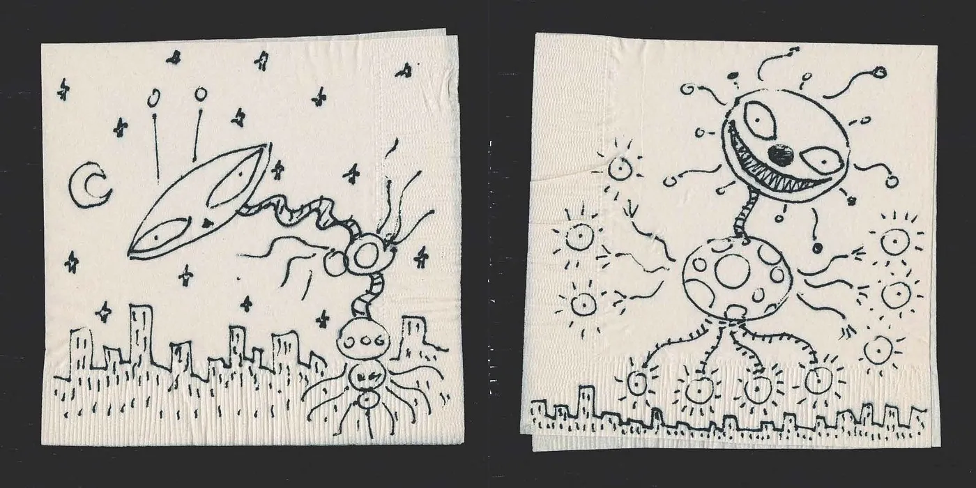
Tim Burton, the famous film director, producer, screenwriter, and animator, sketched most of his ideas on napkins. He even published a napkin book. Image from timburton.com.
Your colleague gets it. The idea is solid. But now what? He can take the napkin… and throw it in the trash, because he still needs to manually recreate the visualization from scratch.
That’s the problem — your BI tool doesn’t know what to do with your napkin sketch. Or does it?
What if your quick doodle could be recognized, understood, and transformed into an interactive chart? What if AI could bridge the gap between analog sketches and digital analytics?
Let’s find out.
Welcome to the era of napkins analytics
I’m currently part of the AI team of GoodData analytics platform, trying to excavate the innovation potential of the LLMs and generative AI in general.
From our experience, every analytics project starts with a drawing board (be it real, or just virtual), where the business people and analysts agree on what to measure and how. This board is actually a manifestation of how the analytics should behave. It would be a waste if the analysts needed to go to the BI tool and manually re-create all the sketches and magnificent ideas.
That’s where napkin analytics comes into play. It takes all your analytics sketches and translates them into interactive analytics objects.
How it works under the hood
Napkin analytics consists of two major parts. First, it recognizes what is on the image, and then this gets mapped into the existing semantic layer and recreated as an interactive analytics object.
Recognizing the image content
Image recognition is a well-known challenge with many algorithms such as Convolutional Neural Networks, You Only Look Once, or even non-deep learning algorithms like Support vector machines.
In our prototype, we actually used an LLM (GPT-4o), which reliably identifies the major characteristics of the chart. The performance is not great, but good enough for the demonstration.
On the image we search for aspects such as chart title, chart type, axis names, series names…
Example call to OpenAI to get the image description:
{

  "role": "user",
    "content": [
      {
         "type": "text",
         "text": "Map what is on the image to the described visualization structure. Use the available fields. If not found, use the most similar fields.",
      },
      {
         "type": "image_url",
         "image_url": {"url": f"data:image/jpeg;base64,{base64_image}"},
      },
    ],
}
Creating interactive charts
Now let’s get to the meat. First, we need to map the extracted chart properties into existing analytics objects. Thankfully GoodData uses the concept of a semantic layer, which greatly simplifies the work. All the fields with analytical meaning are available through a catalog, including their relationships.
With selected analytics fields and additional chart properties, it should be quite easy to recreate the chart itself. But only in case the BI tool supports some sort of programmatic description of the chart that would be easy for the AI to grasp. GoodData has exactly such a human (and LLM) readable YAML representation of all the analytics elements.
With all this knowledge, we used OpenAI’s structured output to force the LLM to return a valid chart object.
First few lines of the JSON schema to GoodData visualizations:
{
    "type": "json_schema",
    "json_schema": {
        "name": "datasets_schema",
        "schema": {
            "type": "object",
            "title": "Visualisation",
            "description": "JSON schema for GoodData Analytics Visualisation",
            "properties": {
                "type": {
                    "description": "Type of visualisation.",
                    "type": "string",
                    "enum": [
                        "table", "bar_chart", "column_chart", "line_chart",
                        "area_chart", "scatter_chart", "bubble_chart", "pie_chart",
                        "donut_chart", "treemap_chart", "pyramid_chart", "funnel_chart",
                        "heatmap_chart", "bullet_chart", "waterfall_chart",
                        "dependency_wheel_chart", "sankey_chart", "headline_chart",
                        "combo_chart", "geo_chart", "repeater_chart"
                    ]
                },
And here is the outcome:
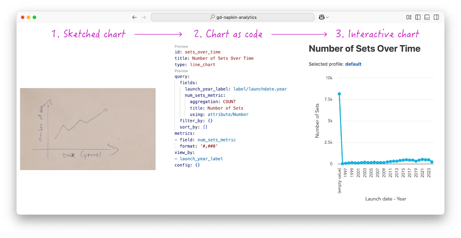
The “flow of a napkin”. From image to Yaml code, and then finally to interactive chart.
Have you spotted the suspicious spike in the interactive chart? Keep an eye out for the next article, where I’ll share techniques for handling such anomalies.
Tech Stack
By now, you might be wondering why I haven’t mentioned any programming languages. And I didn’t mention them for a good reason — it doesn’t really matter.
Our platform is made with Developer Experience (DX) in mind, which also includes high flexibility of implementation. This is also part of the reason why GoodData is very well prepared for all the AI innovations to come. Be it visualization generation, or even helping you make decisions directly.
OK, code-philosophy aside, most of my code is done in Python (with our PySDK), and it has less than 100 lines of code for the whole backend (not counting the prompts…). Another 150 lines of code to create a compatible front-end with canvas for drawing the visualizations and all the other bells and whistles.
Conclusion
To sum up, the basic idea is quite simple. The hidden knowledge is, as usual with LLMs in the initial prompt, tons of examples and API-first analytics platform. Are you interested in knowing more about these? Then check out my article The Road to AI-generated Visualizations.
Why does this matter?
The most important thing is that there is less friction between your idea and your visualization. With this, the sky is the limit, you don’t need a deep understanding of the model, you only need to know what you want to see.
What’s Next? From Sketches to Dashboards
Luckily visualizations are not the limits of the sketches in analytics. Next stop is dashboards, so buckle up for a new article that I plan to publish in the near future!
Experience GoodData in Action
Discover how our platform brings data, analytics, and AI together — through interactive product walkthroughs.
Explore product tours

