Can your BI tool import sketched dashboards?
Written by Tomáš Muchka |

If not, you should probably look for a new one
Sketching a dashboard is still one of the most common ways to start basically any analytical project. With today’s technologies even a paper sketch can be transformed into an interactive dashboard.
From our experience at GoodData, a typical analytics project starts over a whiteboard. The solution architect and UX designer meet with the customer and put together the first draft of the future analytics product.
While a future-proof data model is a cornerstone of any successful project, customers can provide much more feedback when discussing the visuals of their future product, in our case dashboards.
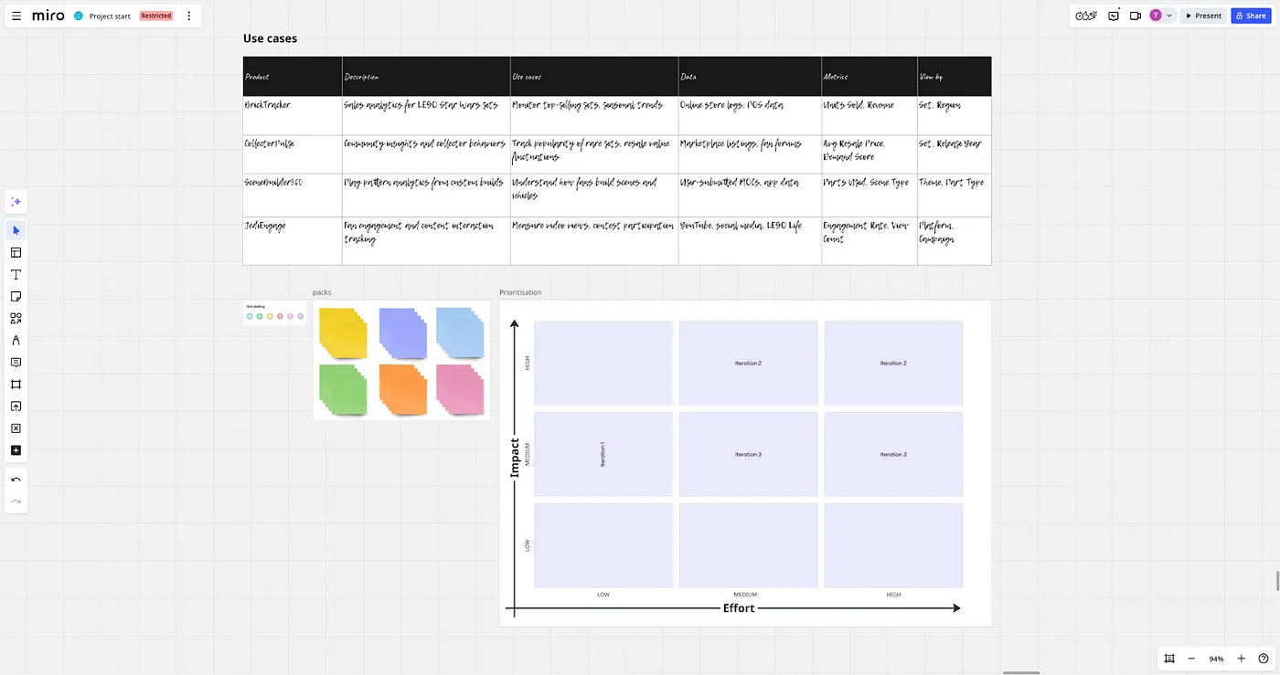
That’s why we create wireframes of the dashboards as fast as possible and continuously discuss and iterate them with the customer. We even developed the GoodWire Figma library to speed up the process. These wireframes are focused on information architecture and dashboards’ layout. With such a sketch, we can already validate with the end users whether the dashboard communicates the desired insights correctly.
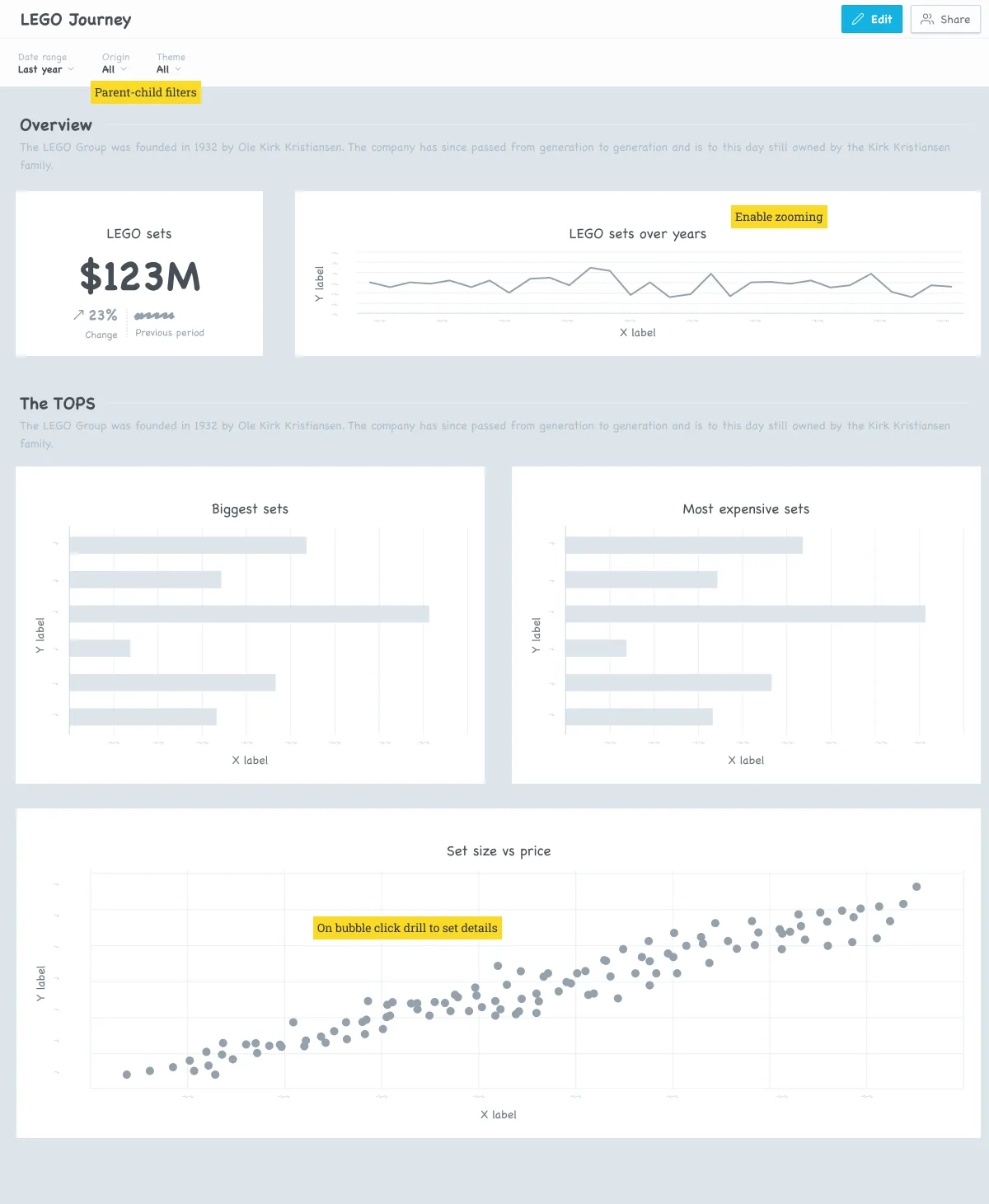
However, the juiciest stuff are the annotations. Our customers tend to clarify their needs through sticky notes on dashboard sketches. These usually include interactions or additional clarification that cannot be seen on the dashboard sketch (e.g., when the filters should have a parent-child relationship).
OK, now imagine what happens, when the dashboard sketch gets approved. The solution architect creates the corresponding semantic layer, so the solution designer can take the approved sketch… and throw it away, because it needs to be rebuilt from scratch step by step in the BI tool.
Rebuilding approved sketches into dashboards is a waste of everyone’s time.
Don’t rebuild, generate!
Instead of recreating the dashboard according to the sketch manually, let’s take the previously created sketch and generate a real dashboard out of it. Wouldn’t it be beautiful?
Although GoodData does not offer such a functionality out of the box, I decided to explore the possibilities and build such a feature on top of our existing tooling. Similar to my article From Sketch to Interactive Data, my idea was to use AI to generate the YAML definition of dashboard based on the sketch.
GoodData sports the concept of composable analytics. Which means it separates visualisations from dashboards. So I need to create not only the dashboard definition, but also separate definitions for all the visualisations on the dashboard.
Fortunately, GoodData supports the as-code representation of the analytics entities including dashboards and visualisations.
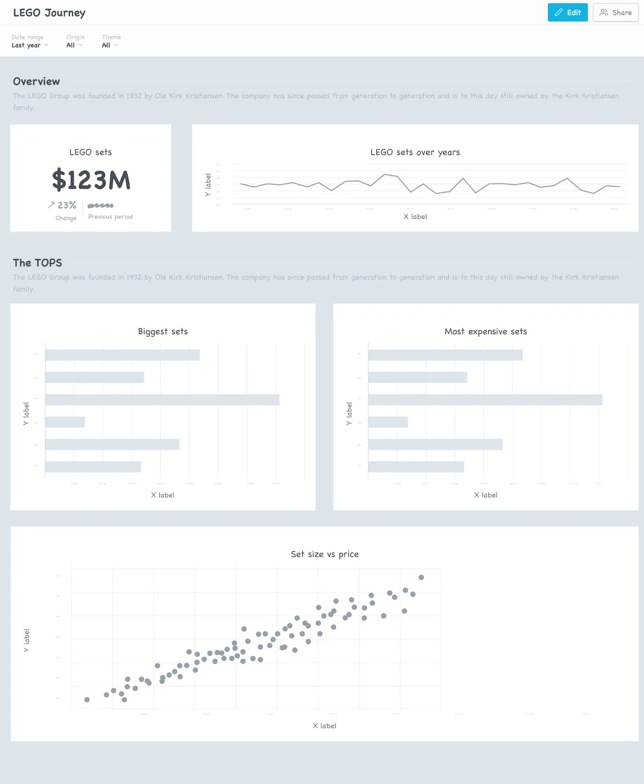
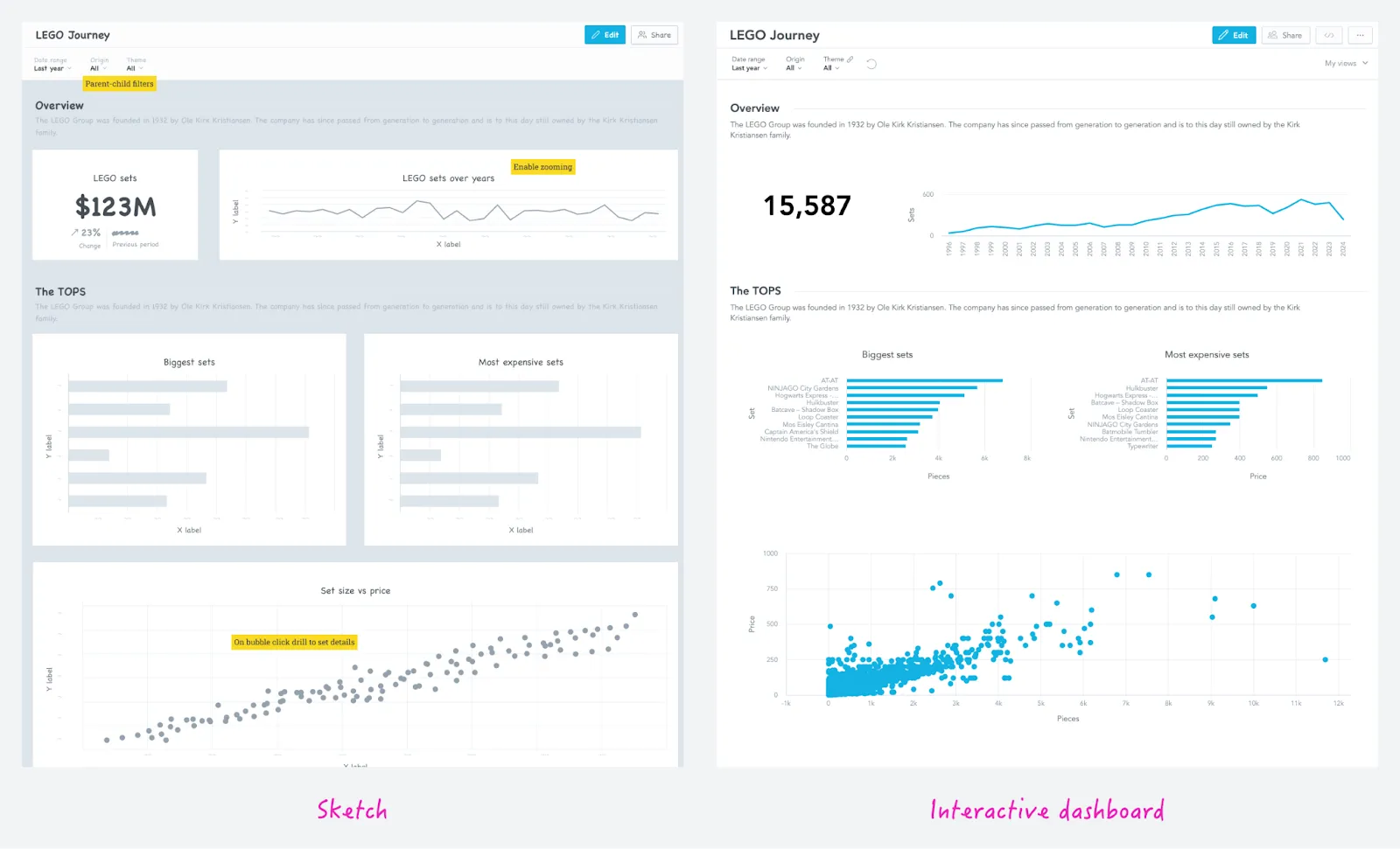
With all of that, check the interactive dashboard generated from the sketch.
As code + AI = ♥️
Now let’s take a look at how to make the as-code work with AI, namely OpenAI’s GPT-4o (o1 or o3 might be better for this, but it will take much longer). I’m not using the chatbot interface, but the OpenAI API. Never tried that? Then read the official quickstart first.
Step 1: Create the visualisations
First we are going to send the base64 encoded dashboard sketch to AI, expecting to get a list of visualisations that are on the image.
outcome = client.chat.completions.create(
        model="gpt-4o",
        messages=[
            {"role": "system", "content": INSTRUCTIONS},
            {"role": "assistant", "content": f"Here are the fields from which you can build visualizations. Use only existing attributes and facts. {PROMPT_DATASETS}"},
            {"role": "assistant", "content": f"Here are examples of existing visualizations: {PROMPT_EXAMPLES_OF_VISUALIZATION}"},
            {"role": "assistant", "content": f"Here are the metrics from which you can build visualizations. Use only existing metrics. {PROMPT_METRICS}"},
            {
                "role": "user",
                "content": [
                    {
                        "type": "text",
                        "text": "Identify visualisations (charts) on the image and map it to the described visualization structure. Use the available fields. If not found, use the most similar fields.",
                    },
                    {
                        "type": "image_url",
                        "image_url": {"url": f"data:image/jpeg;base64,{base64_image}"},
                    },
                ],
            }
        ],
        response_format = schema
    )
And the schema starts like this:
"type": "json_schema",
    "json_schema": {
        "name": "visualisations_schema",
        "schema": {
            "type": "object",
            "properties": {
                "visualisations": {
                    "type": "array",
                    "items": {
                        "type": "object",
                        "title": "Visualisation",
                        "description": "JSON schema for GoodData Analytics Visualisation",
Once we have the visualisations ready, save them:
visus = ask_ai_to_create_dashboard_visualizations(encoded_file)
for visu in visus:
    create_visualization(visu)
Are you interested in more details on how this works? In my article The Road to AI-generated Visualizations I go over the whole process.
Step 2: Create dashboard
dashboard = ask_ai_to_create_dashboard(encoded_file)
create_dashboard(dashboard)
Where AI sets the dashboard layout and finds the most suitable visualisations to populate it.
outcome = client.chat.completions.create(
        model="gpt-4o",
        messages=[
            {"role": "system", "content": INSTRUCTIONS},
            {"role": "assistant", "content": f"Here are the fields from which you can build dashboard filters. {PROMPT_DATASETS}"},
            {"role": "assistant", "content": f"Here are existing visualizations which you can use when building dashboard: {PROMPT_EXAMPLES_OF_VISUALIZATION}"},
            {"role": "assistant", "content": f"Here are already existing dashboards to learn from: {PROMPT_EXAMPLES_OF_DASHBOARDS}"},
            {
                "role": "user",
                "content": [
                    {
                        "type": "text",
                        "text": "Map what is on the image to the described dashboard structure. Use existing visualizations and connect it to the newly created dashboard.",
                    },
                    {
                        "type": "image_url",
                        "image_url": {"url": f"data:image/jpeg;base64,{base64_image}"},
                    },
                ],
            }
        ],
        response_format = schema
    )
Have you noticed that I’m sending the image twice? It isn’t ideal, but from my experience asking the AI to do many things at once often doesn’t lead to a good result. It yields much better results when I first create the visualisations and then build the workspace. These two calls have much different expected outputs (schemas) and prompts.
Next, you may also notice that, when building the dashboard in the second step, the AI looks for visualisations created in the first step. In theory, it could find some of the already existing visualizations more suitable than the newly created ones, but I haven’t observed this behaviour so far.
Here is the final flow from sketch to an interactive dashboard:
Conclusion
Having the ability to transform sketched dashboards into their interactive twins greatly reduces the time to insight. Even if such a transformation should not be 100% correct and additional updates should be needed, it is an appreciated helper for anyone who builds analytics solutions.
Want to learn more about the GoodData analytics as code approach? Check out our other articles on Medium.
Written by Tomáš Muchka |
Related content
Read more

