9 Bad Data Visualization Examples That You Can Learn From


Summary
Data visualization is powerful, but when done poorly, it can confuse more than clarify. Common mistakes like misleading scales, cluttered layouts, and awkward color choices often result in visuals that misrepresent the data or distract from the message.
Creating effective visualizations means focusing on clarity, accuracy, and purpose. When done right, charts and graphs help people see patterns, understand trends, and make better decisions.
In this article, you’ll learn more about the most common data visualization pitfalls and how to avoid them, so your data tells the right story every time.
The Cost of Bad Data Visualizations
Poor data visualizations can lead to misunderstandings, misinterpretations, and flawed decision-making. So today we’re looking at bad examples of data visualization to highlight some common pitfalls to avoid. Sidestep these frequent errors and you'll be on your way to creating data visualizations that are clear, accurate, and effectively convey your message.
Example 1: Wrong Chart Type Selection
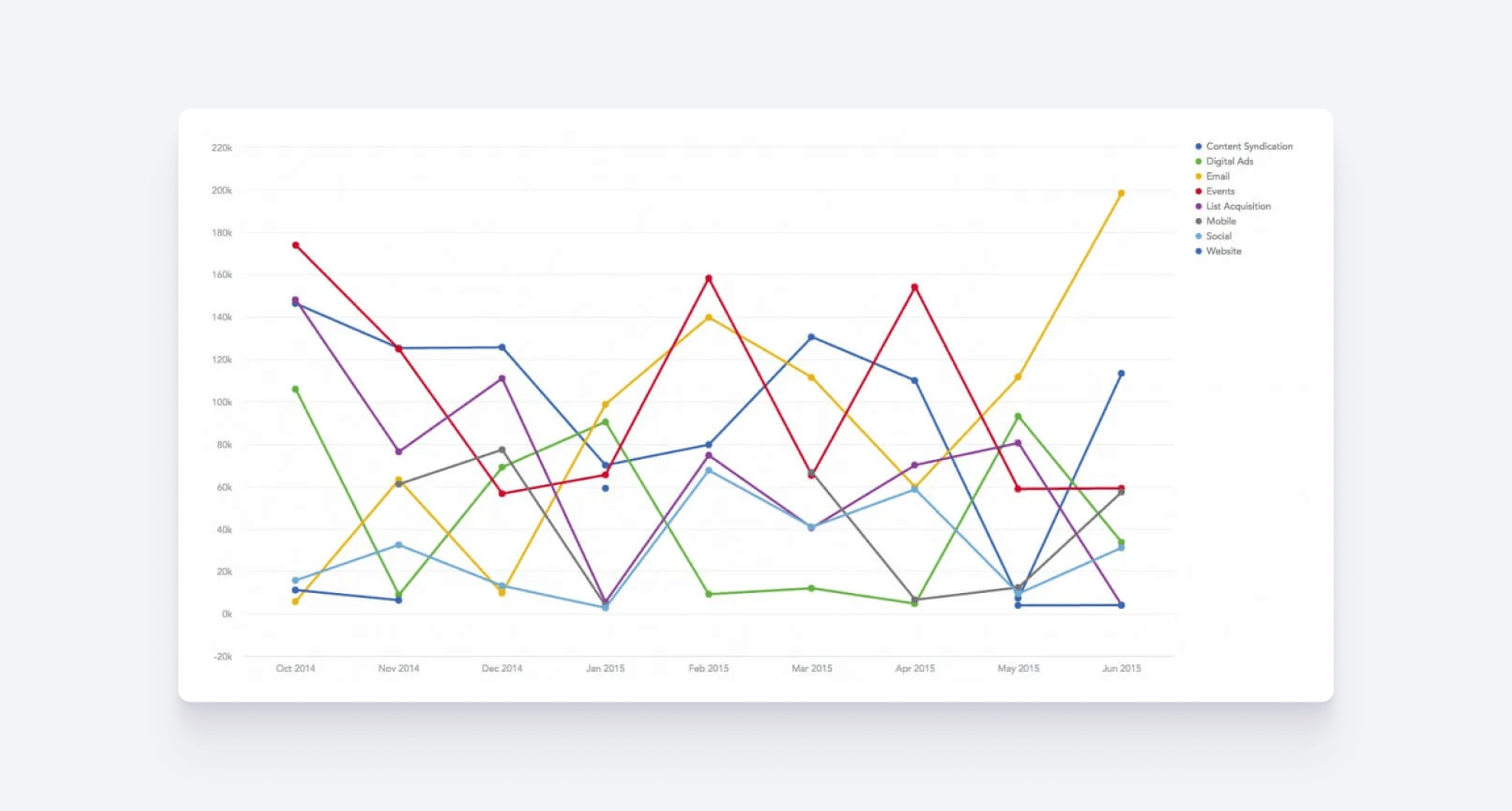
Poorly chosen visualizations can distort the message of your data and disengage your audience. In this bad graph example, several crisscrossing lines make it nearly impossible to identify any meaningful trends or patterns.
How you can avoid this: Consider whether the chosen chart type will make the data clear and easy to understand. If you’re unsure, try out a few chart types and see which one presents the information most effectively. Several of the best analytics solutions provide wireframing libraries to help with this. For specific information on different chart types and when to use them, check out our guide to choosing the best chart type.
Example 2: Failing to Simplify Complex Data
In this example of one of the worst data visualizations, the excess of information is overwhelming. Without interactive features such as filtering or drilling, all the data is presented at once, leading to cluttered visuals that obscure key insights. By failing to incorporate interactivity, you not only rob users of the chance to dig into the data themselves but also risk creating a visual experience that is too dense and complicated.
How you can avoid this: Invest in an analytics solution with interactive features. That way, you’ll be able to create tidy charts and graphs that contain tonnes of complex data for users to explore. To learn more about interactive visualizations, check out: Interactive Data Visualization: The Only Guide You Need.
Example 3: Neglecting to Tell a Story
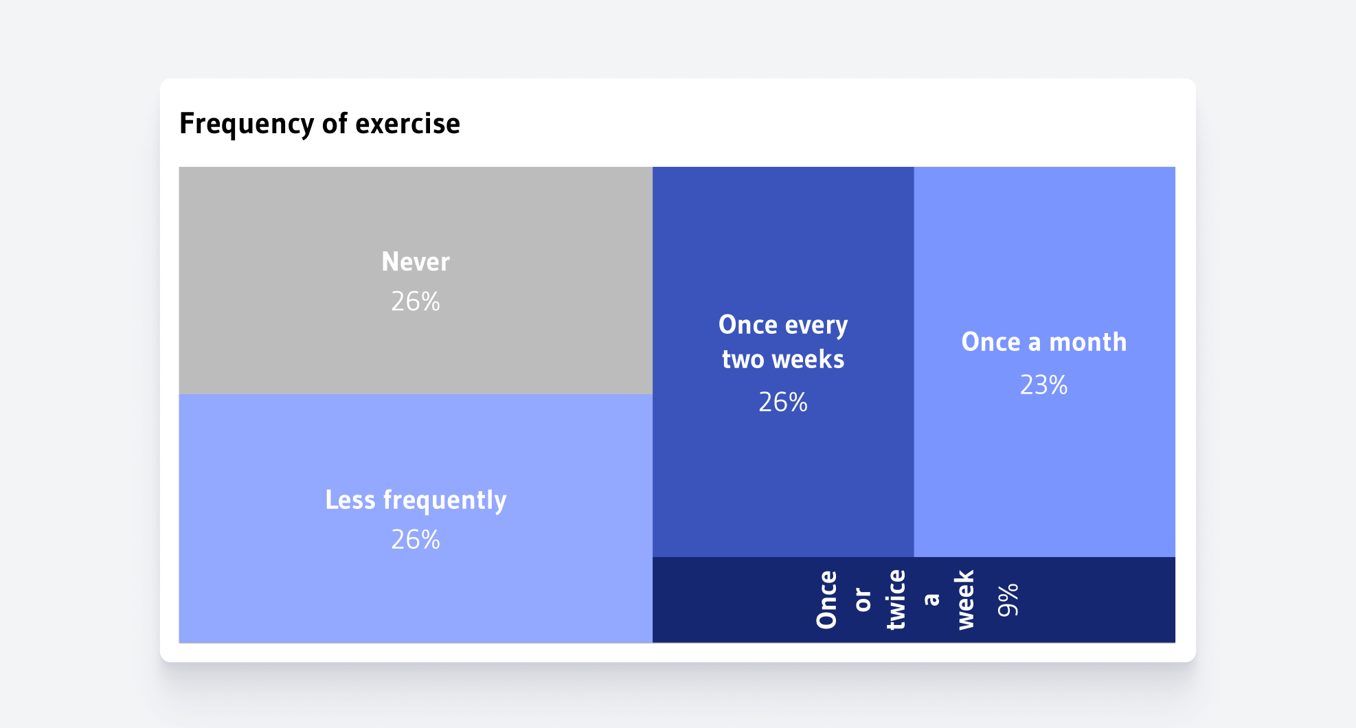
In this bad chart example, it's unclear what key insights or conclusions we're meant to draw. The visualization lacks a clear narrative or focus, making it difficult for viewers to understand the main message. Without a coherent data story guiding the interpretation, we are left with a collection of figures and visuals without meaning. In fact, the data may as well not have been visualized at all. In this instance, it would have the same effect if the numbers were simply written down.
How you can avoid this: To create a compelling data story, start by identifying the key message you want to convey. Focus on highlighting the most important data points that support your narrative, and organize the visuals in a way that guides the audience through the information step by step. Use clear labels, consistent design elements, and a logical flow to ensure the story is easy to follow and impactful.
Example 4: Misleading Pie Charts
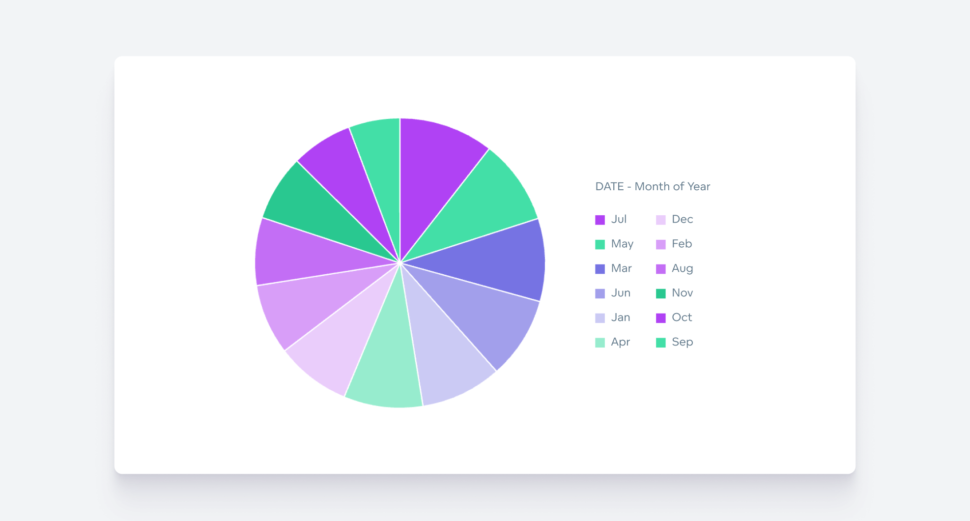
When it comes to misleading data visualizations, pie charts are often the worst offenders. The example above is ineffective because the number of segments is too high for a pie chart. When there are too many slices, a chart becomes cluttered, and the differences between segments are hard to distinguish. This overwhelms the viewer and diminishes the chart’s ability to communicate any meaningful insights.
How you can avoid this: Dodge cluttered and misleading pie charts by choosing a donut chart or line graph instead. Also, read our countdown of proven data visualization best practices to help you avoid creating your own real-life examples of bad data visualizations.
Example 5: Thoughtless Use of Color
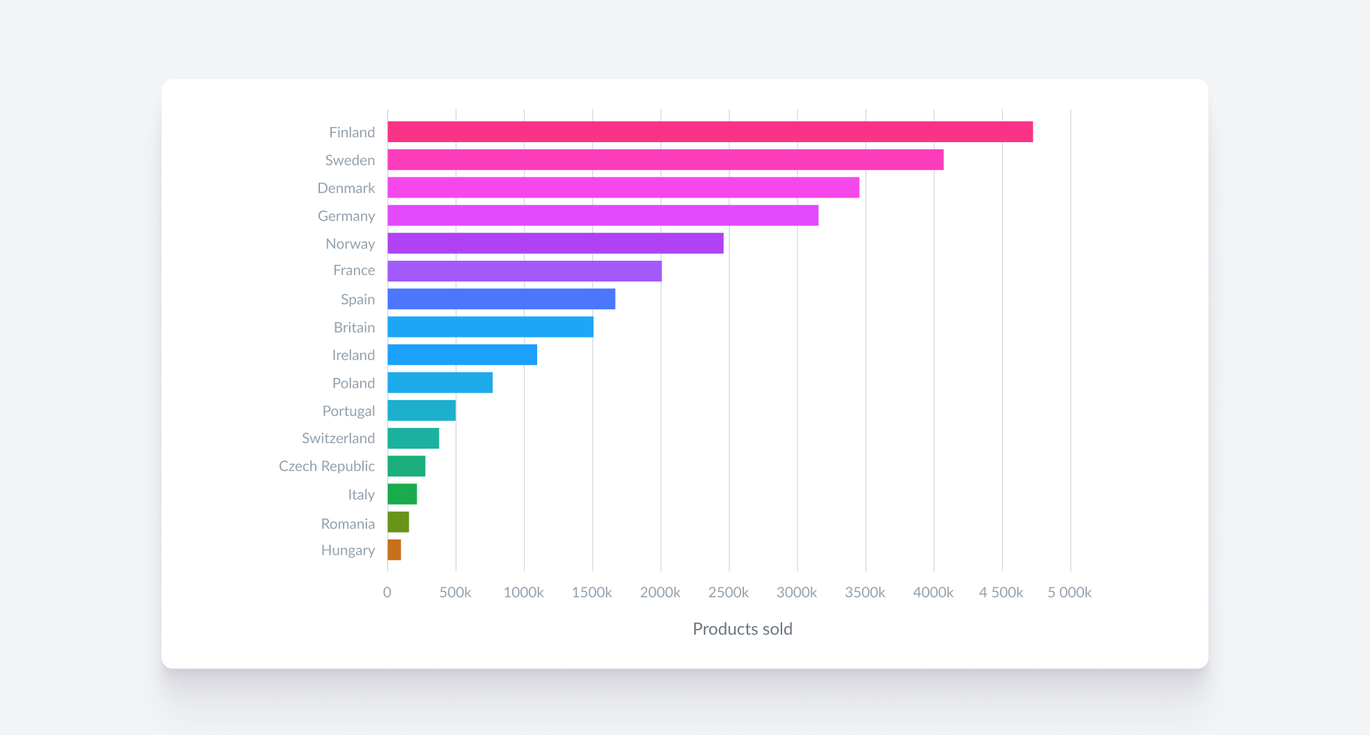
In this example of bad data visualization, colors have been randomly assigned to represent different countries. While the colors may create an aesthetically pleasing chart, they contribute nothing to our understanding of the data. In fact, instead of adding clarity, the colors create visual noise that detracts from the data's message.
How you can avoid this: Be intentional with your use of color rather than treating it as decoration. For a clear methodology on how to successfully use and assign colors, check out 7 Tips for Good Data Visualizations.
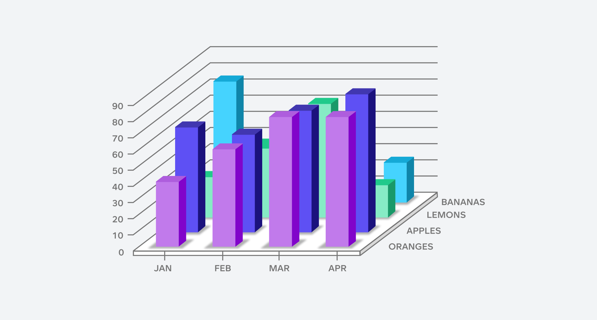
Example 6: Inappropriate use of 3D
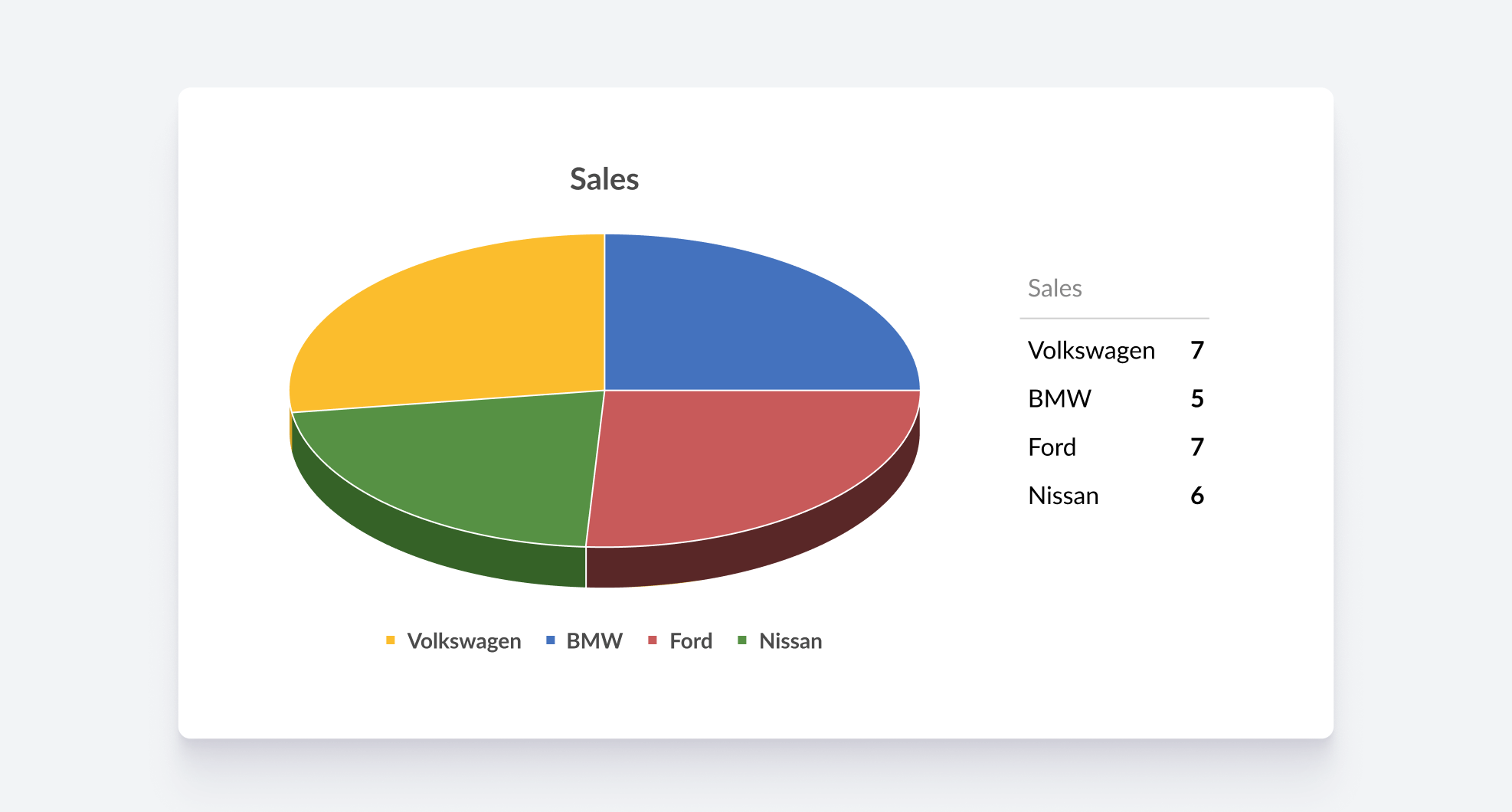
While 3D visualizations may seem visually striking, they are often not a good choice for accurately conveying data. In the above example, the use of 3D creates perspective distortion, skewing the representation and making it difficult to interpret the information correctly. Many top data visualization tools don't even offer 3D options, as it's widely regarded as poor practice.
How you can avoid this: This one’s straightforward: whenever you’re tempted to use 3D, don’t.
Example 7: Truncated Y-axis
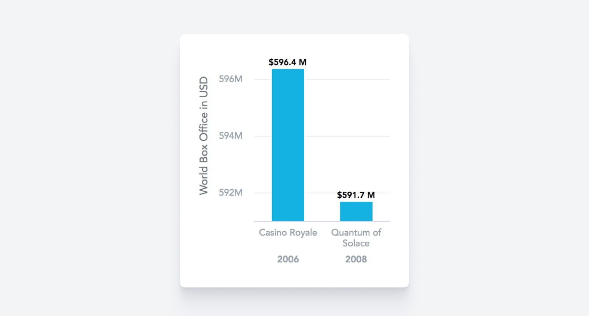
In this bad visualization, the y-axis doesn’t start at zero, exaggerating the difference in box office income and making the disparity appear greater than it actually is. Truncating the y-axis is a common mistake that can skew perceptions, making the data seem more dramatic and ultimately leading to inaccurate conclusions.
How you can avoid this: Some people intentionally truncate the y-axis to exaggerate their points, but if your goal is to create accurate and honest visualizations, it's important to always start the axis at zero (unless there's a compelling reason not to and you're confident it won’t mislead your audience). This approach ensures the data is represented with true proportions, preserving both integrity and clarity.
Example 8: Creating a Misleading Scale

In the above example of bad data visualization, the overall size of the pictures does not contribute to the data points being represented but the impression is that they are integral to the data. The audience then draws incorrect conclusions based on the false narrative created by the disproportionate emphasis on the images.
How you can avoid this: Regardless of the type of chart or graph you’re creating, keep the scale consistent, On a broader level, ensure that all visual elements have a clear and relevant role in conveying the data. This will ensure you are not creating misleading data visualizations.
Example 9: Overlapping Elements
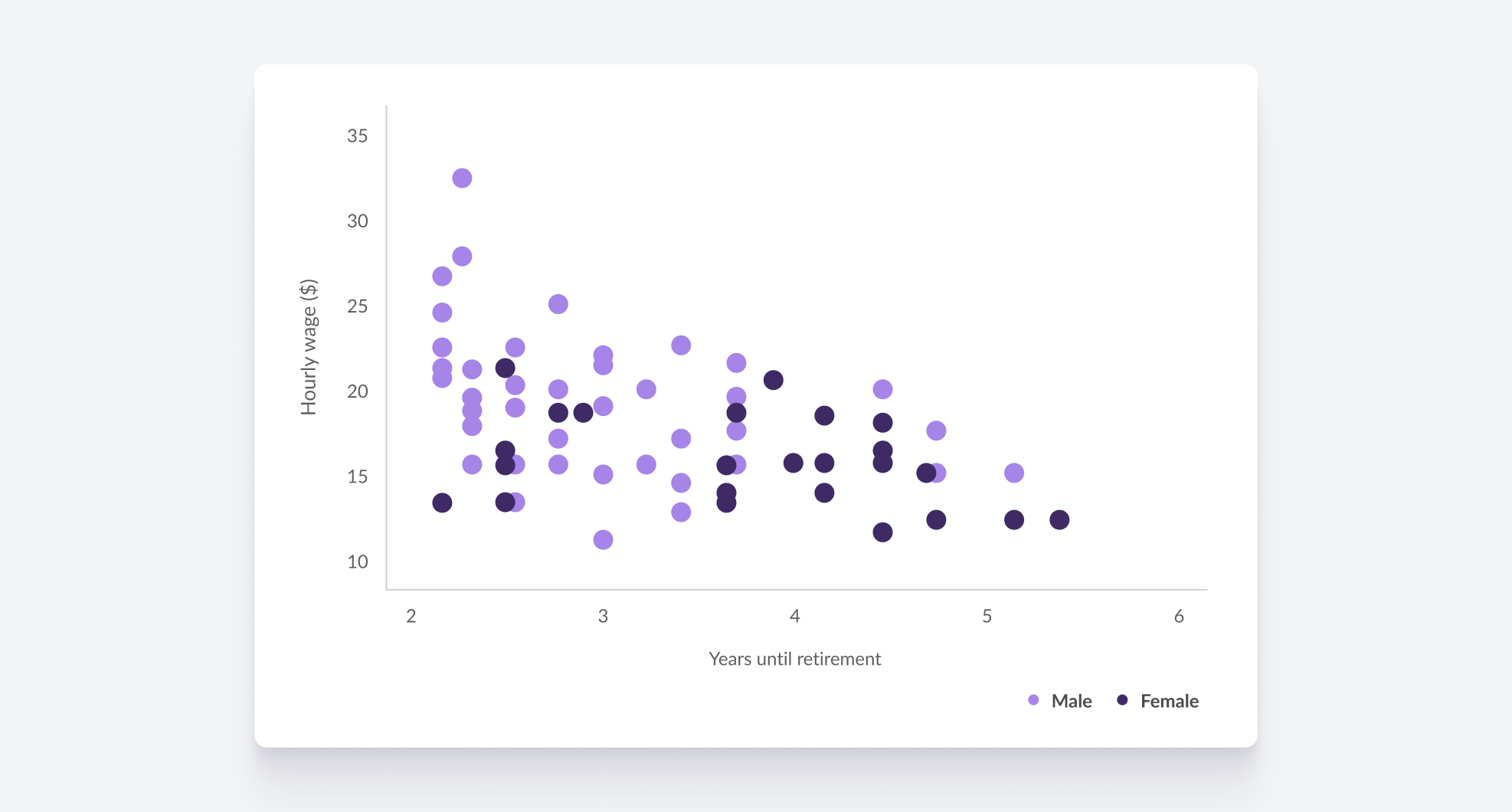
In the example above, the overlapping dots obscure individual data points, making it difficult to discern specific values. When data points overlap in this way, it becomes challenging to understand the distribution and relationships within the dataset.
How you can avoid this: Consider using techniques such as adjusting the transparency of the dots, employing different shapes or sizes, or incorporating interactive features that allow users to explore the data more effectively.
Use GoodData to Avoid Creating Your Own Real-life Examples of Bad Data Visualization
Take advantage of the GoodData to create visualizations the right way. Our platform simplifies everything, from consolidating and connecting your data sources to crafting fully customizable visualizations. To see how we can help you meet your data challenges, request a personalized demo today.
FAQs About Bad Data Visualizations
A data visualization becomes misleading when it distorts the message through improper scale, incorrect chart type, or lack of context. These visuals can unintentionally or deliberately exaggerate trends, making data appear more dramatic or less significant than it truly is.
Start by identifying the story you want to tell (comparison, trend, distribution, or composition). Then select a chart that naturally fits that purpose, like a line chart for trends over time or a bar chart for comparing categories.
Color impacts readability and emotional response. Using too many colors or choosing ones with poor contrast can confuse viewers. Consistent and intentional color schemes help highlight key data points and guide interpretation.
3D effects often distort data perception by adding unnecessary complexity and depth. They can make it difficult to compare values accurately, especially when data points are partially obscured or misaligned visually.
Businesses should focus on clarity and relevance by tailoring visualizations to their audience. Simplifying charts, avoiding data overload, and highlighting actionable insights help stakeholders grasp key messages quickly.
Yes, misleading or unclear visuals can lead to incorrect interpretations, resulting in flawed strategies or missed opportunities. Reliable data visualization is essential for informed, confident decision-making.


