7 Tips for Good Data Visualizations
5 min read | Published


The right data visualizations can help you tell a story. They can help you make sure that your audience understands what the data is communicating. They can also help your audience figure out what actions they should take next.
Clearly, data visualizations are important, but I often find that they’re designed poorly or treated as an afterthought. For this blog, I’ve pulled together some best practices and common visualization mistakes to avoid. These best practices are intended not only for analysts and data scientists but also for regular analytics users looking to better communicate the results of their ad-hoc analysis.Whether you’re using some open source visualization library or mature business intelligence or data analytics tools like the GoodData platform, you can apply these tips to improve your data visualizations.
Tip 1: Avoid displaying too much data
Displaying too much data can easily overwhelm your users, and I find that tables are one of the visualizations most prone to this issue. Yes, the table is one of the most universally understood visualizations, but take a step back to think critically about whether a table is telling the right story and whether your data analysis tool offers a visualization better suited to communicate the data.
If you chose to go forward with using a table, follow these best practices to help your users make sense of what they’re seeing:
- Filter data only to top/bottom N rows. Some data may be irrelevant for decision making, and a filter can help users determine which data is most important.
- If you’re choosing to use a table to increase trust in the data by showing what’s behind the numbers, consider making the detailed data from your sources available only on demand.
- If you use pivot tables, consider using conditional formatting or heat map visualization to make it easier for users to find hot spots in the presented data set.
- Think wisely about whether you need to display all the data labels in the table. Too many data labels may spoil your visualization and distract the user. The details can be made accessible using tooltip instead of displaying them directly in the visualization.
Want to see what GoodData can do for you?
Get a guided tour and ask us about GoodData’s features, implementation, and pricing.
Request a demoTip 2: Employ the right visualization for the story
Always think about what role a given visualization is playing in your data analysis. Here are some suggestions for which visualizations to use in some of the most common use cases.
Trending
While a column chart is frequently used to display trends with a low number of data points, you can better use a line or area chart if the number of periods in a trend is high.
You can also consider displaying forecasts as part of your predictive analytics by using one of the predictive models available in your analysis tool.
Comparison
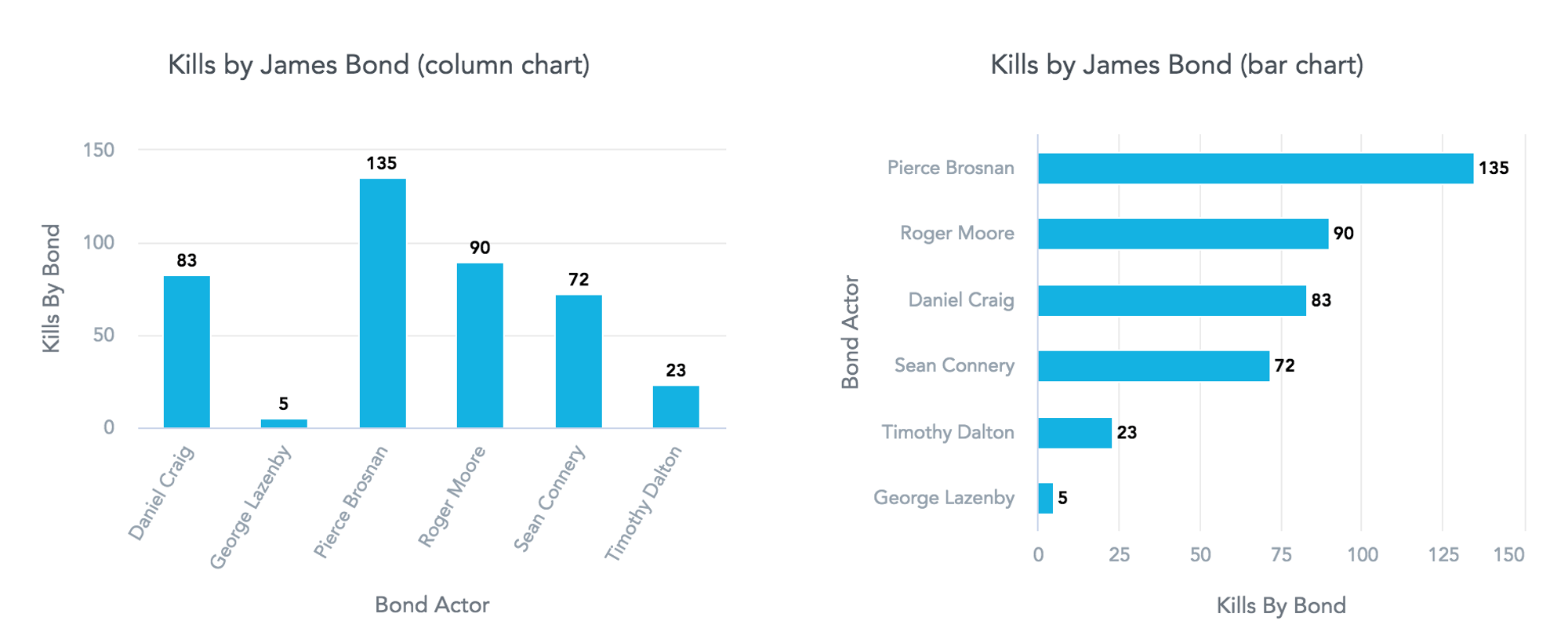
The column chart is often used for comparing data that is ordered by value. If there are too many columns, axis labels may not fit. Many users solve the problem by rotating the label, but consider using a bar chart with horizontal bars instead. This way, there is more space to display the axis label. Ordering by values also helps with comparing the data.
Example: The chart on the right is easier to read, and the differences are more apparent.
Comparison of measures with different units
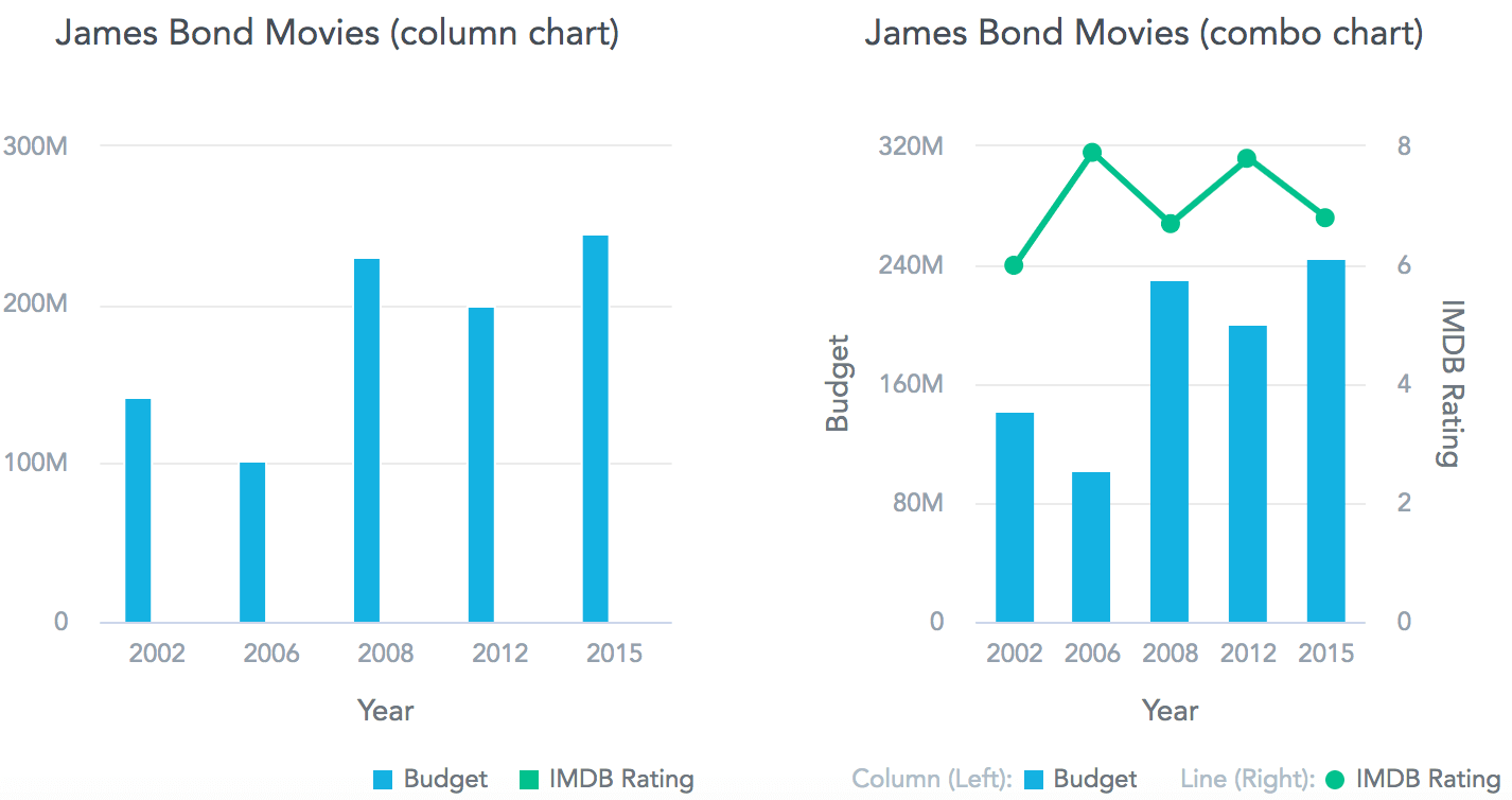
Measures with different units in one chart may become invisible due to differences in the ranges of values.
- If you need to compare measures with different units, you can of course use a table, but also consider splitting into multiple charts or using one of the techniques mentioned below.
- You can use a dual axis chart to compare two measures of different scales.
- You can also use a combo chart to ensure that data with different axis scales can be more easily differentiated.
Example: Comparison of metrics with different scales is possible in the right chart.
Correlation/Relationship
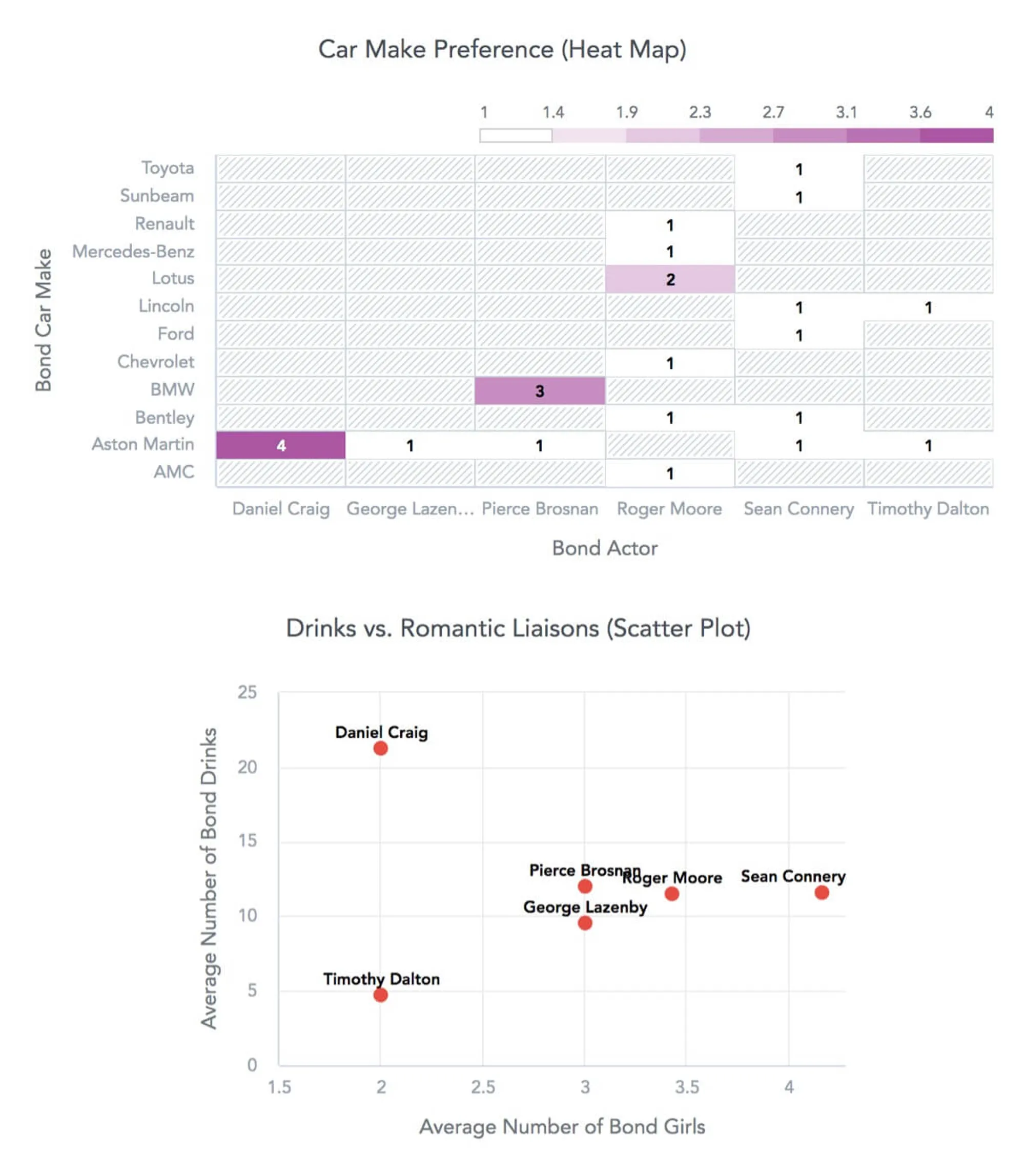
Depending on the type of data you’re presenting, you can also use scatter plots, bullet charts, or heat maps.
Example: You can see the differences in James Bond’s preferences depending on the actor who played him.
Contribution (parts-to-a-whole relationship)
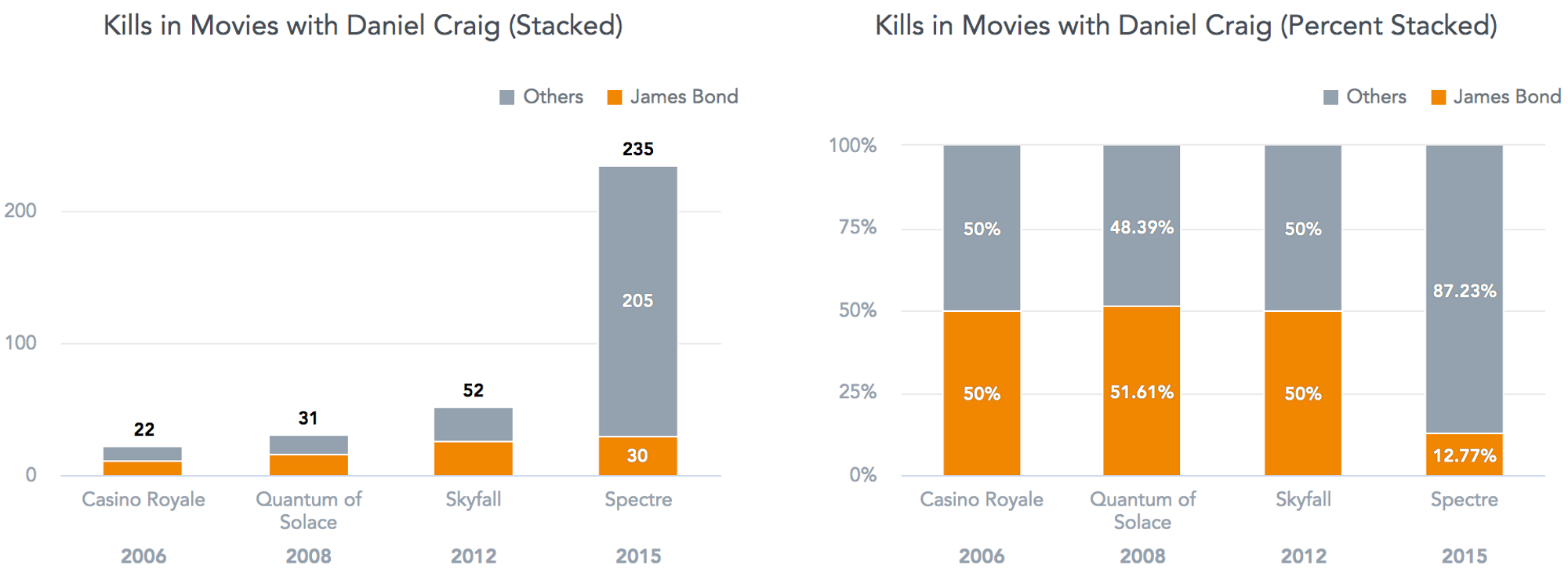
To convey this kind of relationship, you can use stacked charts, tree maps, or donut charts. See the next tip for additional considerations when doing this type of analysis.
Example: The chart on the left shows the total number of individual participants and their contributions. Differences between contributions and changes over time are more apparent in the chart on the right.
Tip 3: Avoid common mistakes with non-additive measures
You should be careful when using measures that are not additive or have negative values. For example, adding up median values does not provide meaningful results. Some best practices include:
- Do not visualize non-additive measures in pie or donut charts.
- Do not stack non-additive measures.
- Use waterfall charts to visualize positive and negative increments alike.
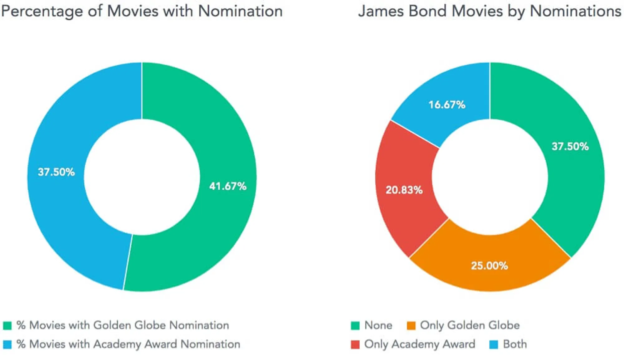
Example: Some James Bond movies were nominated for both Golden Globe Awards and Academy Awards, and some were not nominated at all. The chart on the left is wrong because the percentage of movies do not add up to 100%. The chart on the right provides a better overview of the nominated movies.
Tip 4: Make the data easier to read
You can improve the readability of big numbers by using commas or by skipping unnecessary decimal points.
Within the GoodData platform, you can also shorten numbers by truncating values and adding letters like K, M, and B (thousands, millions, and billions) to make data shorter and easier to read.
Example: Take a look at the world box office earnings for the last three James Bond movies using three different formats. Which one is easiest to read?

Tip 5: Avoid using pie charts
Pie charts are often used to display how segments contribute to the whole. However, the problem with this type of visualization is that the user needs to compare areas or angles, which can be difficult. The center of a pie chart looks messy and overwhelming if the number of segments is too high or some of the segments are too small. You can try using some alternatives, such as:
- Donut charts to eliminate the problem of comparing angles by focusing more on the length of the arc.
- Line charts to more clearly display trend of ratio than multiple pie chart visualizations can.
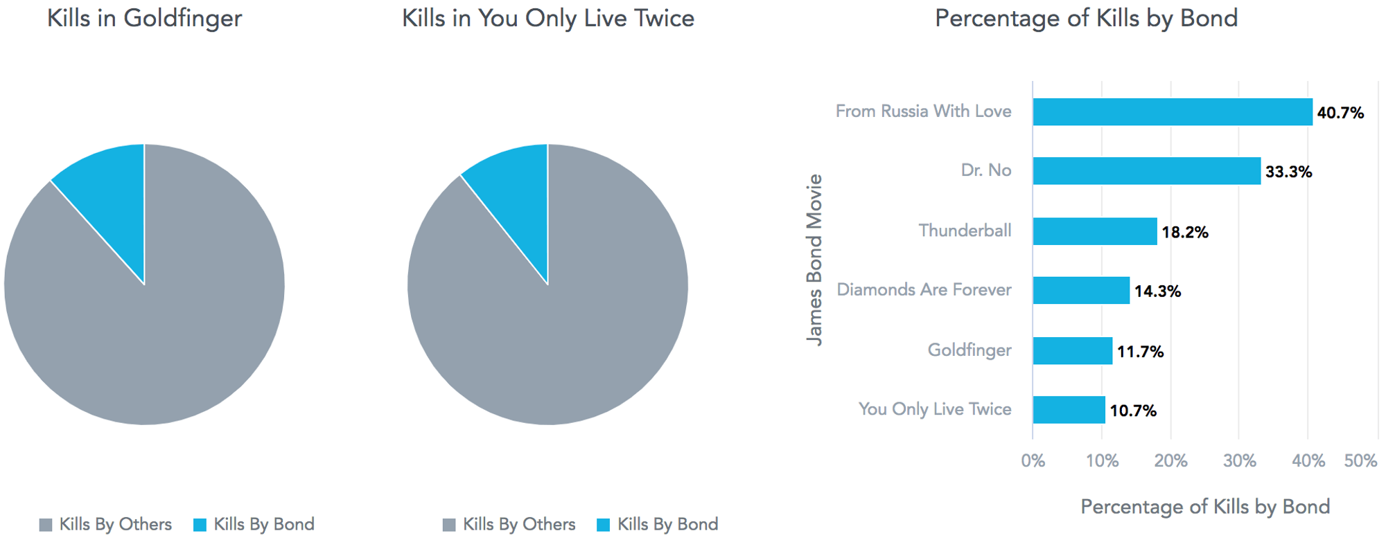
Example: The kills share of Bond in Goldfinger and You Only Live Twice cannot be easily compared using a pie chart. The chart on the right communicates the information much more clearly.
Tip 6: Match series colors
Colors in a chart are usually assigned from a common palette without any logic. I suggest you assign colors by following this methodology:
- Match series colors on multiple charts so that the legend does not need to be included in each chart and it is easier to look at the same data from different angles through multiple charts.
- Color data with intention. For example, if a series represents a brand and there is some well-understood color for that brand, you can use it to color the related data.
- Do not use a legend with too many colors, or users will not be able to differentiate the data. Keep the number of colors low to tell a good story clearly.
Tip 7: Be careful when changing the axis scale
While it is easy to change the axis scale so that axis does not start at zero, it can confuse readers or make it appear as if you’re attempting to intentionally mislead the reader. I suggest always starting with zero in a column and area chart to avoid giving the wrong signal to the reader. Change the axis scale only if you really need to show detail which would otherwise be invisible or difficult to spot.
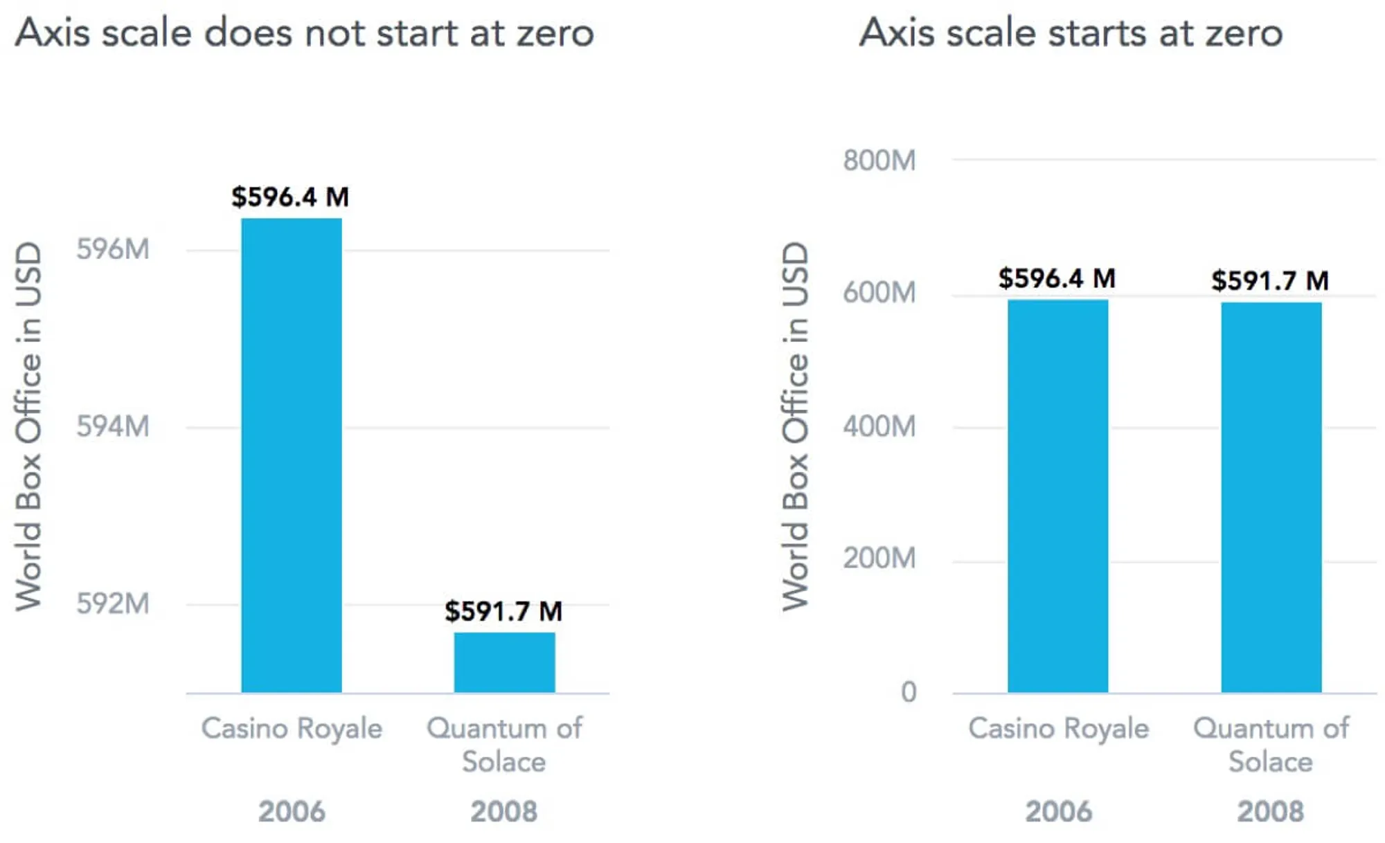
Example: The world box office earnings from Quantum of Solace seem to be very low in the chart on the left. In reality, its earnings were very similar to the earnings from Casino Royale, as can be clearly seen in the chart on the right.
I’ve used data about James Bond movies to make the examples more engaging, but did you also know that our office building in the Czech Republic was featured in the pre title sequence in Casino Royale?
Want to see what GoodData can do for you?
Get a guided tour and ask us about GoodData’s features, implementation, and pricing.
Request a demo
