Top 10 Proven Data Visualization Best Practices
6 min read | Published


Summary
Clear data visualizations make it easier to understand complex information and take action. But getting there takes more than just picking a chart and adding numbers. This article walks through ten best practices that help visuals do their job well. You will learn how to choose the right chart type, remove distractions, use color intentionally, add context with labels, and tailor each visualization to your audience. Together, these techniques will make your data easier to read, harder to misinterpret, and more effective at driving decisions.
Who are these data visualization tips for?
These data visualization best practices aren't just for data wizards or analysts tucked away in some back room. Whether you use open-source tools or advanced analytics software, they will show you the best way to visually display data, ensuring you get your message across in a clear and impactful way.
Data is a universal language, but how it's interpreted depends on the lens through which it's viewed. The choices you make with your visualizations aren’t just aesthetic; each decision you make is critical to shaping the message you wish to convey. These 10 data visualization best practices will help you turn your data into insights everyone can understand.
1. Know your audience
Your audience’s needs, preferences, and expectations will influence every aspect of your visualization, from choice of chart to color scheme. Whether you're presenting data to executives, a sales team, or the general public, tailoring your visuals to your audience will ensure your message is not just seen but truly understood.
Resist the temptation to create visualizations that meet the needs of every single stakeholder who might one day look at it. The most fundamental data visualization best practice is to understand your audience by asking the following questions:
- Who is the visualization designed for?
- What kind of decision do you want the user to make (strategic, operational, tactical)?
- What actions do you want them to take? What actions do you want them to take?
The more detailed your answers, the more insightful your visualizations will be.
2. Keep your visualizations simple and digestible
Content marketers have long known that content needs to be snackable – and this applies to visually representing data too! The best dashboards allow users to quickly understand high-level overview information and help themselves to more information as needed.
Complex visualizations lead to confusion and information overload. They also consume more time for analysis, affecting efficiency and potentially leading to missed business opportunities.
It can be tempting to create intricate dashboards with a lot of information, but carefully selecting the relevant data points and avoiding distracting elements is the best way to create visualizations that allow your audience to answer questions and effectively strategize.

The difference between a complicated and simple visualization
3. Choose the most effective visualization
Being intentional with your choice of chart type is a visualization best practice that can make or break how your data is received. When deciding which data visualization to use, begin by considering the following guidelines for common chart types:
- Use line charts to track changes or trends over time and show the relationship between two or more variables.
- Use bar charts to compare quantities of different categories.
- Use scatter plots to show the correlation between two variables plotted along parallel axes.
- Use bubble charts to express a similar correlation to the above when you have three data items.
- Use treemaps for comparing the proportions between categories via their area size in a space-efficient way.

Effective data visualization examples
4. Avoid pie charts
Pie charts can be useful to show how a small amount of data segments contribute to the whole. However, they are not always the best way to present data visually because the user needs to compare areas or angles, which can be difficult.
If the number of segments is too high or some of the segments are too small, the center of a pie chart looks messy and overwhelming. In such instances, you’re better off using alternatives, such as:
- Donut charts to eliminate the problem of comparing angles by focusing more on the length of the arc.
- Line charts to more clearly display a trend of ratio than multiple pie charts can.

Sometimes a line chart can be a better option than a pie or donut chart.
5. Tell a story
In the age of AI, we can expect big improvements in employee productivity: machine learning-powered recommendations can predict customers who will churn, power personalized marketing campaigns, and tell you how to optimally price your products.
In many cases, tasks will be automated, but in others, expert users will need to review predictions and recommendations. To do so, they need to understand the context of the prediction or recommendation, i.e., the story the data is telling them. This is true even in simple use cases without machine learning, like sales performance.
To drive an action, the viewer needs to understand how the performance compares to something tangible, like a goal or a benchmark from a previous period. The best visualizations present metrics in comparison with dynamic thresholds to help viewers better interpret the numbers. Machine learning or not, the clearer the story, the easier it is to know where action is required.
Providing context is just one technique you can use to tell the story.
Want to see what GoodData can do for you?
Get a guided tour and ask us about GoodData’s features, implementation, and pricing.
Request a demo6. Make your visualizations interactive
Today’s users expect more than just pretty visuals, they want to be able to engage with the data. Interactive visualization elements can elevate user engagement to new heights.
Incorporating features like tooltips, filters, and drilling can transform static visuals into a dynamic and user-driven experience. Tooltips, for instance, provide additional context or detailed information when users hover over data points. Filters allow users to explore data from various angles, making it easier to isolate specific trends or focus on particular data subsets.
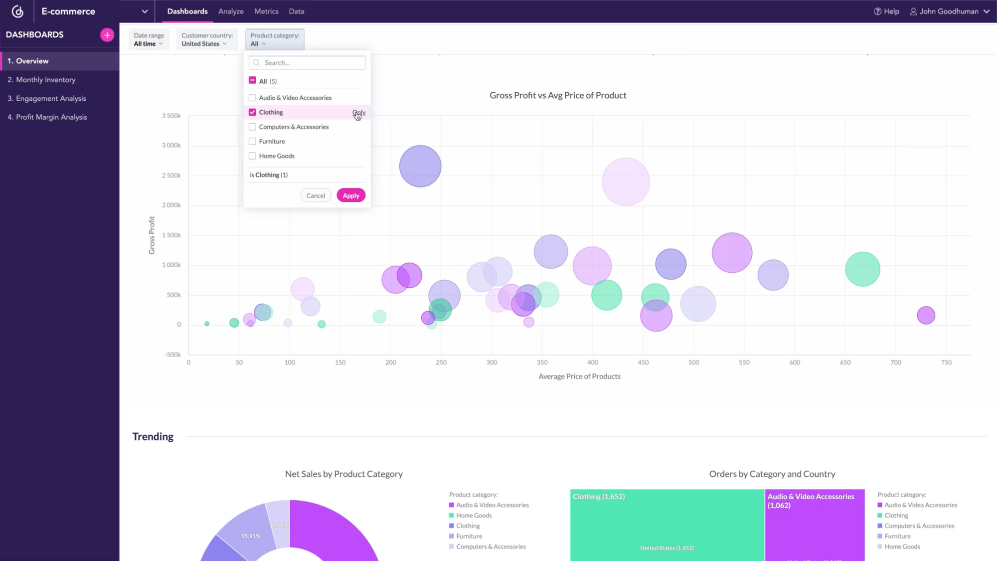
Tools such as filtering allow users to better interact with the data.
Instead of using static visualizations, you might also want to consider a data tool that enables AI-powered interactivity. AI can enable users to interact and ask questions using natural language (via chatbots) to get answers, predict gross profit, make forecasts, and more.
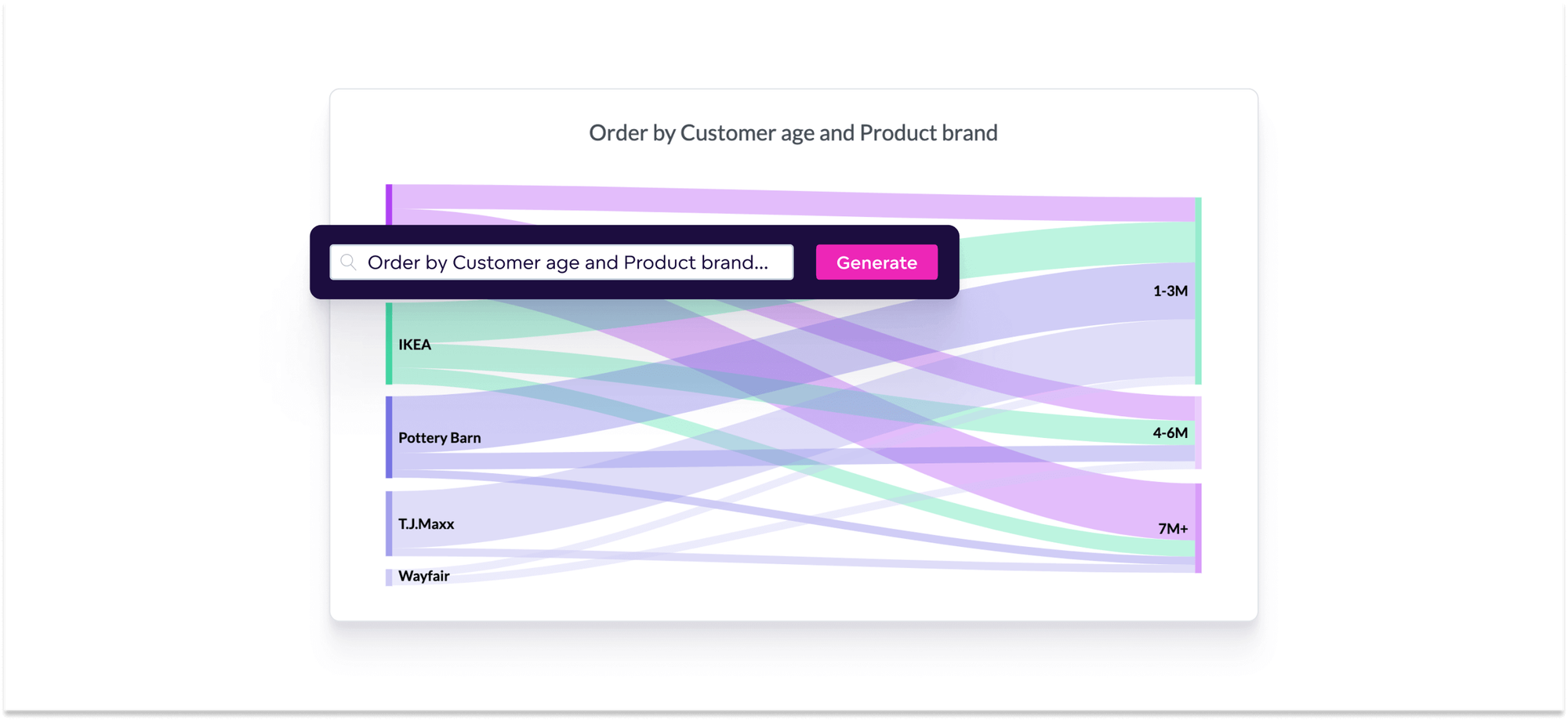
AI-powered features like NLQ mean faster insights and faster decisions.
7. Utilize data visualization design best practices
Good data visualizations are built on a solid foundation of key design principles. These make your audience more receptive to the data, and guide their attention to the most critical information.
Intuitive visual clues, such as color, shape, and position, allow viewers to understand the data story without extensive explanation. For example, you might like to match series colors on multiple charts so the legend does not need to be included in each chart, making it easier to look at the same data from different angles through multiple charts. Effective labels are another cornerstone of UX-friendly design, providing clarity and context.
8. Customize your visuals for a personalized user experience
Fully customized visualizations can be tailored to the preferences and needs of your audience to create a sense of personalization. Users are more likely to connect with visuals that resonate with their specific interests and requirements. Choosing more creative ways to visualiza data can also contribute to the effective communication of your statistics. By aligning visual elements with the audience's expectations, you can simplify the understanding of complex data sets, which can significantly impact how users interpret and act upon the data.
9. Make your visualizations accessible to all users
Ensuring your visuals are accessible to all users (including the visually impaired) is another important data visualization best practice. Incorporate the following methods to create visuals that are accessible to a diverse audience.
- Choose color schemes with high contrast between foreground and background elements. For instance, use dark text on a light background or vice versa. High contrast benefits all users by making the content more readable, leading to better data visualizations.
- Avoid red-green combinations as these can be challenging for those with color vision deficiencies.
- Incorporate patterns and textures to differentiate data points, bars, or sections.
- Test your visualizations with accessibility tools and screen readers. This can identify any potential issues and ensure the content is navigable and understandable for all users.
10. Test and iterate your visualizations
By subjecting your visualizations to user feedback and usability testing, you’ll gain insights into how well your audience comprehends the data, which aspects may be confusing, and what improvements can be made. This is a vital step in uncovering any accessibility or usability barriers that may hinder users from engaging with the data and being able to make decisions.
Once you’ve tested your visualizations, iterate based on the feedback. Building good visualizations is a continuous cycle where you refine the design, content, and interactivity to meet evolving needs.
What's next?
Incorporate these data visualization best practices and you’ll be ahead of the curve when it comes to creating impactful visuals. To further improve your skills, check out our accompanying article that offers guidelines for building dashboards users love.
Want to see what GoodData can do for you?
Get a guided tour and ask us about GoodData’s features, implementation, and pricing.
Request a demoFAQs about data visualization best practices
First, define the goal of the visualization and the story you want to tell. Then select a chart type that aligns. For example, use bar charts for category comparisons, line charts for trends over time, and scatter plots for relationships.
Focus on key data points and remove unnecessary elements. Limit colors, simplify axes, and ensure the layout supports easy scanning of the main message.
Context like labels, benchmarks, or reference lines helps viewers interpret data accurately and prevents misleading comparisons.
Annotations act as guideposts, highlighting significant trends or outliers and explaining underlying causes, making the visual easier to understand without separate commentary.
Storytelling structures the visualization flow (from overview to detail). It helps emphasize key insights and encourages viewers to engage with the narrative rather than just consume raw numbers.

