Data Storytelling: 6 Tips To Help You Tell Effective Data Stories
Written by Tom Czaban |

With more and more data to analyze and statistics to present, helping people make sense of it all becomes all the more challenging. Enter data storytelling — as a way to turn raw data into compelling narratives that resonate with audiences.
Imagine you're trying to convey insights to various groups — customers, colleagues, or partners — data storytelling helps you do just that by simplifying complex information into engaging stories that your audience can understand.
In this article, we'll explore six practical tips for mastering data storytelling. From gaining clarity on your audience to creating interactive dashboards, we'll give you the tools you need to tell effective data stories. Whether you're a product builder or analyst, or have limited technical knowledge, these tips will help you transform data into meaningful narratives that encourage data-driven action.
What is data storytelling?
Ask for a data storytelling definition and you’ll probably be told it’s the practice of using data to tell a story. But what does that really mean? Essentially, it's the process of analyzing data to uncover meaningful insights and then presenting those insights in a palatable way. Storytelling with data is about going beyond the numbers to reveal the underlying narrative and using that narrative to inform and persuade.
What are the benefits of telling stories with data?
Data storytelling comes with several benefits. Firstly, it empowers individuals to make informed decisions based on data they understand. This access to relevant data at the right time enables employees to carry out their tasks more effectively and efficiently, ultimately driving better outcomes. Secondly, data storytelling ensures individuals receive just the right amount and scope of data, preventing confusion. Through effective data storytelling, organizations can cultivate a data culture — where ‘data-driven decision-making’ is not a buzzword but a guiding principle for success.
How to tell a story with data
Today there are some excellent data analytics tools that can facilitate the stories you want to tell. Some of these massively simplify the process by allowing you to build your visualizations and dashboards using AI. But while these solutions are crucial to bringing your data to life, the information you present will still fall flat if you’ve failed to master the techniques of data storytelling. With that in mind, let’s dive into our six actionable tips.
Tip 1: Be clear about who your data story is for
To create the best visualizations and dashboards you need to do more than simply track performance or share results. Recognize that this entire process is about communicating with a specific group of people. To tell an effective data story, ask yourself the following questions:
Who is the target consumer?
Plan your data story by identifying the highest priority persona. Ask subquestions like:
- Who will be looking at this data?
- What challenges do they face and what roadblocks prevent them from overcoming those challenges?
- Why is a particular report required, when, and by whom will it be used?
- What knowledge did they want to gain but have failed to get from the data so far?
- What formatting or design restrictions are required?
What decision should the data help to make?
- Is the decision strategic, meaning it may only need to be answered once (financial, sales, market performance, and shareholder-related information)?
- Is the decision operational and needs to be answered multiple times a day (daily overviews, uptime/downtime, quality management reporting)?
- Or, is the decision more tactical, requiring regular weekly or monthly reviews at a meeting (sales/marketing/customer support reporting that focuses on the activities within the sales funnel)?
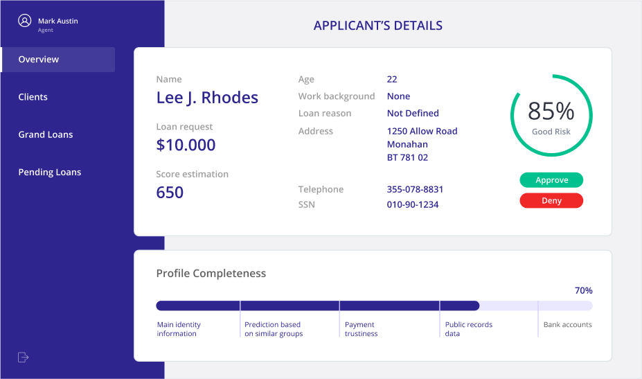
Your data story should be designed to align with the frequency of the decision-making. For example, operational decisions are ripe for simple binary visualizations, such as text that suggests “Approve” or “Deny” the claim, whereas tactical decisions may justify a more complex and interactive user interface.
Tip 2: Use the right data visualizations for your data storytelling
Selecting the appropriate data visualizations is crucial to effective storytelling. Choose the wrong one and you may confuse or mislead your audience. How do you determine which types work best for your narrative? Each visualization comes with its own set of strengths and weaknesses, and knowing when to use each is crucial.
For instance, tables offer a structured display of detailed information but can overwhelm users who are seeking high-level insights. Line charts excel in showcasing trends over time and relationships between variables. Treemaps efficiently compare proportions between categories using area size. To delve deeper into selecting the best visualizations, check out choosing the best chart type.
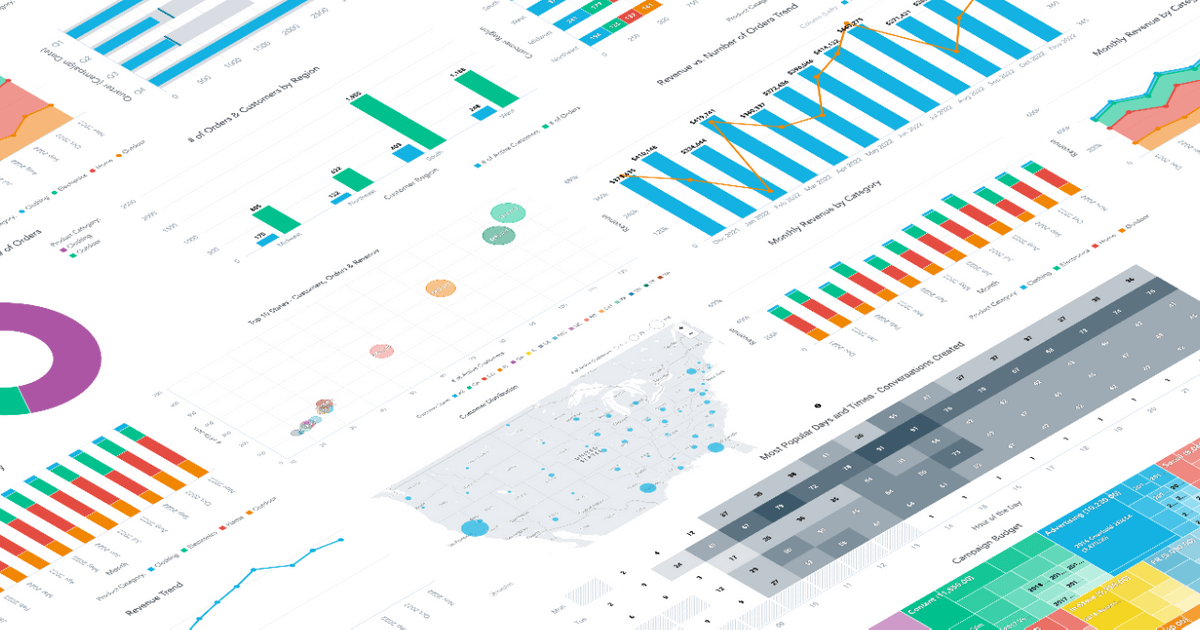
Another important factor to consider in data storytelling and visualization is the color palette. Opt for bold colors over softer tones, and avoid using red and green together, especially if your audience includes color-blind individuals. Keep colors simple and intuitive, with green indicating positivity, red signaling negativity, yellow for caution, blue as neutral, and gray for supporting context or comparison. The aim here is to avoid confusion and use color to underline the elements of your data story that you’d like the user to focus on.
Tip 3: Give your data story some context
To ensure your narrative resonates, it's crucial for the audience to grasp how the data you’re presenting aligns with concrete benchmarks or goals. This comparison will help them reach a better understanding of what the numbers actually mean and the story that is being told.
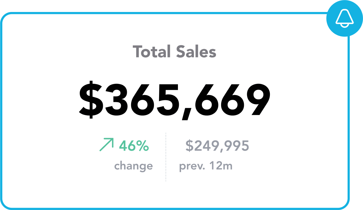
For instance, showing users how their current performance compares to past periods will give a much more complete picture of how they’re doing. Similarly, discovering your company has made 10x more profit than last year offers a much clearer picture than being told the total profit was $200,000 — as whether that figure represents a successful outcome is open to interpretation.
As the image below demonstrates, visual elements like arrows and descriptive text help to provide clarity on how to interpret the data in relation to the benchmarks.
Tip 4: Turn your data story into a choose-your-own-adventure
Today, your data story will likely act as a container for users to explore the data themselves and create their own stories. To fully understand this, it may help to think of your main dashboard reports as the summary version of that book that you never read in school.
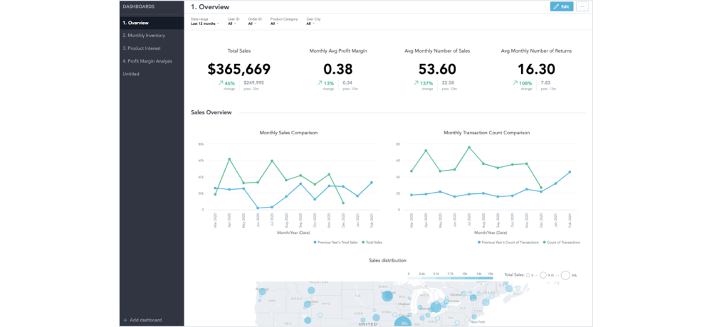
Newspapers figured out a long time ago that you should always position the important high-level information in the first place a reader will look. The same goes for your end users. Doing this provides them with an easy and reliable way to understand the status of their KPIs and quickly interpret the data.
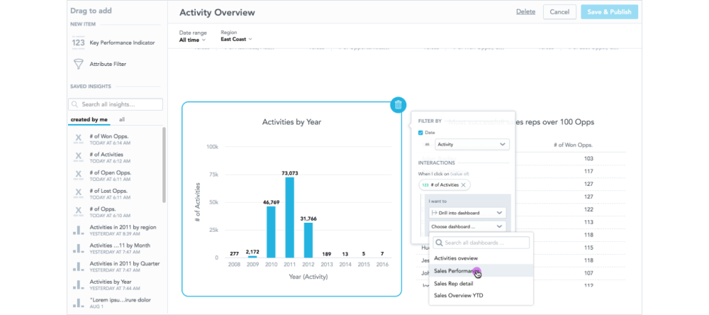
The main visualizations should focus on the major trends and key metrics but don’t have to contain a full breakdown of the information. A more granular view of the data can be achieved by providing drilling and filtering options or separate dashboard tabs. This will encourage users to explore the data in-depth and enable them to enjoy an interactive experience. A good analytics platform will offer generative AI capabilities, allowing users to interact with the data using natural language and providing various options to discover new insights.
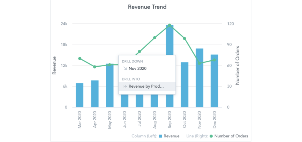
Drilling is a very important aspect of data storytelling. With drilling up and down, users can navigate within the hierarchy of data — zooming in and out to more or less detail. When you start your dashboard with headlines, you continue on to summarize insights where you drill to lower or different reports around the same data — so called drill through operation.
Filtering can help users answer questions where two or more options exist that have a dependency in a hierarchy. An example is defining a restaurant category that you want to focus on and then allowing users to continue with filtering of other areas — such as menu categories. This is especially useful when you have a long list of attributes and you want to narrow down the filters so that end-users only see the filter values relevant to them.
Tip 5: Present your data story in an unobtrusive way
While it’s true that you can’t judge a book by its cover, the look and feel of your data story will have a real impact on how it is received by your audience. Whether you are building customer-facing analytics or an internal portal for your employees, you need to align the themes with the colors, fonts, logos, and formatting to meet the brand guidelines of your business and avoid giving off a bad impression.
If you are embedding your analytics into your core product and delivering this to your customers, it’s preferable to use a solution that provides front-end libraries for rapid development of the analytical interface. To embed analytics into your product — especially if you have only front-end coders or if you just need to embed a simple dashboard — direct embedding is the best way forward.
You also need to ensure that your analytics are formatted according to the standards in the user’s region and in a way that improves the readability of the results. For instance, you want to keep the dates in the right format or use the right separator of numbers and metrics format, including colors that change based on the number interval or large number truncation. Your ultimate goal is to make the user experience seamless; so the visual presentation complements rather than obstructs the story.
Tip 6: Help your users share data stories
Once your audience understands WHY the data you’re showing them matters and they’ve had an opportunity to explore the data themselves, a good BI solution will enable them to easily share the dashboards with their peers.
Copying and pasting to emails and slides might be easy, but it’s far from ideal for keeping the audience consistently up-to-date with accurate data to work with. There are instead, two common ways to achieve this. The first is to have a shared dashboard where the user can add insights for others to see. This is useful when you are anticipating that all users will prefer to log into the product.
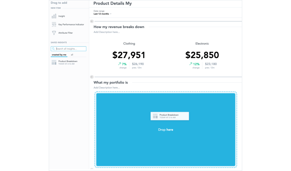
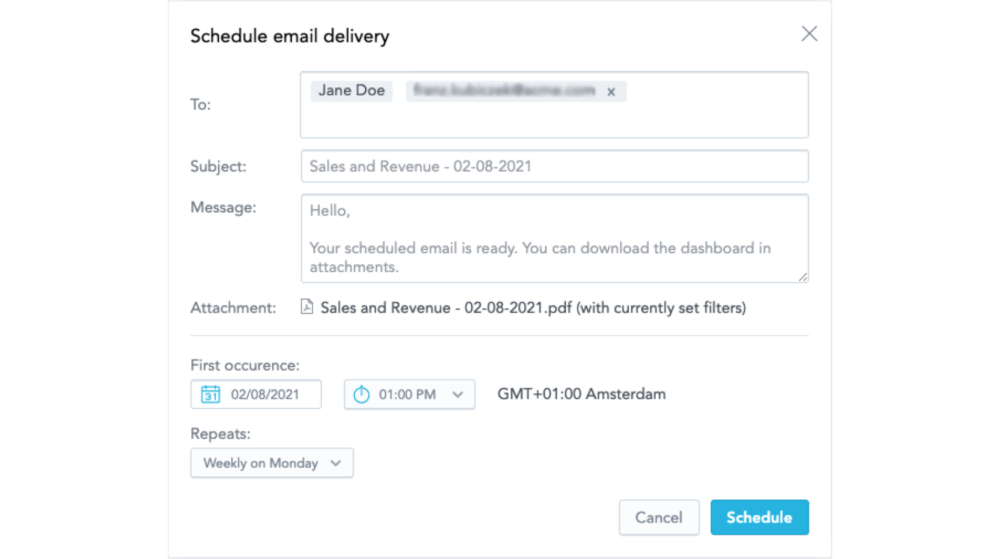
The second is to share the data via email for consumers who prefer document-based reporting or are unable to access the product (like external users, for example). Here you can set up repeat automation so that the audience gets the data in the most updated version when they need it — such as before a status meeting. The user should also be able to download that dashboard or report manually as well.
How difficult is it to create data stories?
All data tells a story — whether you want it to or not — so it is easy to unintentionally create a data story by default. But there is a clear distinction between this and making sure users are hearing the story you want to tell. In this respect, crafting great data stories can be both challenging and rewarding.
One of the key factors influencing the difficulty level is your choice of analytics tool. As mentioned, a good analytics solution streamlines the process, providing intuitive features for data visualization, analysis, and storytelling.
When navigating the complexities of data storytelling consider the differences between dashboards designed for internal users versus customer-facing analytics embedded into products.
Customer-facing analytics present unique challenges due to the diverse needs and preferences of end-users. Unlike internal analytics where user personas and use cases are well-known, customer-facing analytics require a more generalized approach. With customer-facing analytics, you're tasked with building an analytical model, reports, and dashboards that cater to a wide range of users across different industries. This necessitates providing customers with self-service capabilities to customize insights and dashboards according to their specific requirements.
To succeed in customer-facing analytics, it's crucial to strike a balance between providing a baseline of pre-calculated metrics (the data story) and enabling customers to create custom reports and dashboards.
Data storytelling examples
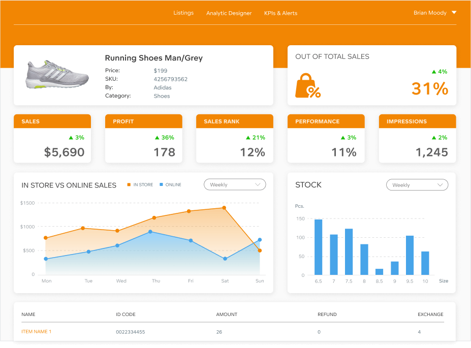
Great data storytelling tends to hide in plain sight; much like appreciating a piece of art — the simplicity of presentation belies the careful planning and effort behind it.
A well-designed dashboard instantly draws attention to the most important figures, making it easy to understand their significance and impact. The storytelling is so seamless that users are naturally encouraged to explore further. Below, are a few examples of straightforward and impactful data stories that demonstrate the art of effective storytelling.
Data-driven storytelling with GoodData
In this article, we've outlined six tips for crafting great data stories. Build these narratives with GoodData and you’ll be leveraging a platform trusted by a diverse range of customers across multiple industries.
Request a demo today to see how GoodData can revolutionize your data storytelling experience, providing technical flexibility, scalability, and top-tier security to drive informed decision-making and business growth.
Written by Tom Czaban |
Subscribe to our newsletter
Get your dose of interesting facts on analytics in your inbox every month.
Subscribe